
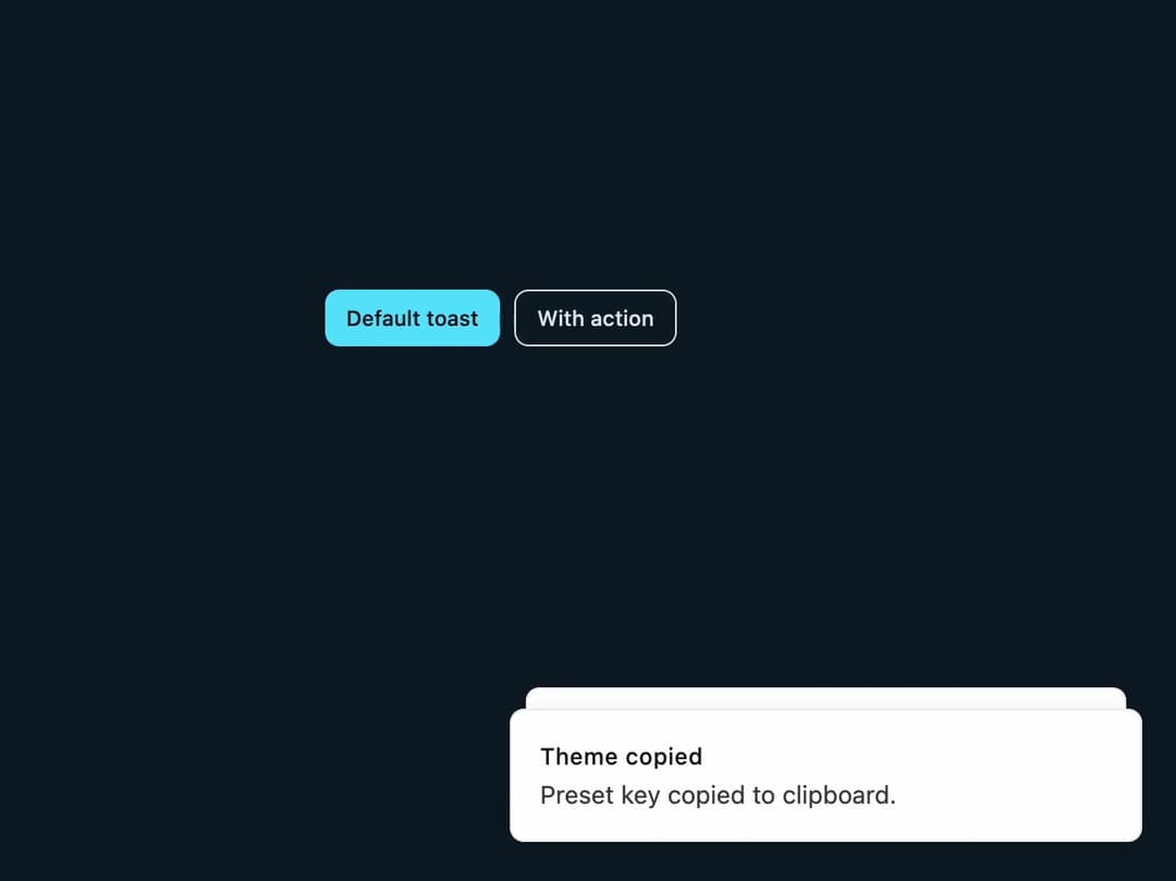
About
A toast notification component for showing brief success, error, or status messages that appear and auto-dismiss at the edge of the screen, built on the sonner library.
Built with React and Tailwind. Copy the prompt and paste it into Claude Code, Cursor or Lovable: your agent adds Toast Notification to your project and fits it to your theme.
Code
How Toast Notification is used: the demo's code. The component's own source comes with a free account.
Usage.tsx
"use client";

import { toast } from "sonner";
import { Button } from "@/components/ui/button";
import Toaster from "@/components/ui/toast";

export default function ToastDemo() {
  return (
    <div className="flex min-h-[320px] w-full items-center justify-center p-10">
      <div className="flex flex-wrap gap-2">
        <Button
          size="sm"
          onClick={() =>
            toast("Theme copied", {
              description: "Preset key copied to clipboard.",
            })
          }
        >
          Default toast
        </Button>
        <Button
          size="sm"
          variant="outline"
          onClick={() =>
            toast("Long-running deploy", {
              description: "Polling node health…",
              action: {
                label: "Cancel",
                onClick: () => toast.info("Cancelled"),
              },
            })
          }
        >
          With action
        </Button>
      </div>
      <Toaster />
    </div>
  );
}
Dependencies
More by ghaerdi
View all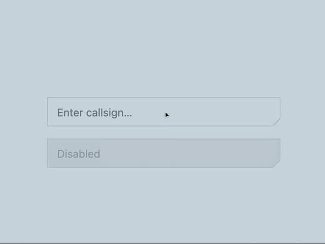
Carved Neon Input
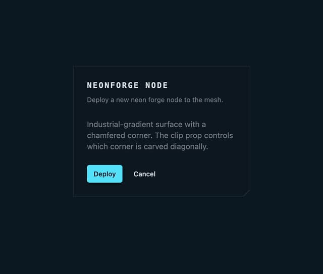
Chamfered Glass Card