
About
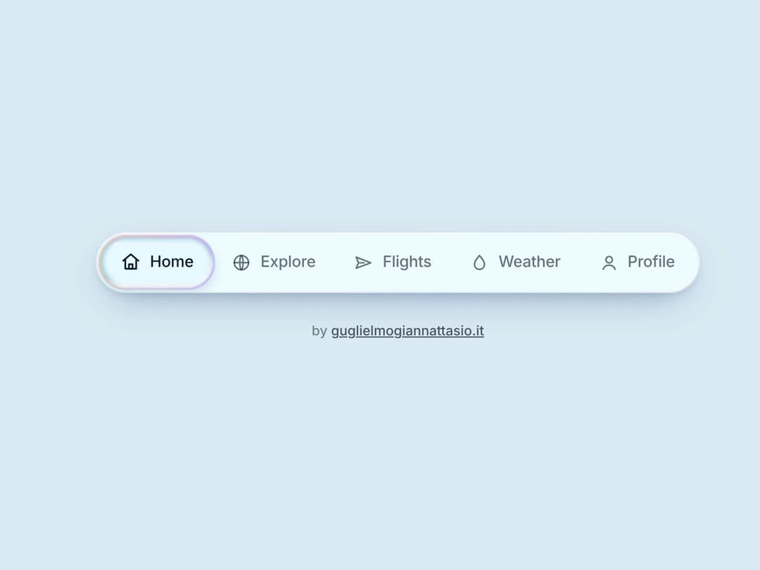
Liquid glass navbar with a real water drop: it stretches, splits into gooey droplets and merges back with a ripple. Animated icons, hover meniscus, WebGL shader with CSS fallback. Apple-style liquid glass, zero dependencies.
Built with React and Tailwind. Copy the prompt and paste it into Claude Code, Cursor or Lovable: your agent adds Liquid Glass Navbar to your project and fits it to your theme.
Code
How Liquid Glass Navbar is used: the demo's code. The component's own source comes with a free account.
Usage.tsx
import { LiquidNavbar, NimbusIcons } from "@/components/ui/liquid-glass-navbar"

export default function Demo() {
  return (
    <div
      style={{
        minHeight: "100vh",
        width: "100%",
        display: "flex",
        flexDirection: "column",
        alignItems: "center",
        justifyContent: "center",
        gap: 28,
        padding: "0 16px",
        background: "#DCEBF5",
      }}
    >
      <LiquidNavbar
        tone="light"
        defaultActive={0}
        sound={false}
        items={[
          { label: "Home", icon: NimbusIcons.home, fx: "glow" },
          { label: "Explore", icon: NimbusIcons.globe, fx: "spin" },
          { label: "Flights", icon: NimbusIcons.plane, fx: "plane" },
          { label: "Weather", icon: NimbusIcons.drop, fx: "drop" },
          { label: "Profile", icon: NimbusIcons.user, fx: "wave" },
        ]}
      />
      <span
        style={{
          font: "500 12px/1 ui-sans-serif, -apple-system, 'Segoe UI', system-ui, sans-serif",
          color: "rgba(11,19,43,.5)",
        }}
      >
        by{" "}
        <a href="https://guglielmogiannattasio.it" target="_blank" rel="noopener noreferrer" style={{ color: "rgba(11,19,43,.7)" }}>
          guglielmogiannattasio.it
        </a>
      </span>
    </div>
  )
}
More by Guglielmo Giannattasio
View all

Scroll-Locked Video Hero
3.2K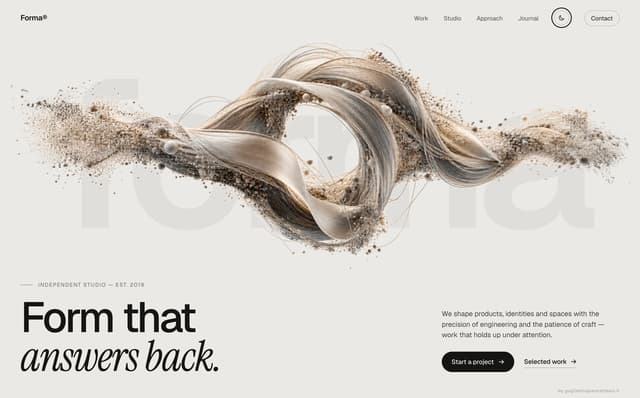
Liquid Sculpture Hero
1.3K
Broken by Design — Shattered Glass Hero
502
Sunset Skyline Hero
460
Elsewhere — Day/Night Video Hero with Ambient Sound
181
Shave Reveal Hero
72
UFO Hero
49