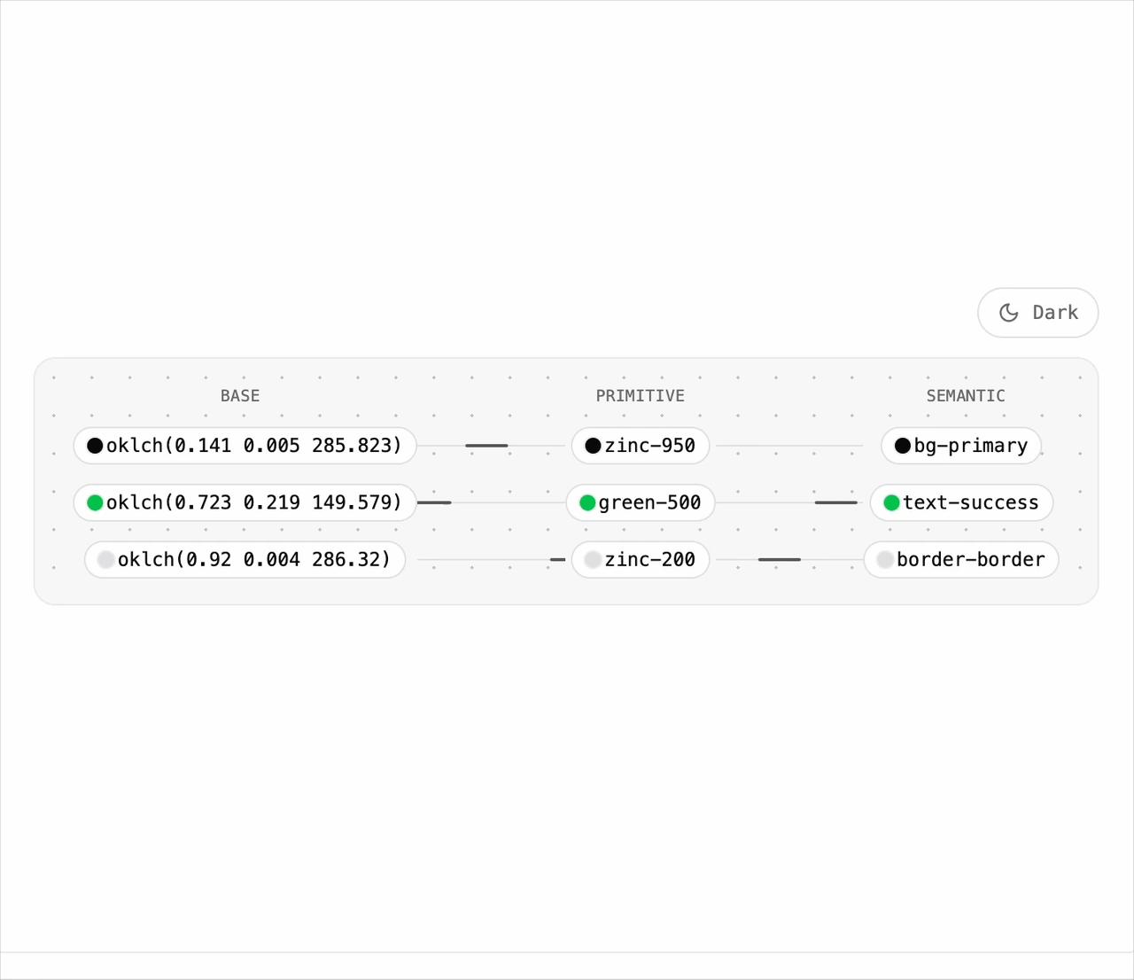
"use client"

import { useState } from "react"
import { MoonIcon, SunIcon } from "lucide-react"

import { TokenFlow } from "@/components/ui/token-flow"

const ROWS = [
  {
    base: "oklch(0.141 0.005 285.823)",
    primitive: "zinc-950",
    semantic: "bg-primary",
    use: "Primary actions, headings",
    dark: { base: "oklch(0.985 0 0)", primitive: "zinc-50" },
  },
  {
    base: "oklch(0.723 0.219 149.579)",
    primitive: "green-500",
    semantic: "text-success",
    use: "Resolved, healthy, within threshold",
  },
  {
    base: "oklch(0.92 0.004 286.32)",
    primitive: "zinc-200",
    semantic: "border-border",
    use: "Hairlines and inputs",
    dark: { base: "oklch(0.274 0.006 286.033)", primitive: "zinc-800" },
  },
]

function ThemeToggle({
  isDark,
  onToggle,
}: {
  isDark: boolean
  onToggle: () => void
}) {
  return (
    <button
      type="button"
      onClick={onToggle}
      className="inline-flex h-8 items-center gap-2 rounded-full border border-border bg-background px-3 font-mono text-xs text-muted-foreground transition-colors hover:text-foreground"
    >
      {isDark ? (
        <SunIcon className="size-3.5" aria-hidden />
      ) : (
        <MoonIcon className="size-3.5" aria-hidden />
      )}
      {isDark ? "Light" : "Dark"}
    </button>
  )
}

/**
 * The preview host pins the document theme, so the demo scopes its own
 * `dark` class to a wrapper and passes the theme down explicitly.
 */
export default function TokenFlowDemo() {
  const [isDark, setIsDark] = useState(false)
  return (
    <div
      className={
        isDark
          ? "dark flex w-full max-w-3xl flex-col items-end gap-3 rounded-2xl bg-background p-6 text-foreground"
          : "flex w-full max-w-3xl flex-col items-end gap-3 rounded-2xl bg-background p-6 text-foreground"
      }
    >
      <ThemeToggle isDark={isDark} onToggle={() => setIsDark((d) => !d)} />
      <TokenFlow
        rows={ROWS}
        theme={isDark ? "dark" : "light"}
        className="w-full"
      />
    </div>
  )
}