About
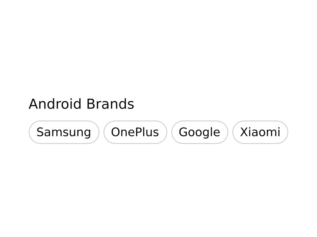
A collection of tags displayed together for categorizing, filtering, selecting, or removing multiple labels, built on React Aria Components.
Built with React and Tailwind. Copy the prompt and paste it into Claude Code, Cursor or Lovable: your agent adds Tag Group to your project and fits it to your theme.
Code
How Tag Group is used: the demo's code. The component's own source comes with a free account.
Usage.tsx
"use client";

import { Label } from "@/components/ui/field";
import { Tag, TagGroup, TagList } from "@/components/ui/tag-group";

export const androidBrands = [
  { id: "1", name: "Samsung", available: false },
  { id: "2", name: "OnePlus", available: true },
  { id: "3", name: "Google", available: true },
  { id: "4", name: "Xiaomi", available: false },
];

export default function TagGroupDemo() {
  return (
    <TagGroup selectionMode="multiple">
      <Label>Android Brands</Label>
      <TagList items={androidBrands}>
        {(item) => <Tag>{item.name}</Tag>}
      </TagList>
    </TagGroup>
  );
}
Dependencies
More by Intent UI
View all

Radar Chart
234
Radial Chart
84
Bar Chart
46
Pie Chart
36
Toggle Group
28
Loader
25
Progress Bar
22
Color Slider
14