
About
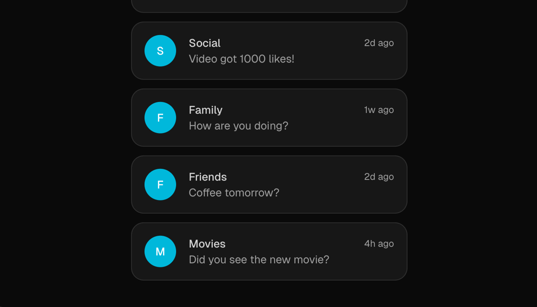
A dynamic list component with smooth animations that forms a column and scrolls through items continuously.
Built with React and Tailwind. Copy the prompt and paste it into Claude Code, Cursor or Lovable: your agent adds Animated List to your project and fits it to your theme.
Code
How Animated List is used: the demo's code. The component's own source comes with a free account.
Usage.tsx
import { AnimatedList } from "@/components/ui/animated-list";


export default function AnimatedListDemo() {
  const notifications = [
    { name: "Location", message: "Thomas has arrived home", time: "2h ago" },
    { name: "Fitness", message: "Daily step goal reached!", time: "1h ago" },
    {
      name: "Calendar",
      message: "Team meeting in 30 minutes",
      time: "45m ago",
    },
    { name: "Tasks", message: "3 tasks due today", time: "1d ago" },
    { name: "Health", message: "Heart rate elevated", time: "3h ago" },
    { name: "Email", message: "New message from manager", time: "5m ago" },
    { name: "Social", message: "Video got 1000 likes!", time: "2d ago" },
    { name: "Family", message: "How are you doing?", time: "1w ago" },
    { name: "Friends", message: "Coffee tomorrow?", time: "2d ago" },
    { name: "Movies", message: "Did you see the new movie?", time: "4h ago" },
  ]
  return (
    <div className="bg-background relative h-[400px] w-full overflow-hidden rounded-lg border">
      <AnimatedList
        stackGap={20}
        columnGap={85}
        scaleFactor={0.05}
        scrollDownDuration={5}
        formationDuration={1}
      >
        {notifications.map((notification, index) => (
          <div
            key={index}
            className="bg-card flex w-full max-w-[350px] items-center gap-4 rounded-2xl border p-4 shadow-sm"
          >
            <div className="flex h-10 w-10 items-center justify-center rounded-full bg-cyan-500 text-sm font-medium text-white">
              {notification.name.charAt(0)}
            </div>
            <div className="flex flex-1 flex-col">
              <div className="flex items-center justify-between">
                <span className="text-sm font-medium">{notification.name}</span>
                <span className="text-muted-foreground text-xs">
                  {notification.time}
                </span>
              </div>
              <span className="text-muted-foreground text-sm">
                {notification.message}
              </span>
            </div>
          </div>
        ))}
      </AnimatedList>
    </div>
  )
}
Dependencies
More by Mudunuri bhaskara karthikeya varma
View all

Animated Badge
559
Dynamic Square
290
Testimonal Slider
213
Orbit Rotation
140
Testimonals Carousel
101
Animated Card
77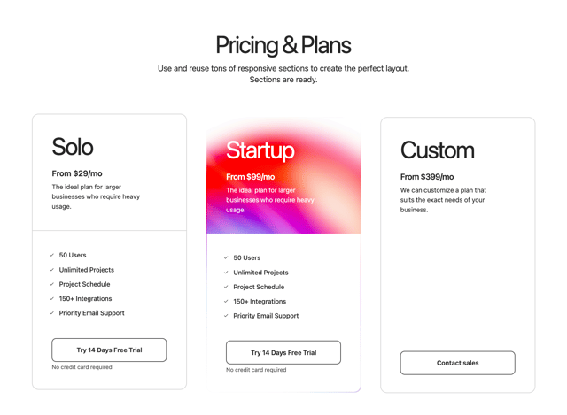
Gradient Pricing
75
Header Navbar
10
More in Cards
View all
Stats cards with links
120

Course Design Cards
1.1K

Statistics Card 2
259
Card
56

Card Studio
9
The Item one
3
Statistics Card 7
289

Weather Card
54
