
About
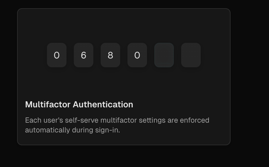
An animated OTP (One-Time Password) input component with random digits, customizable delay, hover control, and card customization for authentication flows.
Built with React and Tailwind. Copy the prompt and paste it into Claude Code, Cursor or Lovable: your agent adds Clerk OTP to your project and fits it to your theme.
Code
How Clerk OTP is used: the demo's code. The component's own source comes with a free account.
Usage.tsx
import {ClerkOTP} from "@/components/ui/clerk-otp";

export default function ClerkOTPDemo() {
  return (
    <ClerkOTP
      delay={3500}
      cardTitle="Hover to Animate"
      cardDescription="Animation only triggers when hovering over the card. Random digits generated each time."
      whileHover={true} // Animation only on hover
    />
  )
}
Dependencies
More by Mudunuri bhaskara karthikeya varma
View all

Animated Badge
559
Dynamic Square
290
Testimonal Slider
213
Orbit Rotation
140
Testimonals Carousel
101
Animated Card
77
Gradient Pricing
75
Header Navbar
10
More in Cards
View all
Stats cards with links
120

Course Design Cards
1.1K

Statistics Card 2
259
Card
56

Card Studio
9
The Item one
3
Statistics Card 7
289

Weather Card
54
