
About
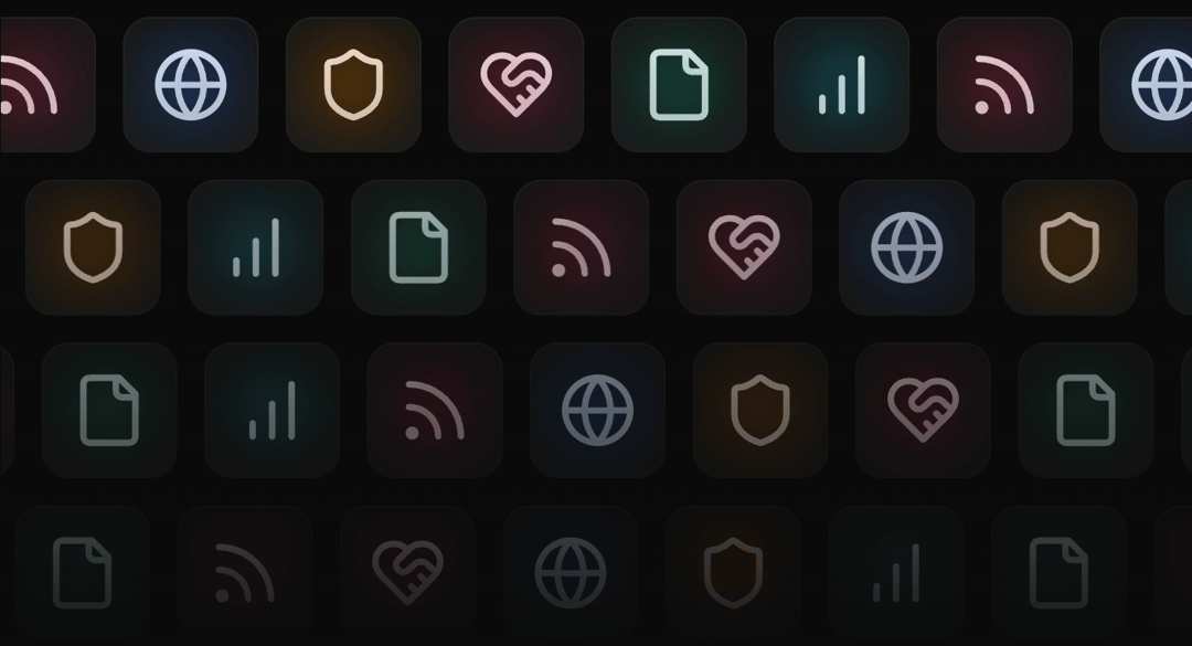
Animated integrations showcase component with marquee effects and gradient backgrounds.
Built with React and Tailwind. Copy the prompt and paste it into Claude Code, Cursor or Lovable: your agent adds Integrations to your project and fits it to your theme.
Code
How Integrations is used: the demo's code. The component's own source comes with a free account.
Usage.tsx
import {Integrations} from "@/components/ui/integrations";

export default function IntegrationsDemo() {
  return (
    <div className="bg-background relative z-10 h-[500px] w-full overflow-hidden rounded-lg border">
      <Integrations />
    </div>
  )
}
Dependencies
More by Mudunuri bhaskara karthikeya varma
View all

Animated Badge
559
Dynamic Square
290
Testimonal Slider
213
Orbit Rotation
140
Testimonals Carousel
101
Animated Card
77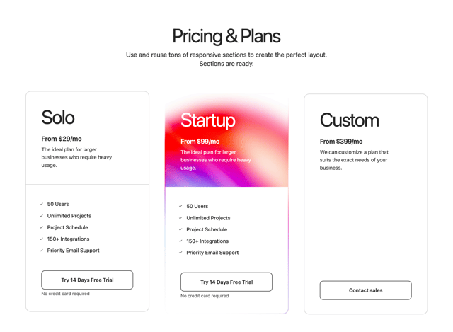
Gradient Pricing
75
Header Navbar
10