
About
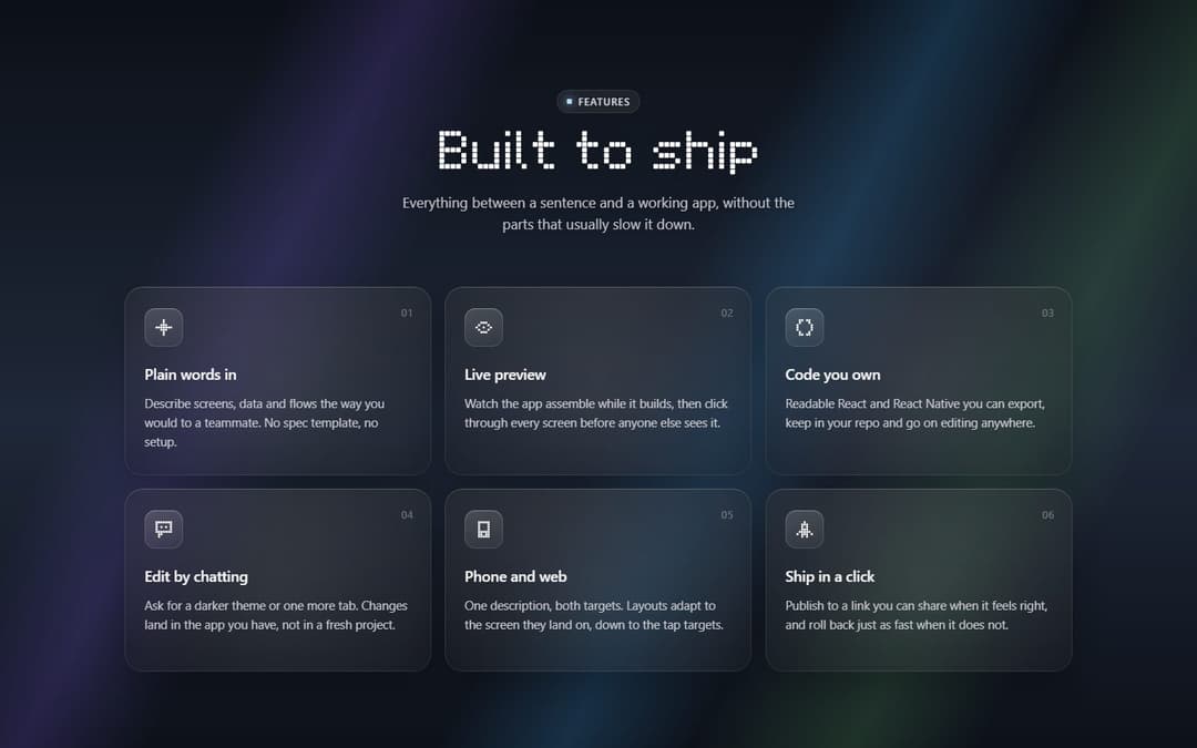
Glassmorphism features section: a pixel-type title that assembles from its pixels, a lede, and frosted-glass cards that drop into the grid one after another, each tilting toward the pointer with a spotlight that follows it. Twelve pixel icons, two or three columns, its own slate-and-spectrum backdrop or yours.
Built with React and Tailwind. Copy the prompt and paste it into Claude Code, Cursor or Lovable: your agent adds Glassmorphism Features Section to your project and fits it to your theme.
Code
How Glassmorphism Features Section is used: the demo's code. The component's own source comes with a free account.
Usage.tsx
"use client"

import GlassFeatureGrid from "@/components/ui/glass-feature-grid"

export default function Demo() {
  return <GlassFeatureGrid />
}
Dependencies
More by Kedhareswer Naidu
View all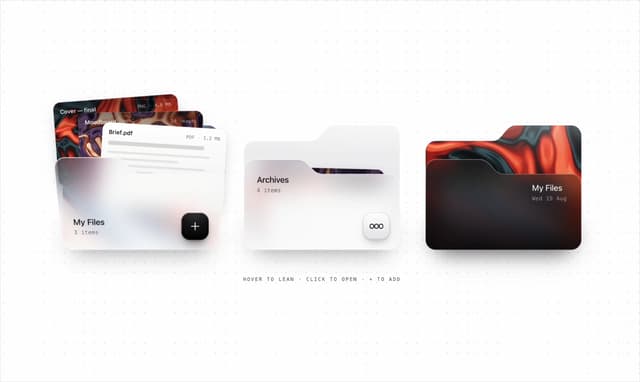

Glassmorphism Folder Cards
3.1K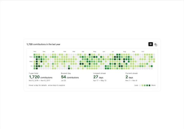
GitHub Contribution Graph 3D Heatmap
1.8K
Morph Gallery
1.5K
Halftone Wordmark Footer
1.4K
Hanging Polaroid Image Carousel
862
Glass Cards
739
Tiger Tear Reveal
663
Particle Animation
653
More in Features
View all

Grid Feature Cards
1.9K

Feature Sections
61
Features Card
209

Features 8
3.1K
Features 1
279

Feature 72
124
Features 2
324
Feature with advantages
281

