
About
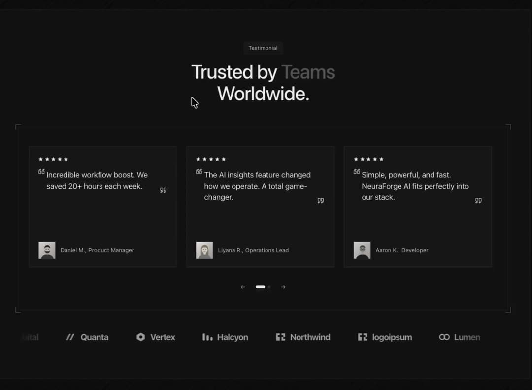
Testimonials section with logo marquee: snap-scrolling quote cards with star ratings, drawn greyscale portraits and an arrows-and-dots pager, over a scrolling row of customer names. Light/dark, zero dependencies.
Built with React and Tailwind. Copy the prompt and paste it into Claude Code, Cursor or Lovable: your agent adds Testimonials Section with Logo Marquee to your project and fits it to your theme.
Code
How Testimonials Section with Logo Marquee is used: the demo's code. The component's own source comes with a free account.
Usage.tsx
"use client"

import InkOrbitTestimonials from "@/components/ui/ink-orbit-testimonials"

export default function Demo() {
  return (
    <div className="w-full">
      <InkOrbitTestimonials theme="dark" />
    </div>
  )
}
More by Kedhareswer Naidu
View all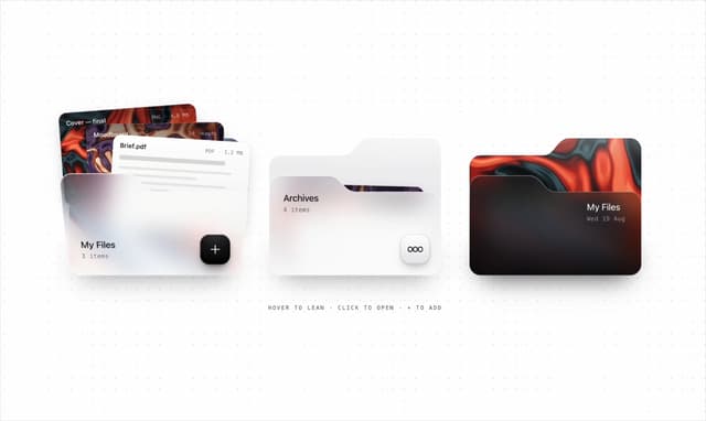

Glassmorphism Folder Cards
2.7K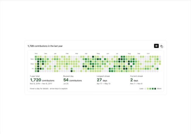
GitHub Contribution Graph 3D Heatmap
1.8K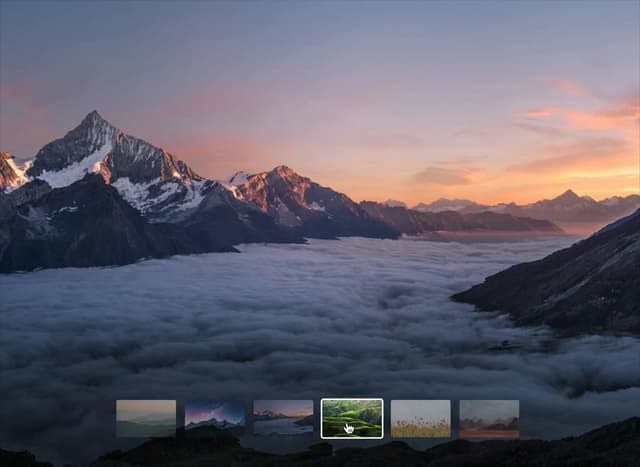
Morph Gallery
1.4K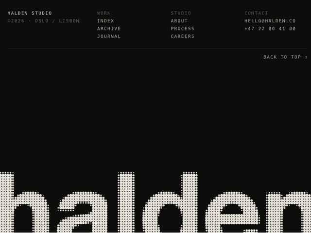
Halftone Wordmark Footer
1.2K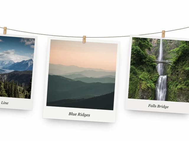
Hanging Polaroid Image Carousel
744
Glass Cards
720
Particle Animation
646
Tiger Tear Reveal
643
More in Testimonials
View all
Testimonial 2
33

Testimonial
44

Staggered Testimonials Grid
144
testimonial
800
Testimonial Card
69
Testimonials Section
241
Testimonials Section
152

Testimonials
245


