
About
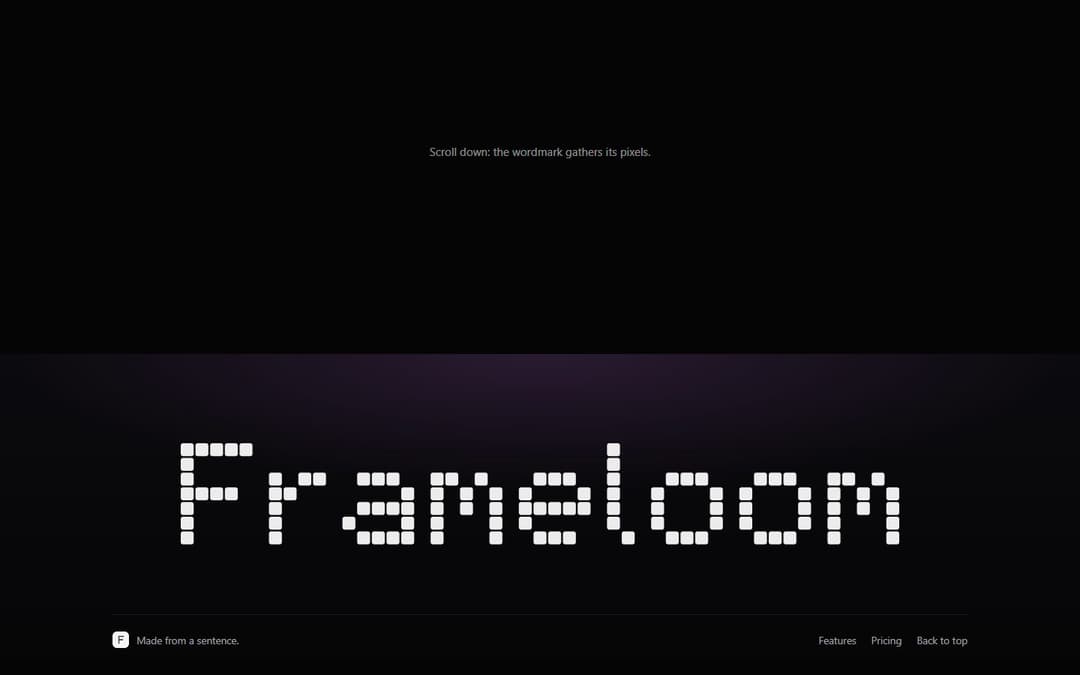
Pixel wordmark footer: the brand drawn as a huge pixel word that gathers from a scattered cloud as the footer scrolls into view and scatters again on the way out, with a pixel monogram mark, a note and footer links. No font file, works in any scroll container.
Built with React and Tailwind. Copy the prompt and paste it into Claude Code, Cursor or Lovable: your agent adds Pixel Wordmark Footer to your project and fits it to your theme.
Code
How Pixel Wordmark Footer is used: the demo's code. The component's own source comes with a free account.
Usage.tsx
"use client"

import PixelWordmarkFooter from "@/components/ui/pixel-wordmark-footer"

export default function Demo() {
  return (
    <div style={{ width: "100%", background: "#050506" }}>
      <div style={{ height: "60svh", display: "grid", placeItems: "center", color: "rgba(255,255,255,.55)", fontSize: 15, fontFamily: "ui-sans-serif, system-ui, sans-serif" }}>
        Scroll down: the wordmark gathers its pixels.
      </div>
      <PixelWordmarkFooter />
    </div>
  )
}
Dependencies
More by Kedhareswer Naidu
View all

Glassmorphism Folder Cards
3.1K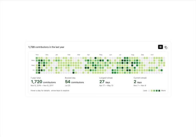
GitHub Contribution Graph 3D Heatmap
1.8K
Morph Gallery
1.5K
Halftone Wordmark Footer
1.4K
Hanging Polaroid Image Carousel
862
Glass Cards
739
Tiger Tear Reveal
663
Particle Animation
653
More in Footers
View all

Footer 7
569
Footer section
1.9K
Large Name Footer
196
Footer
447
Footer column
267

Footer 2
207
Stacked Circular Footer
423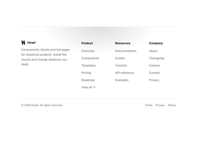
Rounded Top Footer
43


