
About
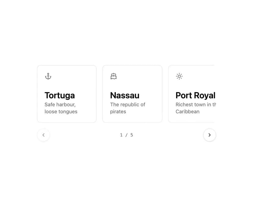
A swipeable, keyboard-accessible slideshow built on native CSS scroll-snap, with previous/next buttons, dot indicators, and an optional coverflow effect.
Built with React and Tailwind. Copy the prompt and paste it into Claude Code, Cursor or Lovable: your agent adds Carousel to your project and fits it to your theme.
Code
How Carousel is used: the demo's code. The component's own source comes with a free account.
Usage.tsx
"use client";

import {
  Carousel,
  CarouselContent,
  CarouselItem,
  CarouselNext,
  CarouselPrevious,
  useCarousel,
} from "@/components/ui/carousel";
import {
  AnchorIcon,
  ShipIcon,
  SunIcon,
  CompassIcon,
  WavesIcon,
} from "lucide-react";

const ports = [
  { icon: AnchorIcon, name: "Tortuga", caption: "Safe harbour, loose tongues" },
  { icon: ShipIcon, name: "Nassau", caption: "The republic of pirates" },
  {
    icon: SunIcon,
    name: "Port Royal",
    caption: "Richest town in the Caribbean",
  },
  { icon: CompassIcon, name: "Havana", caption: "Treasure fleet anchorage" },
  { icon: WavesIcon, name: "Cartagena", caption: "Walls worth avoiding" },
];

function SlideCounter() {
  const { index, count } = useCarousel();
  return (
    <p
      aria-hidden="true"
      className="font-mono text-xs text-muted-foreground tabular-nums"
    >
      {index + 1} / {count}
    </p>
  );
}

export default function CarouselDemo() {
  return (
    <div className="w-full max-w-xl p-6 md:p-10">
      <Carousel aria-label="Ports of call">
        <CarouselContent trackClassName="gap-4">
          {ports.map((port) => (
            <CarouselItem
              key={port.name}
              className="basis-4/5 sm:basis-1/2 lg:basis-1/3"
            >
              <div className="grid h-40 content-between rounded-lg border bg-card p-5 text-card-foreground">
                <port.icon
                  aria-hidden="true"
                  className="size-5 text-muted-foreground"
                />
                <div>
                  <p className="text-2xl font-semibold">{port.name}</p>
                  <p className="text-sm text-muted-foreground">
                    {port.caption}
                  </p>
                </div>
              </div>
            </CarouselItem>
          ))}
        </CarouselContent>
        <div className="mt-4 flex items-center justify-between">
          <CarouselPrevious />
          <SlideCounter />
          <CarouselNext />
        </div>
      </Carousel>
    </div>
  );
}
Dependencies
More by kevingirelli
View all
Aurora
54
Warp Gradient
48
FAQ Section
46
QR Code
46
Wave Text
37
Corner Frame
36
Animated Border
32
Spotlight
23
More in Cards
View all

Statistics Card 2
263
Stats cards with links
39
Card
70

Course Design Cards
1.1K
The Item one
3

Card Studio
7
Statistics Card 7
290

Item
10
