
About
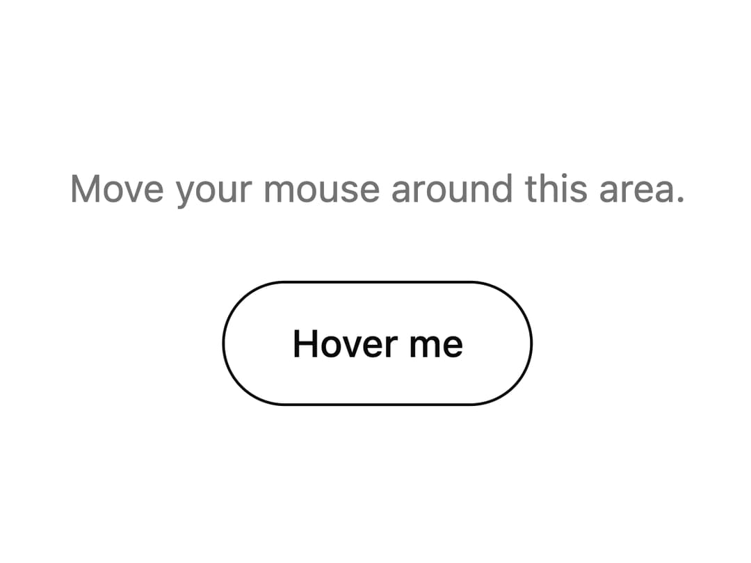
A replacement mouse cursor made of a trailing ring and a dot that grows over links and buttons and can show a label over elements marked data-cursor, falling back to the system cursor on touch devices and reduced-motion.
Built with React and Tailwind. Copy the prompt and paste it into Claude Code, Cursor or Lovable: your agent adds Custom Cursor to your project and fits it to your theme.
Code
How Custom Cursor is used: the demo's code. The component's own source comes with a free account.
Usage.tsx
import { CustomCursor } from "@/components/ui/custom-cursor";

export default function CustomCursorDemo() {
  return (
    <div className="relative flex h-screen w-full flex-col items-center justify-center gap-6 bg-background text-foreground">
      <CustomCursor labels={{ view: "View" }} />
      <p className="text-sm text-muted-foreground">
        Move your mouse around this area.
      </p>
      <a
        href="#"
        data-cursor="view"
        className="rounded-full border border-current px-6 py-3 text-sm font-medium"
      >
        Hover me
      </a>
    </div>
  );
}
More by kevingirelli
View all
Aurora
50
Warp Gradient
48
QR Code
45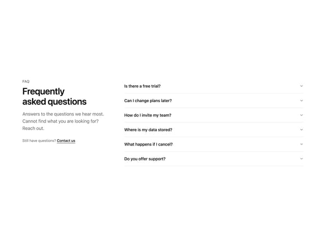
FAQ Section
44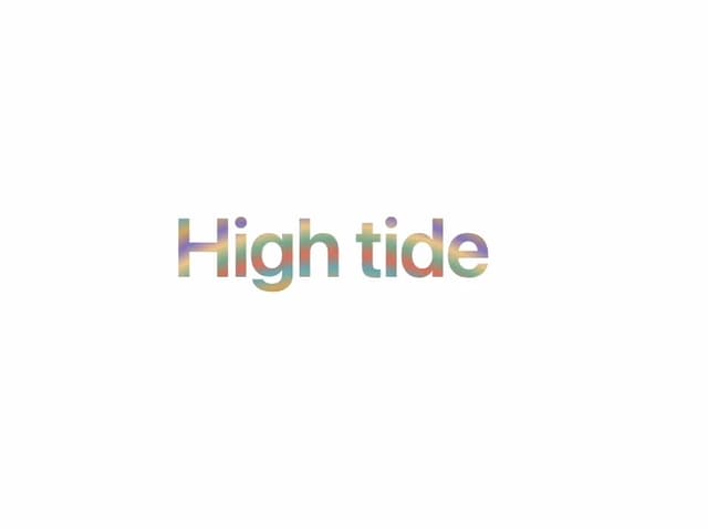
Wave Text
37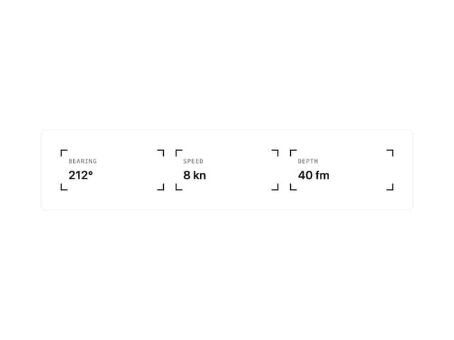
Corner Frame
35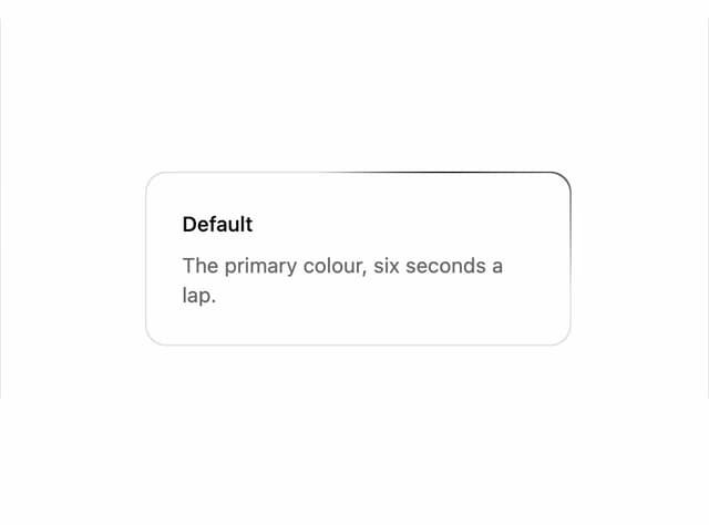
Animated Border
32
Spotlight
23