
About
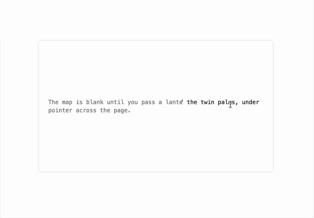
A content panel that reveals a second layer through a soft circle that follows the pointer, like a photo under a sketch or an answer hidden under a question.
Built with React and Tailwind. Copy the prompt and paste it into Claude Code, Cursor or Lovable: your agent adds Hover Reveal to your project and fits it to your theme.
Code
How Hover Reveal is used: the demo's code. The component's own source comes with a free account.
Usage.tsx
import { HoverReveal } from "@/components/ui/hover-reveal";

export default function HoverRevealDemo() {
  return (
    <div className="flex min-h-[420px] w-full items-center justify-center p-10">
      <HoverReveal
        radius={120}
        softness={0}
        className="flex aspect-video w-full max-w-xl items-center rounded-lg border bg-card p-6"
        revealClassName="grid place-items-center bg-background p-6 text-center"
        reveal={
          <p className="font-mono text-sm text-foreground">
            X marks the spot: forty paces north of the twin palms, under the
            flat rock.
          </p>
        }
      >
        <p className="font-mono text-sm text-muted-foreground">
          The map is blank until you pass a lantern over it. Move the pointer
          across the page.
        </p>
      </HoverReveal>
    </div>
  );
}
More by kevingirelli
View all
Aurora
54
Warp Gradient
48
QR Code
47
FAQ Section
46
Wave Text
37
Corner Frame
36
Animated Border
32
Spotlight
23