
About
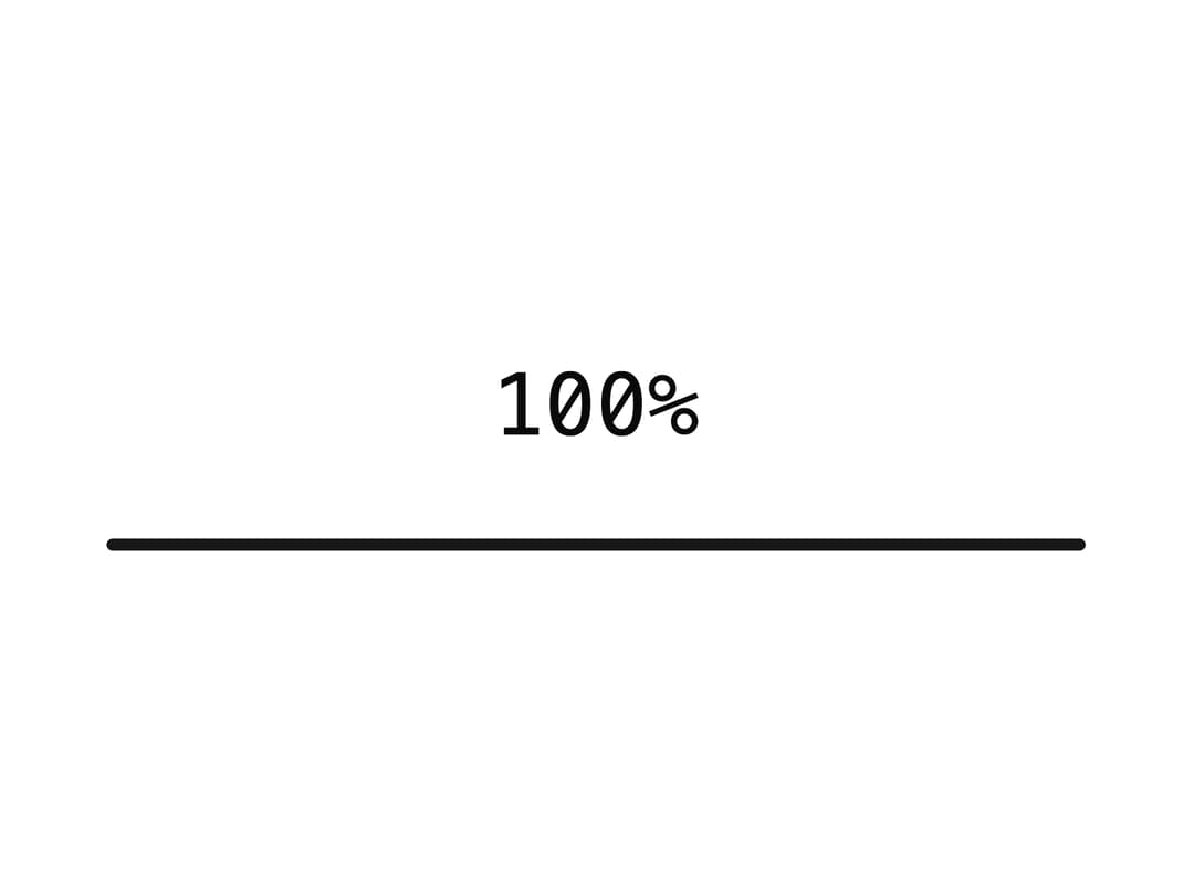
A full-screen loading overlay that counts progress from 0 to 100, waits for data to be ready, then fades out and unmounts itself.
Built with React and Tailwind. Copy the prompt and paste it into Claude Code, Cursor or Lovable: your agent adds Preloader to your project and fits it to your theme.
Code
How Preloader is used: the demo's code. The component's own source comes with a free account.
Usage.tsx
"use client";

import { Preloader, PreloaderBar } from "@/components/ui/preloader";

export default function PreloaderDemo() {
  return (
    <Preloader>
      {(progress) => (
        <div className="grid gap-3 text-center">
          <span className="font-mono text-sm tabular-nums">{progress}%</span>
          <PreloaderBar />
        </div>
      )}
    </Preloader>
  );
}
More by kevingirelli
View all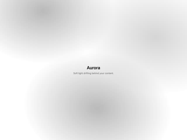
Aurora
54
Warp Gradient
48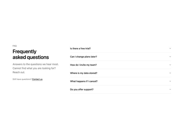
FAQ Section
46
QR Code
46
Wave Text
37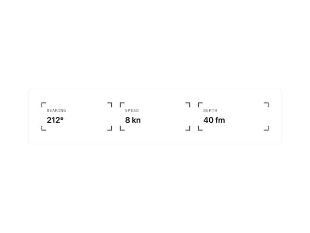
Corner Frame
36
Animated Border
32
Spotlight
23