
About
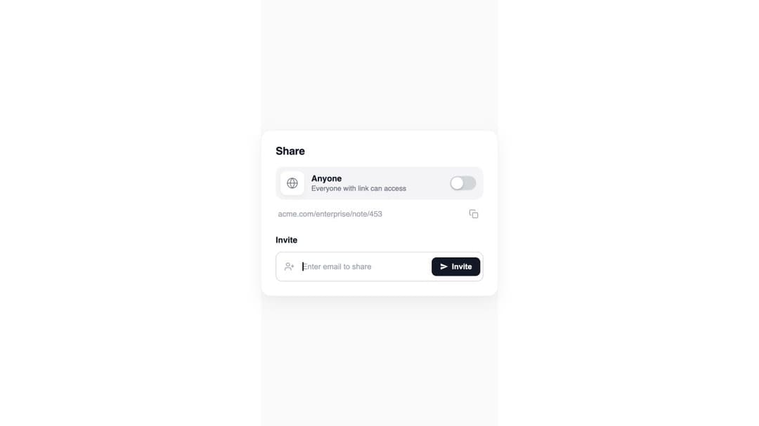
A white share card with a public/private toggle, animated invite panel, multi-email token input, and expanding shared-users list.
Built with React and Tailwind. Copy the prompt and paste it into Claude Code, Cursor or Lovable: your agent adds Expandable Share Card to your project and fits it to your theme.
Code
How Expandable Share Card is used: the demo's code. The component's own source comes with a free account.
Usage.tsx
"use client"

import Component from "@/components/ui/cue-expandable-share-card"

export default function Demo() {
  return <Component />
}
More by David Hakobyan
View all

Futuristic Hero
2.7K
Hero ASCII one
1.4K
Hero ASCII
1.4K
Admit One Ticket
1.1K
Border Beam
1K
Navigation Menu
962
Border Beam Search
644
Thinking Orbs
479
More in Cards
View all
Stats cards with links
94

Card
71
Statistics Card 7
316

Course Design Cards
1.2K

Interactive Tech Stack Bento Grid with Hover Effects
503
Statistics Card 2
296

Card Studio
14

Card
18
