About
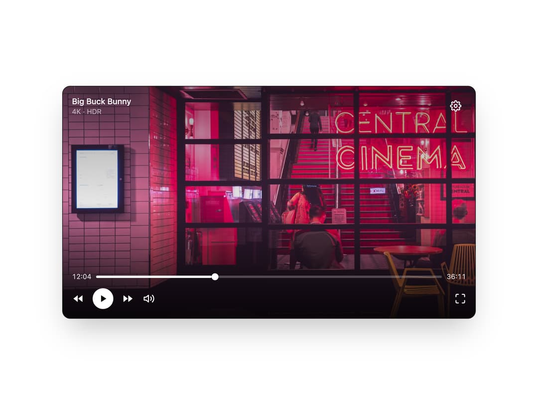
Composable structural containers for building a video player UI — a media frame plus overlay and top/bottom control layers with proper pointer-event layering.
Built with React and Tailwind. Copy the prompt and paste it into Claude Code, Cursor or Lovable: your agent adds Player Layout to your project and fits it to your theme.
Code
How Player Layout is used: the demo's code. The component's own source comes with a free account.
Usage.tsx
"use client"

import {
  ControlsBottomContainer,
  ControlsContainer,
  ControlsOverlayContainer,
  ControlsTopContainer,
  PlayerContainer,
} from "@/components/ui/player-layout"

export default function PlayerLayoutDemo() {
  return (
    <div className="w-full max-w-3xl p-6">
      <PlayerContainer
        className="rounded-xl border border-white/10 bg-black shadow-2xl"
        style={{ ["--aspect-ratio" as string]: "16/9" }}
      >
        {/* Media element */}
        <img
          src="https://cdn.21st.dev/assets/mirror/55/55a65903b12183b46b19b502778c78cd7f49d6dae7309fff54c0b61716e33f72.jpg"
          alt="Now playing"
          className="size-full object-cover"
        />

        {/* Gradient overlay for control legibility */}
        <ControlsOverlayContainer className="bg-gradient-to-t from-black/85 via-black/10 to-black/40" />

        {/* Control layers */}
        <ControlsContainer className="text-white">
          <ControlsTopContainer className="flex items-start justify-between p-4">
            <div>
              <p className="text-sm font-medium">Big Buck Bunny</p>
              <p className="text-xs text-white/60">4K · HDR</p>
            </div>
            <button className="rounded-md p-2 transition-colors hover:bg-white/10">
              <svg viewBox="0 0 24 24" fill="none" stroke="currentColor" strokeWidth="2" strokeLinecap="round" strokeLinejoin="round" className="size-5"><circle cx="12" cy="12" r="3" /><path d="M19.4 15a1.65 1.65 0 0 0 .33 1.82l.06.06a2 2 0 1 1-2.83 2.83l-.06-.06a1.65 1.65 0 0 0-1.82-.33 1.65 1.65 0 0 0-1 1.51V21a2 2 0 0 1-4 0v-.09A1.65 1.65 0 0 0 9 19.4a1.65 1.65 0 0 0-1.82.33l-.06.06a2 2 0 1 1-2.83-2.83l.06-.06a1.65 1.65 0 0 0 .33-1.82 1.65 1.65 0 0 0-1.51-1H3a2 2 0 0 1 0-4h.09A1.65 1.65 0 0 0 4.6 9a1.65 1.65 0 0 0-.33-1.82l-.06-.06a2 2 0 1 1 2.83-2.83l.06.06a1.65 1.65 0 0 0 1.82.33H9a1.65 1.65 0 0 0 1-1.51V3a2 2 0 0 1 4 0v.09a1.65 1.65 0 0 0 1 1.51 1.65 1.65 0 0 0 1.82-.33l.06-.06a2 2 0 1 1 2.83 2.83l-.06.06a1.65 1.65 0 0 0-.33 1.82V9a1.65 1.65 0 0 0 1.51 1H21a2 2 0 0 1 0 4h-.09a1.65 1.65 0 0 0-1.51 1z" /></svg>
            </button>
          </ControlsTopContainer>

          <ControlsBottomContainer className="mt-auto flex flex-col gap-3 p-4">
            <div className="flex items-center gap-2 text-xs tabular-nums text-white/80">
              <span>12:04</span>
              <div className="relative h-1 flex-1 rounded-full bg-white/25">
                <div className="absolute inset-y-0 left-0 w-1/3 rounded-full bg-white" />
                <div className="absolute left-1/3 top-1/2 size-3 -translate-y-1/2 rounded-full bg-white shadow" />
              </div>
              <span>36:11</span>
            </div>
            <div className="flex items-center gap-4">
              <button className="transition-colors hover:text-white/70">
                <svg viewBox="0 0 24 24" fill="currentColor" className="size-5"><path d="M11 5 6 9H2v6h4l5 4V5zM6.5 12l4.5 3.6V8.4L6.5 12z" opacity="0" /><path d="M12 5v14l-9-7 9-7zM22 5v14l-9-7 9-7z" /></svg>
              </button>
              <button className="rounded-full bg-white p-2 text-black transition-transform hover:scale-105">
                <svg viewBox="0 0 24 24" fill="currentColor" className="size-5"><path d="M8 5v14l11-7L8 5z" /></svg>
              </button>
              <button className="transition-colors hover:text-white/70">
                <svg viewBox="0 0 24 24" fill="currentColor" className="size-5"><path d="M12 5v14l9-7-9-7zM2 5v14l9-7-9-7z" /></svg>
              </button>
              <button className="transition-colors hover:text-white/70">
                <svg viewBox="0 0 24 24" fill="none" stroke="currentColor" strokeWidth="2" strokeLinecap="round" strokeLinejoin="round" className="size-5"><polygon points="11 5 6 9 2 9 2 15 6 15 11 19 11 5" /><path d="M15.54 8.46a5 5 0 0 1 0 7.07" /><path d="M19.07 4.93a10 10 0 0 1 0 14.14" /></svg>
              </button>
              <button className="ml-auto transition-colors hover:text-white/70">
                <svg viewBox="0 0 24 24" fill="none" stroke="currentColor" strokeWidth="2" strokeLinecap="round" strokeLinejoin="round" className="size-5"><path d="M8 3H5a2 2 0 0 0-2 2v3M21 8V5a2 2 0 0 0-2-2h-3M3 16v3a2 2 0 0 0 2 2h3M16 21h3a2 2 0 0 0 2-2v-3" /></svg>
              </button>
            </div>
          </ControlsBottomContainer>
        </ControlsContainer>
      </PlayerContainer>
    </div>
  )
}
More by limeplay
View all

Media Provider