
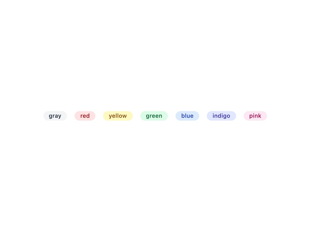
About
A small list of colored pill-style badges (e.g. tags, labels, statuses) rendered from an array of strings, with configurable size and color.
Built with React and Tailwind. Copy the prompt and paste it into Claude Code, Cursor or Lovable: your agent adds Badges to your project and fits it to your theme.
Code
How Badges is used: the demo's code. The component's own source comes with a free account.
Usage.tsx
import {
  Badges,
  badgeColoring,
  type BadgeColoring,
} from "@/components/ui/badges";

export default function BadgeColorsDemo() {
  const colors = Object.keys(badgeColoring) as BadgeColoring[];
  return (
    <div className="flex items-center justify-center min-h-[200px] bg-background p-8">
      <ul className="text-xs flex gap-x-4 gap-y-2 flex-wrap">
        {colors.map((color) => (
          <li key={color} className="flex flex-col items-center gap-1">
            <Badges list={[color]} coloring={color} />
          </li>
        ))}
      </ul>
    </div>
  );
}
Dependencies
More by lipa88-mk
View all
Button
1
Checkbox
Select