
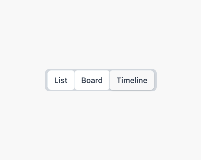
About
A pill-shaped single-choice toggle group for switching between a small set of views or filters, like a tab bar styled as connected buttons.
Built with React and Tailwind. Copy the prompt and paste it into Claude Code, Cursor or Lovable: your agent adds Segmented Control to your project and fits it to your theme.
Code
How Segmented Control is used: the demo's code. The component's own source comes with a free account.
Usage.tsx
"use client";

import * as React from "react";
import { SegmentedControl } from "@/components/ui/segmented-control";

export default function SegmentedControlDemo() {
  const [value, setValue] = React.useState("list");

  return (
    <div className="flex items-center justify-center">
      <SegmentedControl
        items={[
          { value: "list", label: "List" },
          { value: "board", label: "Board" },
          { value: "timeline", label: "Timeline" },
        ]}
        value={value}
        onValueChange={setValue}
      />
    </div>
  );
}
More by Mahmoud Ilyan
View all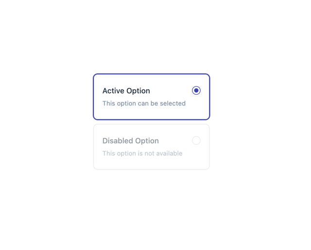
Radio Card
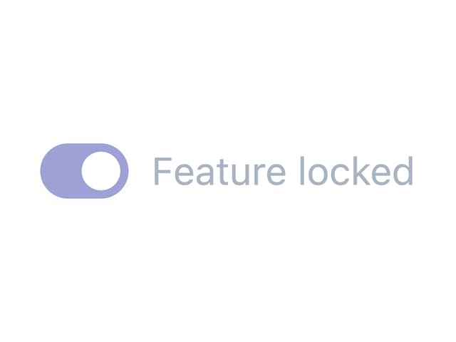
Switch
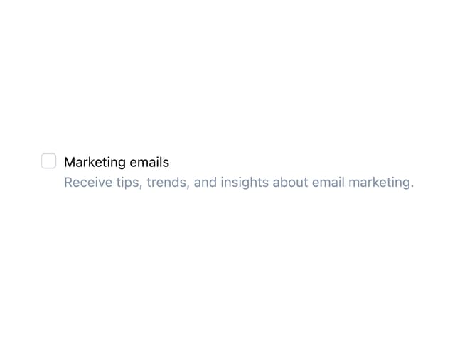
Checkbox
Avatar