
About
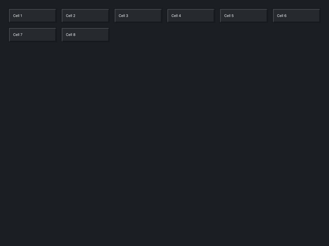
A two-dimensional layout grid that arranges children into a fixed number of equal columns or auto-fills columns to a minimum item width, collapsing to one column on mobile.
Built with React and Tailwind. Copy the prompt and paste it into Claude Code, Cursor or Lovable: your agent adds Block Grid to your project and fits it to your theme.
Code
How Block Grid is used: the demo's code. The component's own source comes with a free account.
Usage.tsx
import BlockGrid from "@/components/ui/block-grid";
import BlockPanel from "@/components/ui/block-grid-utils/BlockPanel";

const cells = (count: number) =>
  Array.from({ length: count }, (_, i) => (
    <BlockPanel key={i} variant="plain">
      Cell {i + 1}
    </BlockPanel>
  ));

export default function BlockGridAutoFillDemo() {
  return (
    <div className="block-ui-root w-full h-screen p-8 overflow-auto">
      <BlockGrid minItemWidth="180px">{cells(8)}</BlockGrid>
    </div>
  );
}
More by malilion
View all
Points Bar
Block Slider