
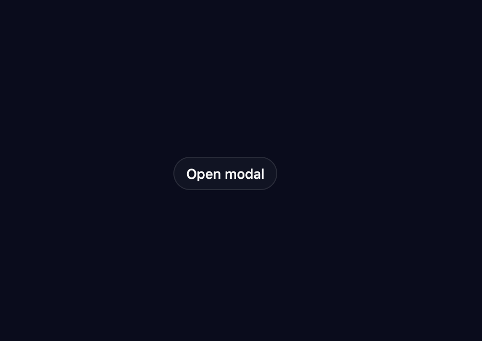
About
A self-contained modal dialog with a scale-and-fade open/close animation, built-in focus trap, and Escape-to-close behavior.
Built with React and Tailwind. Copy the prompt and paste it into Claude Code, Cursor or Lovable: your agent adds Modal Transition to your project and fits it to your theme.
Code
How Modal Transition is used: the demo's code. The component's own source comes with a free account.
Usage.tsx
"use client";

import * as React from "react";

import { ModalTransition } from "@/components/ui/modal-transition";

export default function ModalTransitionDemo() {
  return (
    <div className="flex min-h-[400px] w-full items-center justify-center bg-background">
      <ModalTransition triggerLabel="Open modal" dialogLabel="Delete file">
        <div className="flex flex-col gap-2">
          <h2 className="text-sm font-semibold text-foreground">
            Delete file?
          </h2>
          <p className="text-sm text-muted-foreground">
            This action cannot be undone. This will permanently delete the file.
          </p>
        </div>
      </ModalTransition>
    </div>
  );
}
More by Marvin Kaunda
View all
Card Resize Toggle
4
Rating
Steps

Page Slide Transition