
About
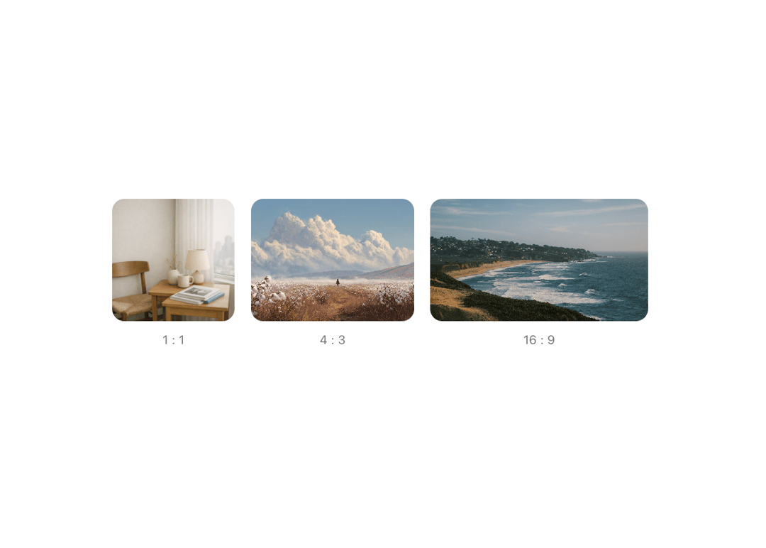
Maintains a fixed width-to-height ratio for its children, regardless of screen size, from Meta's Astryx design system. Use it for media containers like videos, images, thumbnails, or any content that needs consistent proportions. Supports rectangle and ellipse shapes.
Built with React and Tailwind. Copy the prompt and paste it into Claude Code, Cursor or Lovable: your agent adds Astryx Aspect Ratio to your project and fits it to your theme.
Code
How Astryx Aspect Ratio is used: the demo's code. The component's own source comes with a free account.
Usage.tsx
'use client';

import AspectRatio from '@/components/ui/astryx-aspect-ratio';
import {Theme} from '@astryxdesign/core/theme';
import {neutralTheme} from '@astryxdesign/theme-neutral/built';
import {HStack, VStack} from '@astryxdesign/core/Layout';
import {Text} from '@astryxdesign/core/Text';

const items = [
  {
    ratio: 1,
    label: '1 : 1',
    src: 'https://cdn.21st.dev/assets/mirror/24/240616dec5a90cf5d6e4218bf6c3b103d680736b5ecce4a1b25da039a3f53bc1.png',
    alt: '1:1 square',
  },
  {
    ratio: 4 / 3,
    label: '4 : 3',
    src: 'https://cdn.21st.dev/assets/mirror/a3/a3f38b29799899b3017fe3bb0ad962187c5e1038181a9c708c7e8018d20b73bf.png',
    alt: '4:3 standard',
  },
  {
    ratio: 16 / 9,
    label: '16 : 9',
    src: 'https://cdn.21st.dev/assets/mirror/38/387ca9dada3bc020ee335bfae84c266dbb6b2340279c5c3db15d484d7b72c83f.png',
    alt: '16:9 widescreen',
  },
];

export default function AspectRatioShowcase() {
  return (
    <Theme theme={neutralTheme}>
      <div
        style={{
          minHeight: '100dvh',
          display: 'grid',
          placeItems: 'center',
          padding: 24,
        }}>
        <HStack gap={4} vAlign="start">
          {items.map(({ratio, label, src, alt}) => (
            <VStack key={label} gap={2} hAlign="center">
              <AspectRatio
                ratio={ratio}
                style={{
                  height: 120,
                  width: 'auto',
                  borderRadius: 'var(--radius-container)',
                }}>
                <img
                  src={src}
                  alt={alt}
                  style={{width: '100%', height: '100%', objectFit: 'cover'}}
                />
              </AspectRatio>
              <Text type="supporting" color="secondary">
                {label}
              </Text>
            </VStack>
          ))}
        </HStack>
      </div>
    </Theme>
  );
}
Dependencies
More by Meta
View all

Astryx Banner
59
Astryx Avatar
30
Astryx Badge
29
Astryx Button Group
27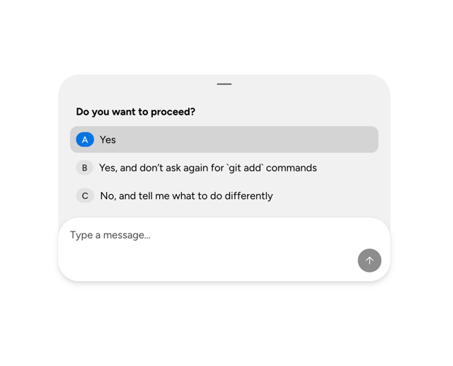
Astryx Chat Composer Drawer
20
Astryx Toggle Button
17
Astryx Avatar Group
9
Astryx Button
6
More in Galleries
View all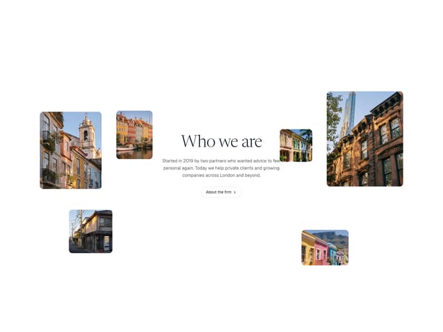

Scattered About
19

Animated Gallery
1.5K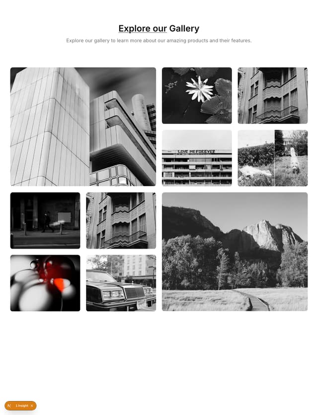

Gallery Component
5
Photo Deck
7
Editorial Collage Hero
507

Elastic Gallery
1.1K
Folded Card
42

Image Gallery
130
