
About
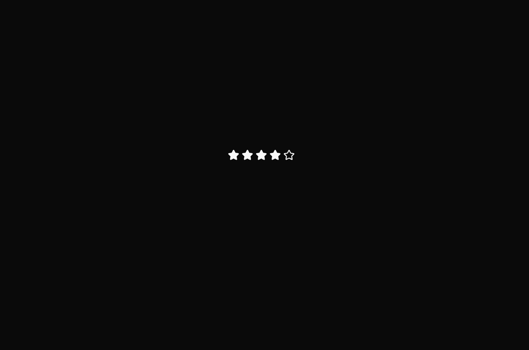
An interactive star rating component with configurable scale, sizes (sm/md/lg), and readonly mode. Users can click stars to set ratings with smooth hover animations and visual feedback.
Built with React and Tailwind. Copy the prompt and paste it into Claude Code, Cursor or Lovable: your agent adds Star Rating to your project and fits it to your theme.
Code
How Star Rating is used: the demo's code. The component's own source comes with a free account.
Usage.tsx
// TODO: Add code


import { StarRating } from "@/components/ui/star-rating";

export default function DemoOne() {
  return <StarRating ratingScale={5} value={4} readonly />;
}
Dependencies
More by Rushil Dhinoja
View all

Morphing Square
465
Voice Input
338
Warp Dialog
278
Orbital Loader
214
Vignette Grid Background
212
Bouncing Dots
199
Wave Loader
134
Discussion
85