
About
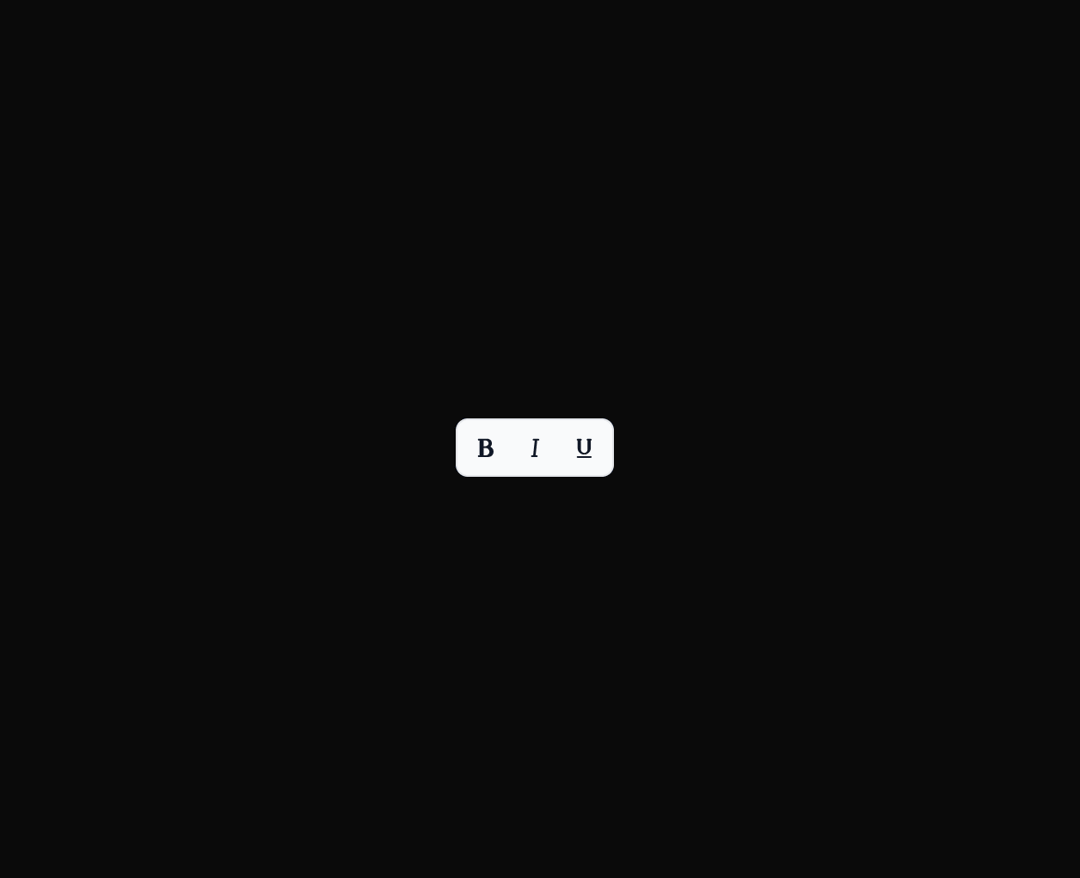
Here is Tooltip component
Built with React and Tailwind. Copy the prompt and paste it into Claude Code, Cursor or Lovable: your agent adds Tooltip to your project and fits it to your theme.
Code
How Tooltip is used: the demo's code. The component's own source comes with a free account.
Usage.tsx
import ExampleTooltip  from "@/components/ui/tooltip-1";

export default function DemoOne() {
  return <ExampleTooltip />;
}
Dependencies
More by MUI
View all
Preview Card
44
Toast
43
Scroll Area
35
Select
30
Accordion
27
Number Field
27
Popover
24
Context Menu
15

More in Buttons
View all
Button
10

Button
1

Eclipse Button
3
Native Button
12
Texture Button
101

App Store Button
472

HeroUI Button Group
1

Button Group
3


