
About
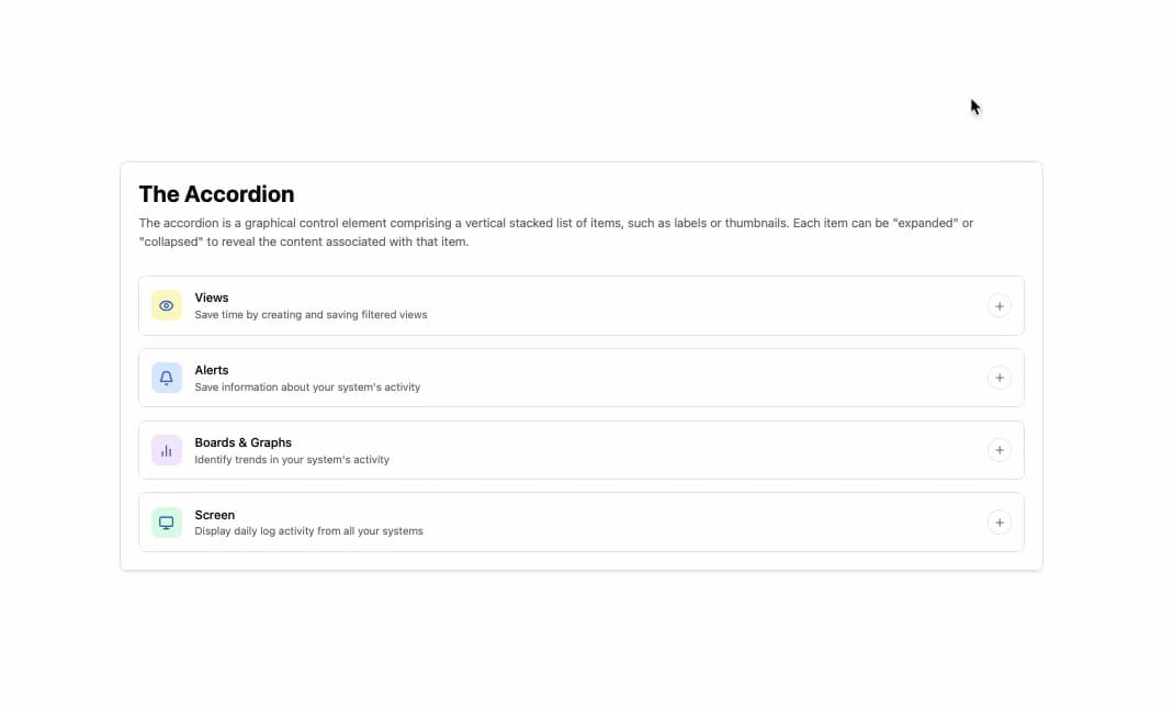
An accordion component with icons, titles, and descriptions for each section. Ideal for organizing content, features, or settings into collapsible panels, making information easy to browse and interact with.
Built with React and Tailwind. Copy the prompt and paste it into Claude Code, Cursor or Lovable: your agent adds Icon Accordion to your project and fits it to your theme.
Code
How Icon Accordion is used: the demo's code. The component's own source comes with a free account.
Usage.tsx
import { AccordionComponent } from "@/components/ui/icon-accordion";

export default function DemoOne() {
  return <AccordionComponent />;
}
Dependencies
More by nextjs shop
View all
Nextjsshop Button
122
Arrow Dots Button
96
Pixel Broke Button
83
Animated Arrow Button
71
Sneaky Button
68
Pixel Button
28
Tags Breadcrumb
9
More in Cards
View all

Course Design Cards
1.3K
Stats cards with links
37

Statistics Card 2
302

Interactive Tech Stack Bento Grid with Hover Effects
594

Card Studio
14
Statistics Card 7
324
Statistics Card 10
293
The Item one
3
