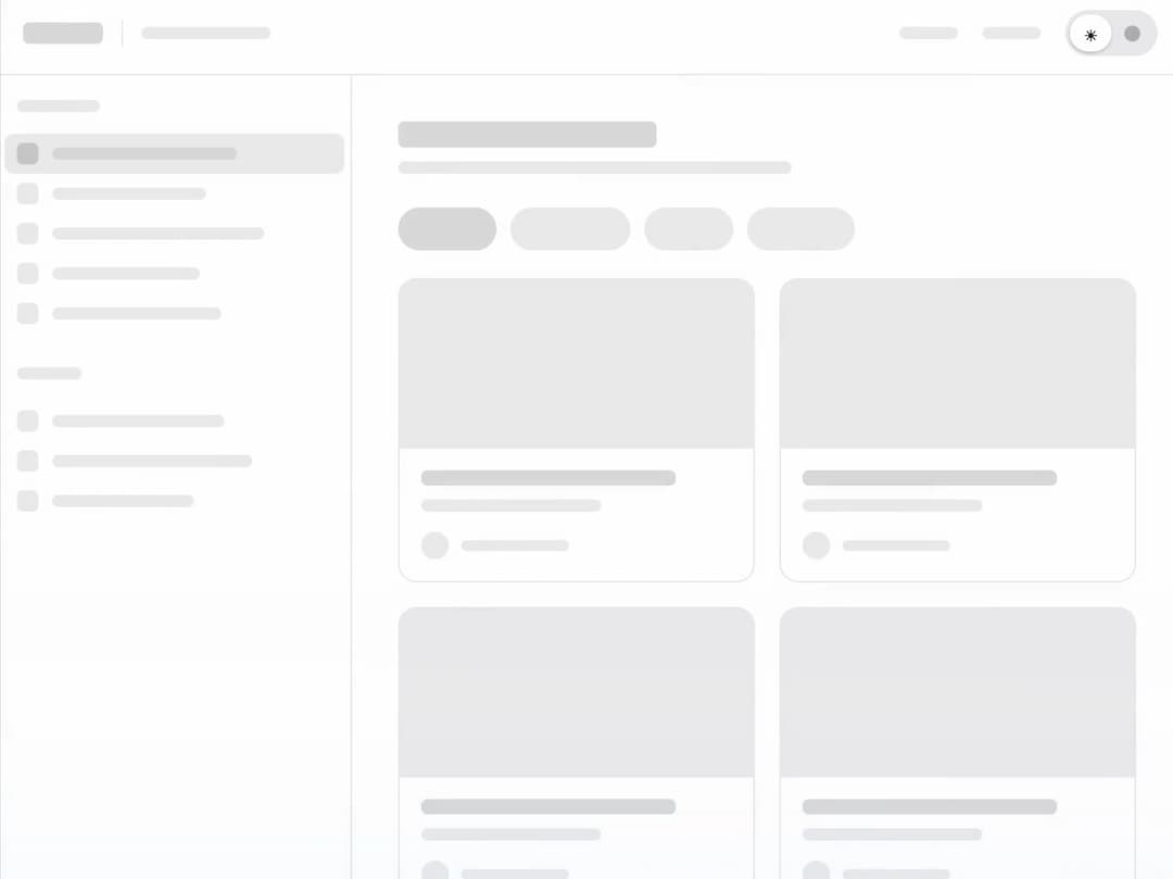
About
A faithful Glimm theme toggle that sweeps a complete dashboard between light and dark appearances.
Built with React and Tailwind. Copy the prompt and paste it into Claude Code, Cursor or Lovable: your agent adds Glimm Theme to your project and fits it to your theme.
Code
How Glimm Theme is used: the demo's code. The component's own source comes with a free account.
Usage.tsx
import GlimmTheme from "@/components/ui/glimm-theme"

export default function Demo() { return <GlimmTheme /> }
Dependencies
More by nomanjack
View all

Glimm Autopilot
7
Glimm Transition
7
Glimm Publish
5
Glimm To-dos
3
Glimm Usage Reset
2
Glimm HTML-in-Canvas
2
Glimm Upgrade to Pro

Glimm Invoice Paid