
About
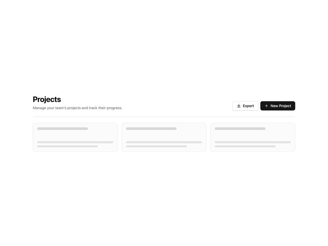
An application page header with a title, description, and action buttons above a content grid.
Built with React and Tailwind. Copy the prompt and paste it into Claude Code, Cursor or Lovable: your agent adds Page Header to your project and fits it to your theme.
Code
How Page Header is used: the demo's code. The component's own source comes with a free account.
Usage.tsx
import PageHeaderBlock from "@/components/ui/page-header-1";

export default function Default() {
  return <PageHeaderBlock />;
}
Dependencies
More by Oliver
View all
Dismissible Alert Stack
398
Us vs Them Comparison
350
Feature Comparison Table
260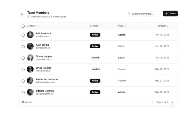
Team Members Data Table
218
How It Works Timeline
211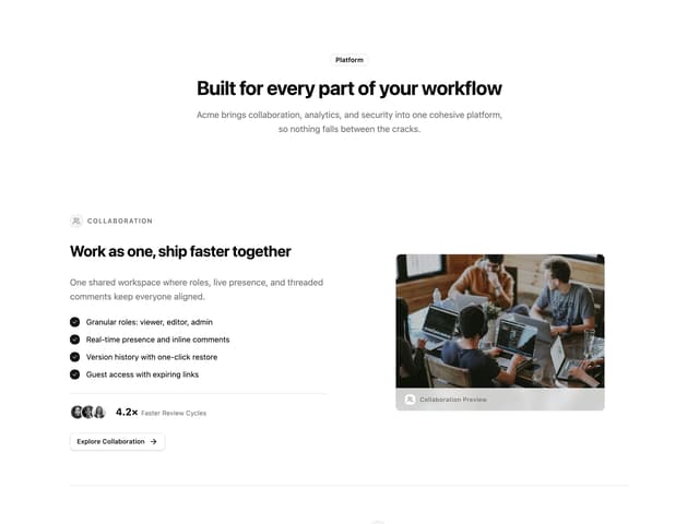
Alternating Rows With Stats
107
Logo Cloud Marquee
105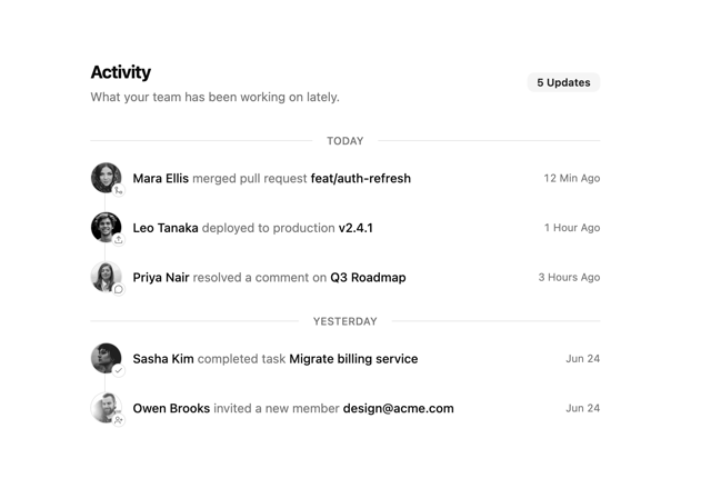
Activity Timeline
88
More in Dashboards
View all
Dashboard with Collapsible Sidebar
2.5K

Sidebar
332

SaaS Template
2.6K

Card
229
Stats Bento
1.2K

Course Design Cards
1.2K

Invoice History Table
82

Data Grid Table
15

