
About
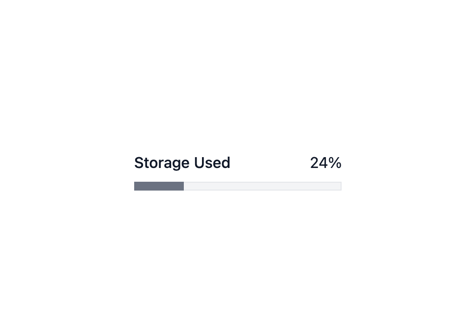
Here is Progress component
Built with React and Tailwind. Copy the prompt and paste it into Claude Code, Cursor or Lovable: your agent adds Progress to your project and fits it to your theme.
Code
How Progress is used: the demo's code. The component's own source comes with a free account.
Usage.tsx
import * as React from 'react';
import { Meter } from '@base-ui-components/react/meter';

export default function ExampleMeter() {
  return (
    <Meter.Root className="box-border grid w-48 grid-cols-2 gap-y-2" value={24}>
      <Meter.Label className="text-sm font-medium text-gray-900">
        Storage Used
      </Meter.Label>
      <Meter.Value className="col-start-2 m-0 text-right text-sm leading-5 text-gray-900" />
      <Meter.Track className="col-span-2 block h-2 w-48 overflow-hidden bg-gray-100 shadow-[inset_0_0_0_1px] shadow-gray-200">
        <Meter.Indicator className="block bg-gray-500 transition-all duration-500" />
      </Meter.Track>
    </Meter.Root>
  );
}
Dependencies
More by MUI
View all
Toast
41
Preview Card
40
Scroll Area
34
Select
29
Number Field
27
Popover
24
Accordion
23
Navigation Menu
15
