
About
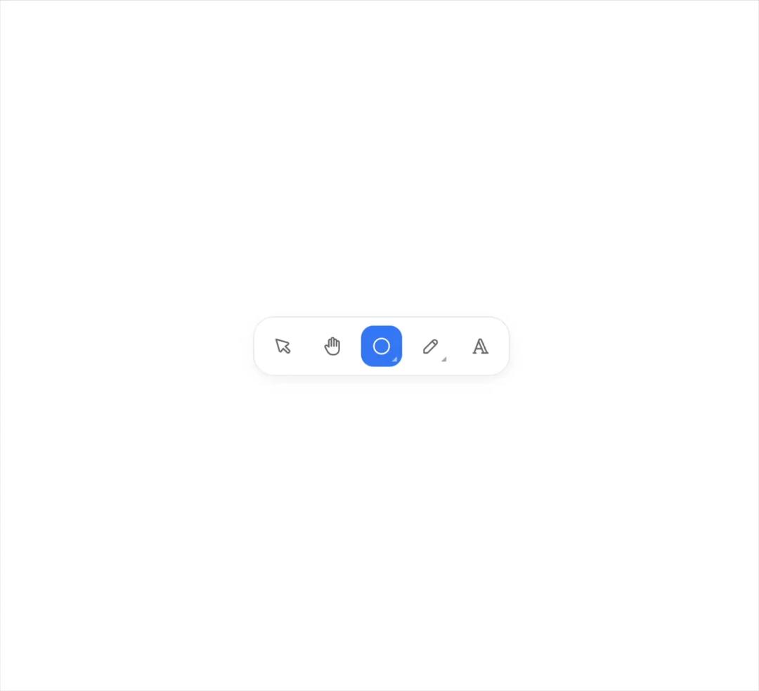
An icon button that unfolds into a tray of tools, pushing its neighbours aside, and folds back into the tool you pick. Free component from uibrik (uibrik.com).
Built with React and Tailwind. Copy the prompt and paste it into Claude Code, Cursor or Lovable: your agent adds Fold Toolbar to your project and fits it to your theme.
Code
How Fold Toolbar is used: the demo's code. The component's own source comes with a free account.
Usage.tsx
"use client";

import { useEffect, useState, type ReactNode } from "react";
import {
  IconArrowUpRight,
  IconCircle,
  IconEraser,
  IconHandStop,
  IconHighlight,
  IconPencil,
  IconPointer,
  IconSquare,
  IconStar,
  IconTriangle,
  IconTypography,
} from "@tabler/icons-react";
import { FoldToolbar } from "@/components/ui/fold-toolbar";
import { cn } from "@/lib/utils";

const SHAPES = [
  { value: "square", label: "Rectangle", icon: <IconSquare stroke={1.75} /> },
  { value: "circle", label: "Ellipse", icon: <IconCircle stroke={1.75} /> },
  { value: "triangle", label: "Triangle", icon: <IconTriangle stroke={1.75} /> },
  { value: "star", label: "Star", icon: <IconStar stroke={1.75} /> },
  { value: "arrow", label: "Arrow", icon: <IconArrowUpRight stroke={1.75} /> },
];

const PENS = [
  { value: "pen", label: "Pen", icon: <IconPencil stroke={1.75} /> },
  { value: "highlighter", label: "Highlighter", icon: <IconHighlight stroke={1.75} /> },
  { value: "eraser", label: "Eraser", icon: <IconEraser stroke={1.75} /> },
];

const direction = "right" as "right" | "left" | "up" | "down";
const props = { size: 40, radius: 12, duration: 0.35, accent: "#3b82f6", closeOnSelect: true };

export default function Demo() {
  // A horizontal bar doesn't fit an unfolded tray on a phone, so it stands up there.
  const [narrow, setNarrow] = useState(false);
  useEffect(() => {
    const mq = window.matchMedia("(max-width: 480px)");
    const sync = () => setNarrow(mq.matches);
    sync();
    mq.addEventListener("change", sync);
    return () => mq.removeEventListener("change", sync);
  }, []);
  const dir = narrow ? (direction === "up" || direction === "left" ? "up" : "down") : direction;
  const vertical = dir === "up" || dir === "down";

  // One tray open at a time.
  const [open, setOpen] = useState<string | null>(null);
  // One tool in use across the whole bar; picking from a tray makes that tray the active one.
  const [active, setActive] = useState("select");
  const tray = (name: string) => ({
    open: open === name,
    onOpenChange: (o: boolean) => setOpen(o ? name : null),
    active: active === name,
    onPick: () => setActive(name),
  });

  const plain = (name: string, label: string, icon: ReactNode) => {
    const on = active === name;
    return (
      <button
        type="button"
        aria-label={label}
        aria-pressed={on}
        title={label}
        onClick={() => setActive(name)}
        className={cn(
          // Fill clipped 2px in, so it matches the fold buttons' fill exactly.
          "grid shrink-0 cursor-pointer place-items-center bg-clip-content p-0.5 outline-none transition-colors focus-visible:ring-2 focus-visible:ring-inset focus-visible:ring-neutral-400 [&_svg]:size-5",
          on
            ? props.accent
              ? "text-white"
              : "bg-black/[0.09] text-foreground dark:bg-white/[0.14]"
            : "text-muted-foreground hover:bg-black/[0.045] hover:text-foreground dark:hover:bg-white/[0.07]",
        )}
        style={{ width: props.size + 4, height: props.size + 4, borderRadius: props.radius + 2, backgroundColor: on && props.accent ? props.accent : undefined }}
      >
        {icon}
      </button>
    );
  };

  return (
    <div className="flex h-screen w-full items-center justify-center px-4">
      <div
        className={cn(
          // A flat surface a step off the canvas in both themes.
          "flex items-center gap-1 border border-black/[0.08] bg-white p-1.5 shadow-[0_4px_16px_-4px_rgb(0_0_0/0.08)]",
          "dark:border-white/[0.08] dark:bg-neutral-900 dark:shadow-none",
          vertical ? "flex-col" : "flex-row",
        )}
        style={{ borderRadius: props.radius + 8 }}
      >
        {plain("select", "Select", <IconPointer stroke={1.75} />)}
        {plain("hand", "Hand", <IconHandStop stroke={1.75} />)}
        <FoldToolbar {...props} {...tray("shapes")} direction={dir} label="Shapes" tools={SHAPES} />
        <FoldToolbar {...props} {...tray("pens")} direction={dir} label="Draw" tools={PENS} />
        {plain("text", "Text", <IconTypography stroke={1.75} />)}
      </div>
    </div>
  );
}
Dependencies
More by Malay Patel
View all
Halftone
6
Balloon Button
5
Ascii Field
3
Halftone Horizon
2
Oil Slick
2
Otp Input