
About
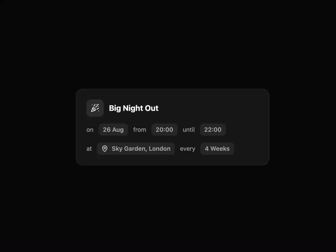
Event Card A visually appealing card to display event details, including title, date, time, location, and frequency. It features a subtle load-in and hover animation for a modern user experience.
Built with React and Tailwind. Copy the prompt and paste it into Claude Code, Cursor or Lovable: your agent adds Event Card to your project and fits it to your theme.
Code
How Event Card is used: the demo's code. The component's own source comes with a free account.
Usage.tsx
// demo.tsx

import { EventCard } from "@/components/ui/event-card";
import { PartyPopper, MapPin } from "lucide-react";

/**
 * A demo component to showcase the EventCard.
 */
export default function EventCardDemo() {
  return (
    <div className="flex min-h-[400px] w-full items-center justify-center bg-background p-4">
      <EventCard
        icon={<PartyPopper className="h-5 w-5" />}
        title="Big Night Out"
        date="26 Aug"
        startTime="20:00"
        endTime="22:00"
        locationIcon={<MapPin className="h-4 w-4 text-primary" />}
        location="Sky Garden, London"
        frequency="4 Weeks"
      />
    </div>
  );
}