
About
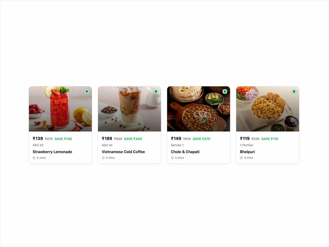
Menu Item Card This component displays a food item with its image, price, name, and an interactive "ADD" button. It's designed to be highly reusable and customizable through props.
Built with React and Tailwind. Copy the prompt and paste it into Claude Code, Cursor or Lovable: your agent adds Menu Item Card to your project and fits it to your theme.
Code
How Menu Item Card is used: the demo's code. The component's own source comes with a free account.
Usage.tsx
// demo.tsx

import { MenuItemCard } from "@/components/ui/menu-item-card"; // Adjust the import path

const menuItems = [
  {
    imageUrl: "https://cdn.21st.dev/assets/mirror/ec/ec5bce0005231b3cbe1f22ed1dd2c5be9443a4173ab13da0e5b106d648bbee86.jpg",
    isVegetarian: true,
    name: "Strawberry Lemonade",
    price: 139,
    originalPrice: 279,
    quantity: "450 ml",
    prepTimeInMinutes: 5,
  },
  {
    imageUrl: "https://cdn.21st.dev/assets/mirror/a1/a1faddabc2da5d4216759258797329cac7e26bf3e204f9205cf79f4fb6c090db.jpg",
    isVegetarian: true,
    name: "Vietnamese Cold Coffee",
    price: 189,
    originalPrice: 529,
    quantity: "450 ml",
    prepTimeInMinutes: 5,
  },
  {
    imageUrl: "https://cdn.21st.dev/assets/mirror/9a/9ae57285eafd9fa7e169ad4c43e8cd062ed0e6cc3c8fb07e84f9714a94c12bbf.jpg",
    isVegetarian: true,
    name: "Chole & Chapati",
    price: 149,
    originalPrice: 419,
    quantity: "Serves 1",
    prepTimeInMinutes: 5,
  },
  {
    imageUrl: "https://cdn.21st.dev/assets/mirror/d4/d4c9fd17d57843e1be923f33f4fb775580dcdc61a1604ea5a48bb76db3624839.jpg",
    isVegetarian: true,
    name: "Bhelpuri",
    price: 119,
    originalPrice: 229,
    quantity: "1 Portion",
    prepTimeInMinutes: 5,
  },
];

export default function MenuItemCardDemo() {
  const handleAddItem = (itemName: string) => {
    // In a real app, you'd add this to a cart state
    console.log(`Added ${itemName} to cart!`);
  };

  return (
    <div className="flex items-center justify-center w-full min-h-screen p-4 bg-background">
      <div className="grid w-full max-w-6xl grid-cols-1 gap-6 sm:grid-cols-2 lg:grid-cols-4">
        {menuItems.map((item, index) => (
          <MenuItemCard
            key={index}
            imageUrl={item.imageUrl}
            isVegetarian={item.isVegetarian}
            name={item.name}
            price={item.price}
            originalPrice={item.originalPrice}
            quantity={item.quantity}
            prepTimeInMinutes={item.prepTimeInMinutes}
            onAdd={() => handleAddItem(item.name)}
          />
        ))}
      </div>
    </div>
  );
}
Dependencies
More by Ravi Katiyar
View all

Animated Shader Hero
3.8K
Hero
3.4K
Circular Gallery
2.9K
Minimalist Hero
2.7K
Glass Calendar
2K
Floating Icons Hero Section
2K
Feature Carousel
1.8K
AI Image Generator Hero
1.5K
More in Cards
View all

Course Design Cards
1.3K

Statistics Card 2
304

Interactive Tech Stack Bento Grid with Hover Effects
601
Stats cards with links
37

Card Studio
14
Statistics Card 7
326
The Item one
3
Statistics Card 10
293
