
About
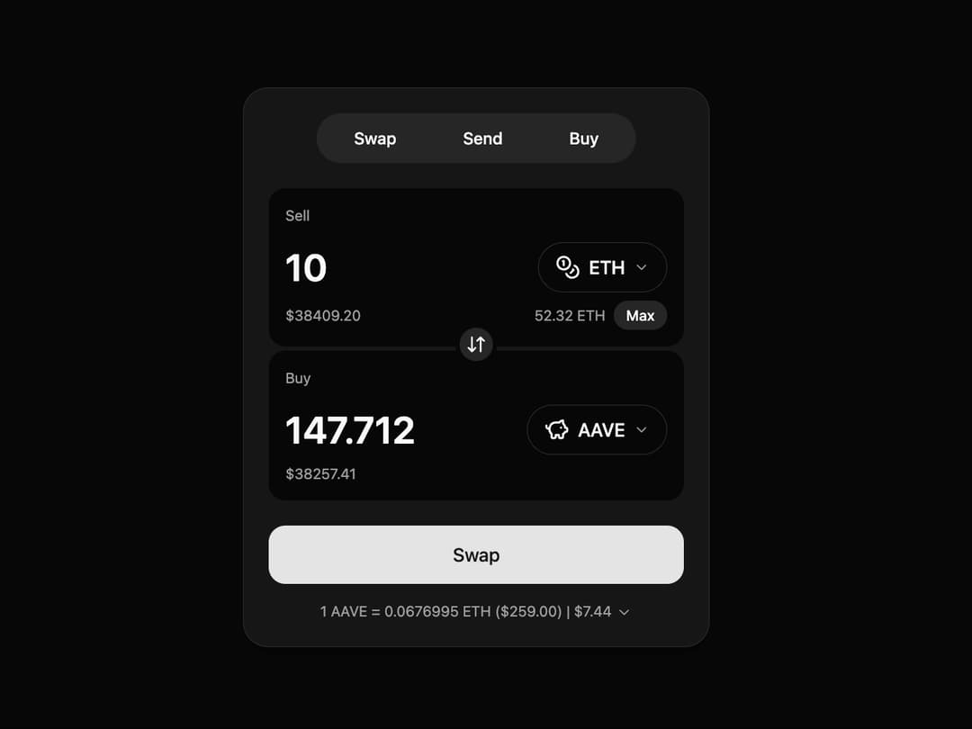
swap-card This file contains the reusable SwapCard component. It uses framer-motion for the layout animations, lucide-react for icons, and is styled with shadcn/ui principles.
Built with React and Tailwind. Copy the prompt and paste it into Claude Code, Cursor or Lovable: your agent adds Swap Card to your project and fits it to your theme.
Code
How Swap Card is used: the demo's code. The component's own source comes with a free account.
Usage.tsx
// demo.tsx
import { SwapCard, type Token } from "@/components/ui/swap-card";
import { Coins, PiggyBank } from "lucide-react"; // Example icons

// Define the tokens with their data and icons
const tokens: Token[] = [
  {
    symbol: "ETH",
    name: "Ethereum",
    icon: Coins,
  },
  {
    symbol: "AAVE",
    name: "Aave",
    icon: PiggyBank,
  },
];

export default function SwapCardDemo() {
  const handleSwap = (data: { sellAmount: string; buyAmount: string; sellToken: Token; buyToken: Token }) => {
    console.log("Swap Initiated:", {
      from: `${data.sellAmount} ${data.sellToken.symbol}`,
      to: `${data.buyAmount} ${data.buyToken.symbol}`,
    });
    // Add your swap logic here (e.g., API call)
  };

  return (
    <div className="min-h-screen bg-background flex items-center justify-center p-4">
      <SwapCard
        tokens={tokens}
        initialSellToken={tokens[0]} // ETH
        initialBuyToken={tokens[1]} // AAVE
        onSwap={handleSwap}
      />
    </div>
  );
}