
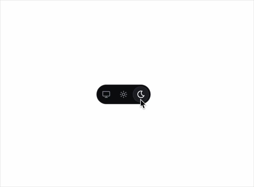
About
A three-way system/light/dark theme switcher control that writes the active theme to the page and persists the user's choice.
Built with React and Tailwind. Copy the prompt and paste it into Claude Code, Cursor or Lovable: your agent adds Theme Switch to your project and fits it to your theme.
Code
How Theme Switch is used: the demo's code. The component's own source comes with a free account.
Usage.tsx
import ThemeSwitch from "@/components/ui/theme-switch";

export default function ThemeSwitchDemo() {
  return (
    <div className="flex min-h-[240px] w-full items-center justify-center bg-background p-10">
      <ThemeSwitch label="Theme" storageKey="redrob-theme-demo" />
    </div>
  );
}
More by redrob-labs
View all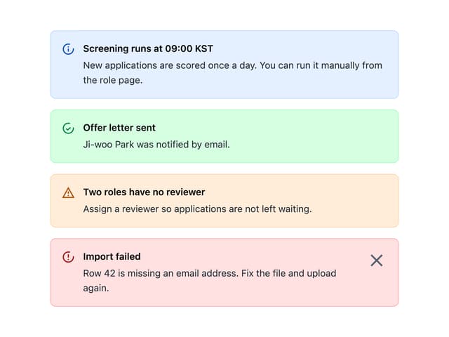
Alert
17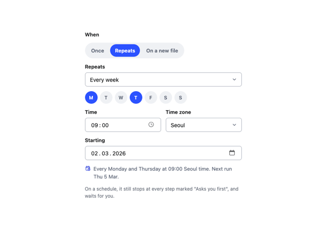
Schedule Picker
15
Hero Section
7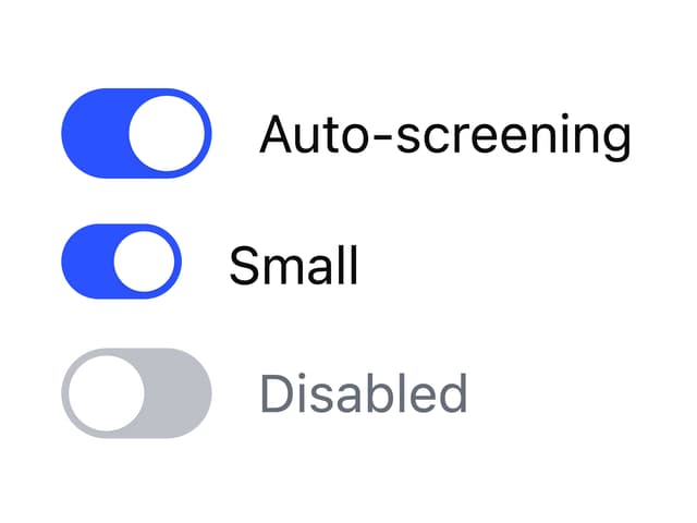
Switch
4
Status Card
4
Meter
2
Memory Scope
2
Accordion
2