
About
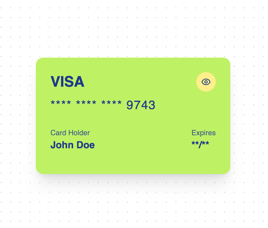
An animated credit card component with reveal/hide functionality and smooth transitions. Features - Animated card reveal - Toggle visibility of sensitive information - Smooth spring animations - Multiple color variants - Perspective 3D effects - Masked card number display - Responsive design - Dark mode support
Built with React and Tailwind. Copy the prompt and paste it into Claude Code, Cursor or Lovable: your agent adds Credit Card to your project and fits it to your theme.
Code
How Credit Card is used: the demo's code. The component's own source comes with a free account.
Usage.tsx
"use client"

import { CreditCard } from "@/components/ui/credit-card"

function DefaultCreditCardDemo() {
  return (
    <div className="flex items-center justify-center p-8">
      <CreditCard
        cardNumber="4111 1111 1111 9743"
        cardHolder="John Doe"
        expiryDate="12/24"
      />
    </div>
  )
}

function DarkCreditCardDemo() {
  return (
    <div className="flex items-center justify-center p-8">
      <CreditCard
        variant="dark"
        cardNumber="5555 4444 3333 2222"
        cardHolder="Jane Smith"
        expiryDate="06/25"
      />
    </div>
  )
}

export { DefaultCreditCardDemo, DarkCreditCardDemo }
Dependencies
More by ExtendUI
View all
Notification Alert Dialog
109
3D Card
93
Alert Dialog Icon
67
Error Alert Dialog
33
Extended Select
32
More in Cards
View all

Course Design Cards
1.1K
Stats cards with links
119

Statistics Card 2
258
Card
54
Statistics Card 7
288
The Item one
3

Card Studio
9

Weather Card
52
