
About
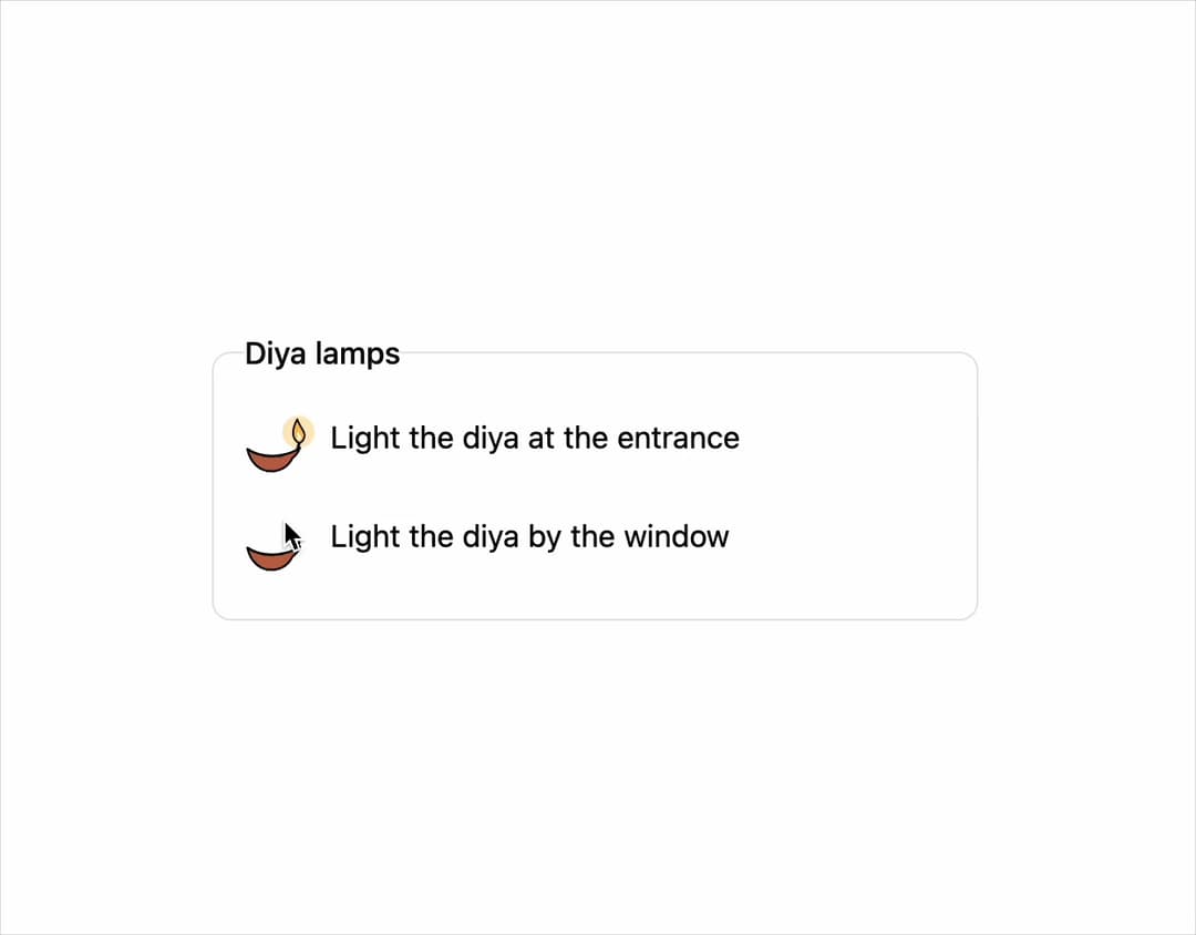
A switch-style checkbox toggle (on/off) with three faithful visual skins — a plain CSS track, a hand-drawn brass door-latch, or a flickering clay lamp — ported from susegad-ui's sg-toggle web component.
Built with React and Tailwind. Copy the prompt and paste it into Claude Code, Cursor or Lovable: your agent adds Toggle to your project and fits it to your theme.
Code
How Toggle is used: the demo's code. The component's own source comes with a free account.
Usage.tsx
import Toggle from "@/components/ui/toggle";

export default function TogglePlayfulDemo() {
  return (
    <div className="w-full max-w-md mx-auto p-6">
      <fieldset className="grid gap-3 rounded-lg border p-4">
        <legend className="mb-1 font-medium">Diya lamps</legend>
        <Toggle
          skin="playful"
          name="lamp-1"
          value="on"
          defaultChecked
          seed="entrance"
          label="Light the diya at the entrance"
        />
        <Toggle
          skin="playful"
          name="lamp-2"
          value="on"
          seed="window"
          label="Light the diya by the window"
        />
      </fieldset>
    </div>
  );
}
More by sarat-asymmetrica
View all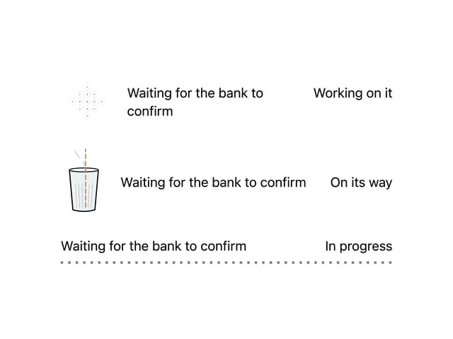
Kolam & Chai Progress
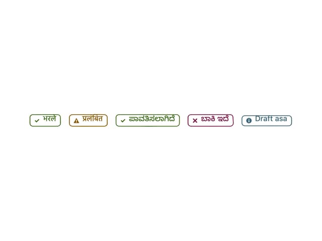
Hand-Inked Status Badge
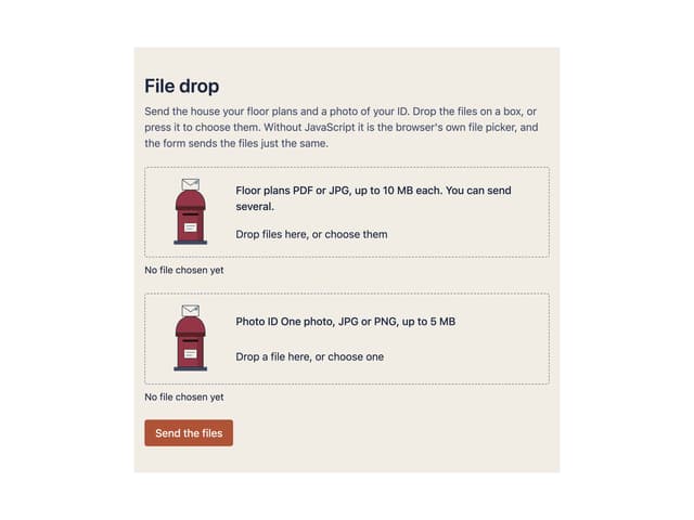
File Drop
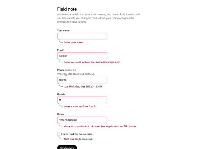
Field Note