
About
A hero section that fans out a stack of rotated photo cards beneath an animated headline, CTA button, and top navbar, ideal for social/creator product landing pages.
Built with React and Tailwind. Copy the prompt and paste it into Claude Code, Cursor or Lovable: your agent adds Hero Section with Cards to your project and fits it to your theme.
Code
How Hero Section with Cards is used: the demo's code. The component's own source comes with a free account.
Usage.tsx
import HeroWithCards from "@/components/ui/hero-with-cards";

export default function HeroWithCardsDemo() {
  return <HeroWithCards />;
}
Dependencies
More by scrollxui
View all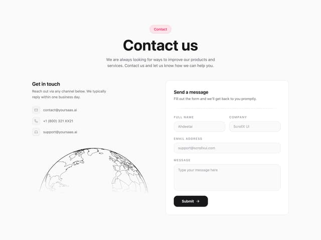

Contact with Globe
380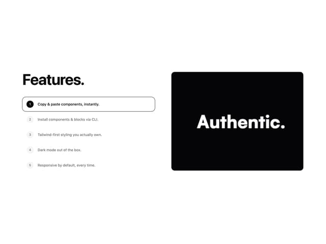
Features With Panel
352
FAQ Accordion
164
Logo Cloud Marquee
157
Particles
99
Hero With Pixel Background
88
Testimonials Marquee
85
Testimonials Vertical Marquee
75
More in Heroes
View all

Responsive Hero Banner
2.1K

SaaS Template
2.5K

Hero
1.3K

Hero Section
427
Editorial Collage Hero
471

Hero 03
339
Centered Hero with Image Fan
1K

Aero Hero-3
590