

About
An image carousel grid that shows one card per breakpoint (1 on mobile, up to 4 on desktop) using aspect-ratio cards with previous/next arrow controls.
Built with React and Tailwind. Copy the prompt and paste it into Claude Code, Cursor or Lovable: your agent adds Carousel with Responsive Basis to your project and fits it to your theme.
Code
How Carousel with Responsive Basis is used: the demo's code. The component's own source comes with a free account.
Usage.tsx
import Pattern from "@/components/ui/c-carousel-4";

export default function Demo() {
  return (
    <div className="flex w-full items-center justify-center p-6">
      <Pattern />
    </div>
  );
}
More by Sean Hello
View all

3D Testimonails
3.4K
Line Charts 9
665
Alert
495
Line Charts 6
396
Area Charts 1
392
Scroll Area
377
Navigation Menu
321
Area Charts 2
318
More in Galleries
View all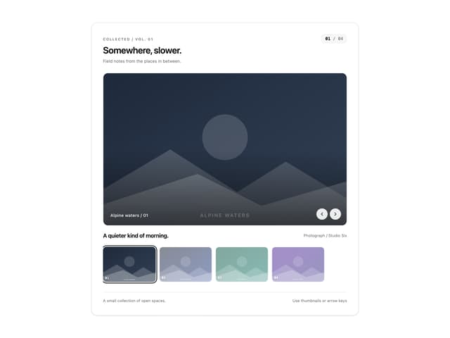
Thumbnail image viewer
69

Animated Gallery
1.5K
Editorial Collage Hero
464

Image Gallery
128

Elastic Gallery
986

About 3
435

Tilted Grid Hero
2.1K

Hero Section 6
906
