
About
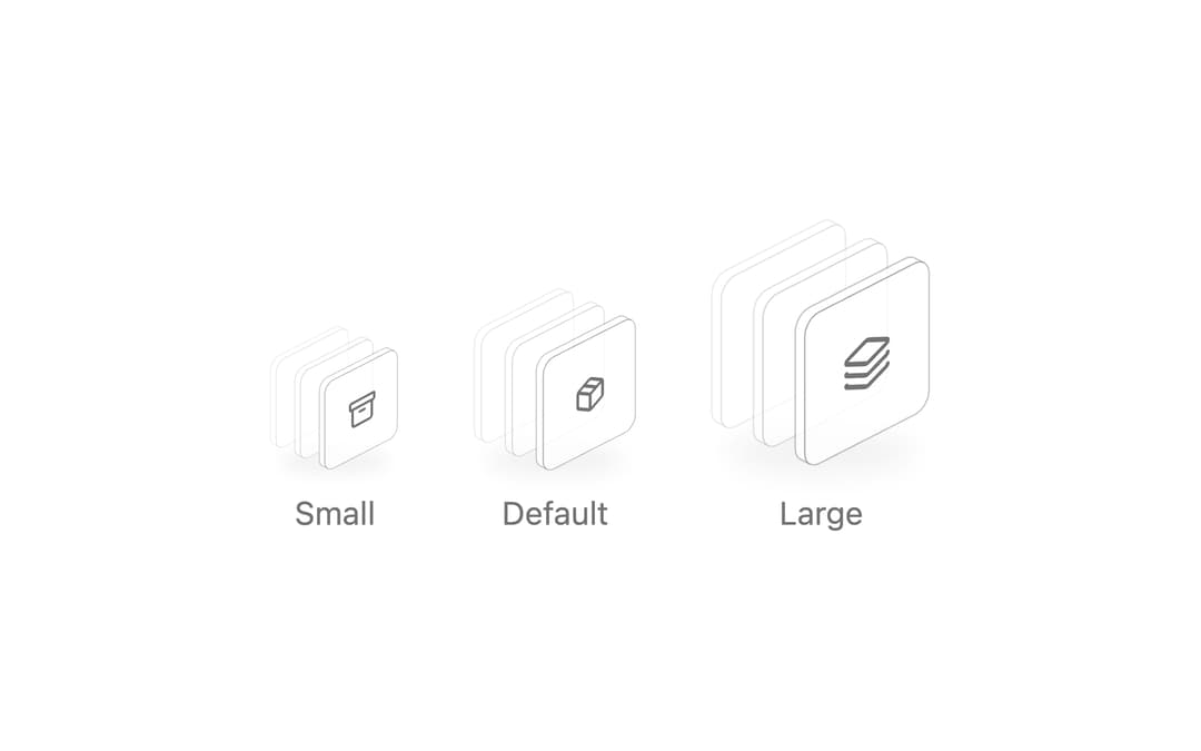
ReUI Icon Stack with the first 6 official ReUI examples, preserved from the MIT-licensed source registry.
Built with React and Tailwind. Copy the prompt and paste it into Claude Code, Cursor or Lovable: your agent adds ReUI Icon Stack to your project and fits it to your theme.
Code
How ReUI Icon Stack is used: the demo's code. The component's own source comes with a free account.
Usage.tsx
import { ArchiveIcon, PackageIcon, LayersIcon } from "lucide-react"
import { IconStack } from "@/components/ui/reui-icon-stack"


const sizes = [
  {
    label: "Small",
    className: "h-16 w-14",
    icon: (
      <ArchiveIcon className="size-3.5" />
    ),
  },
  {
    label: "Default",
    className: "h-20 w-18",
    icon: (
      <PackageIcon className="size-4" />
    ),
  },
  {
    label: "Large",
    className: "h-28 w-24",
    icon: (
      <LayersIcon className="size-6" />
    ),
  },
]

export default function Pattern() {
  return (
    <div className="flex flex-wrap items-end justify-center gap-8">
      {sizes.map((item) => (
        <div key={item.label} className="flex flex-col items-center gap-2">
          <IconStack aria-hidden="true" className={item.className}>
            {item.icon}
          </IconStack>
          <span className="text-muted-foreground text-sm">{item.label}</span>
        </div>
      ))}
    </div>
  )
}
Dependencies
More by Sean Hello
View all

3D Testimonails
3.5K
Line Charts 9
677
Alert
496
Line Charts 6
399
Area Charts 1
394
Scroll Area
378
Navigation Menu
336
Area Charts 2
321