
About
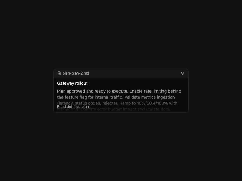
Display a plan title and summary with expand/collapse and an Approve action. State-driven (idle / pending). Self-contained port from 21st.dev Agent Elements without the Markdown dep — summary renders as plain prose.
Built with React and Tailwind. Copy the prompt and paste it into Claude Code, Cursor or Lovable: your agent adds Plan Tool to your project and fits it to your theme.
Code
How Plan Tool is used: the demo's code. The component's own source comes with a free account.
Usage.tsx
import { PlanTool } from "@/components/ui/plan-tool";

const plan = {
  id: "plan-2",
  title: "Gateway rollout",
  summary:
    "Plan approved and ready to execute. Enable rate limiting behind the feature flag for internal traffic. Validate metrics ingestion (latency, status codes, rejects). Ramp to 10%/50%/100% with monitoring. Confirm error budget impact and update docs.",
};

export default function Demo() {
  return (
    <div className="flex items-center justify-center w-full min-h-screen bg-background p-8 overflow-hidden">
      <div className="w-full max-w-md">
        <PlanTool state="idle" plan={plan} approved />
      </div>
    </div>
  );
}
Dependencies
More by 21st
View all
Spline Scene
9.4K
Testimonials with Marquee
2.3K
Gradient Button
1.9K
Pixel Canvas
900
Animated Blur Number
830
Empty State
774
Balloons
755
Status Badge
643

More in Cards
View all
Stats cards with links
39

Statistics Card 2
260

Course Design Cards
1.1K
The Item one
3
Card
70

Card Studio
7
Statistics Card 7
289

Card
17
