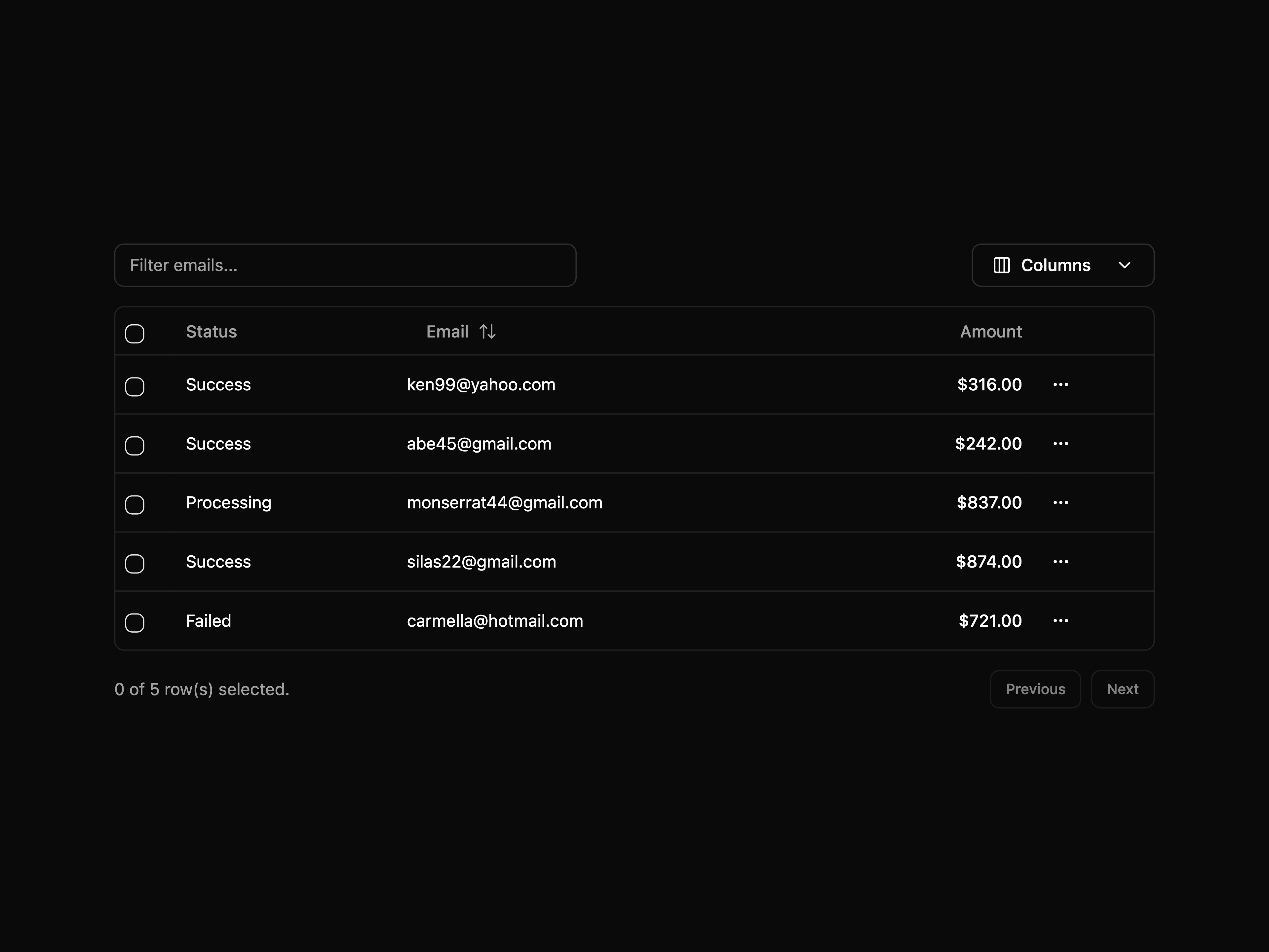
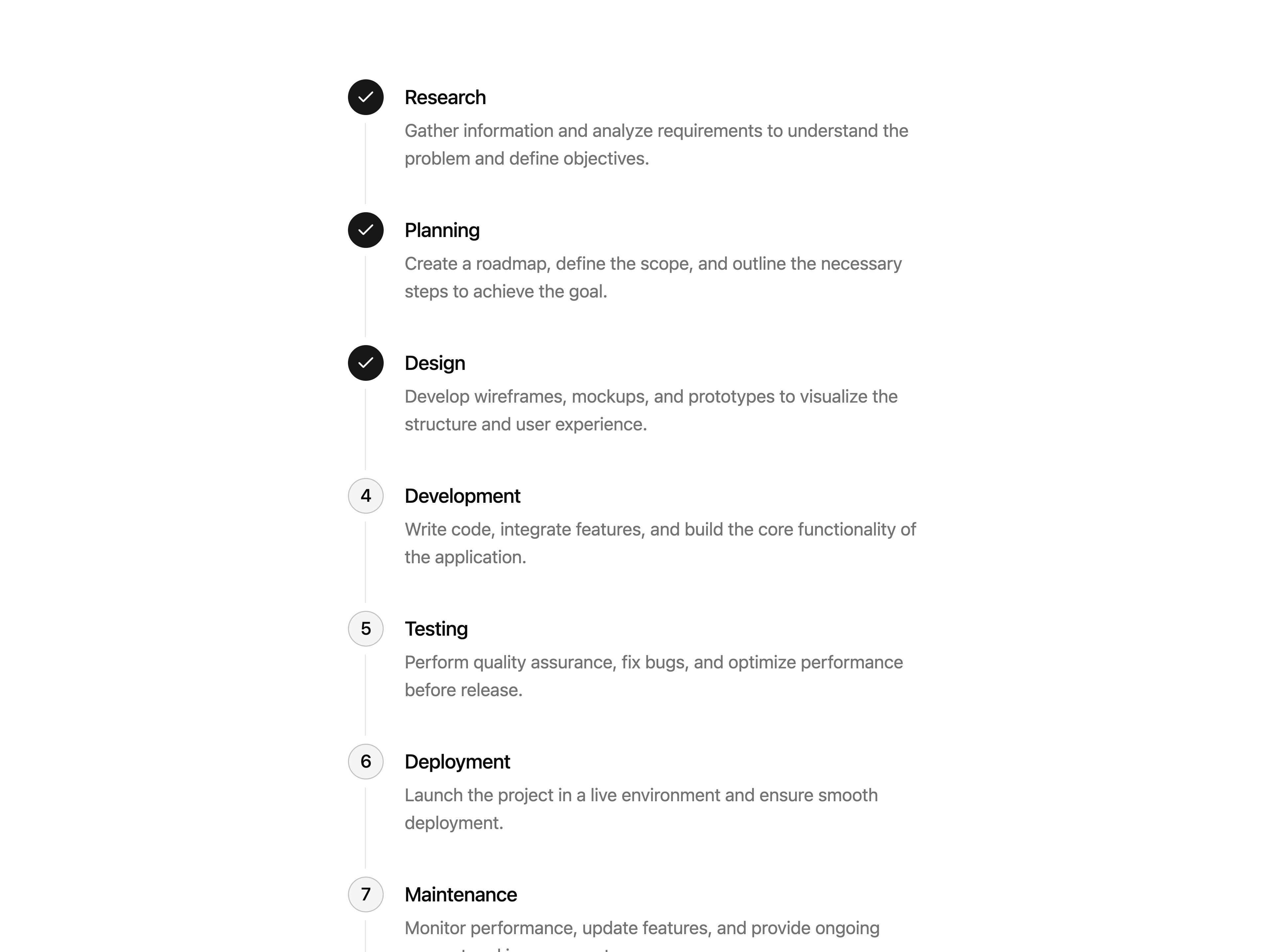
Shadcn UI Blocks publishes a shadcn registry at shadcnui-blocks.com, with 400 components installable through the shadcn CLI.
Copy a prompt for your agent, copy the install command, or open the docs that ship it.
A default accordion component
An outline styled accordion
A box styled accordion
A contained accordion component
A box-contained accordion component
A tabs-styled accordion component
An accordion that highlights the active item
An accordion that allows multiple items to be expanded at once
An accordion with a custom expand icon
An accordion with icons
An accordion with media content
An accordion with disabled items
A primary alert component
A destructive alert component
A success alert component
A warning alert component
An info alert component
An alert with background component
A soft alert component
A bootstrap-styled alert component
A callout alert component
An alert with actions component
A default alert dialog component
An alert dialog with icon component
A destructive alert dialog component
An info alert dialog component
An alert dialog with customized header
An alert dialog with customized footer
A simple animated grid pattern
A default avatar component
A clickable avatar component
An avatar with tooltip component
An avatar with text component
An avatar with hover card component
Different sizes of avatar component
Different colors of avatar component
Different shapes of avatar component
Avatar with fallback component
Avatar with ring component
Avatar with status indicator component
Group of avatars component
Group of avatars with maximum limit component
An avatar dropdown menu component
A default badge component
A secondary badge component
An outline badge component
A destructive badge component
A rounded badge component
A gradient badge component
A gradient outline badge component
A soft badge component
A status badge component
A badge with image component
A badge with icon component
A clickable badge component
A clickable link badge component
A plan features with badge component
An icon button component
A simple banner block
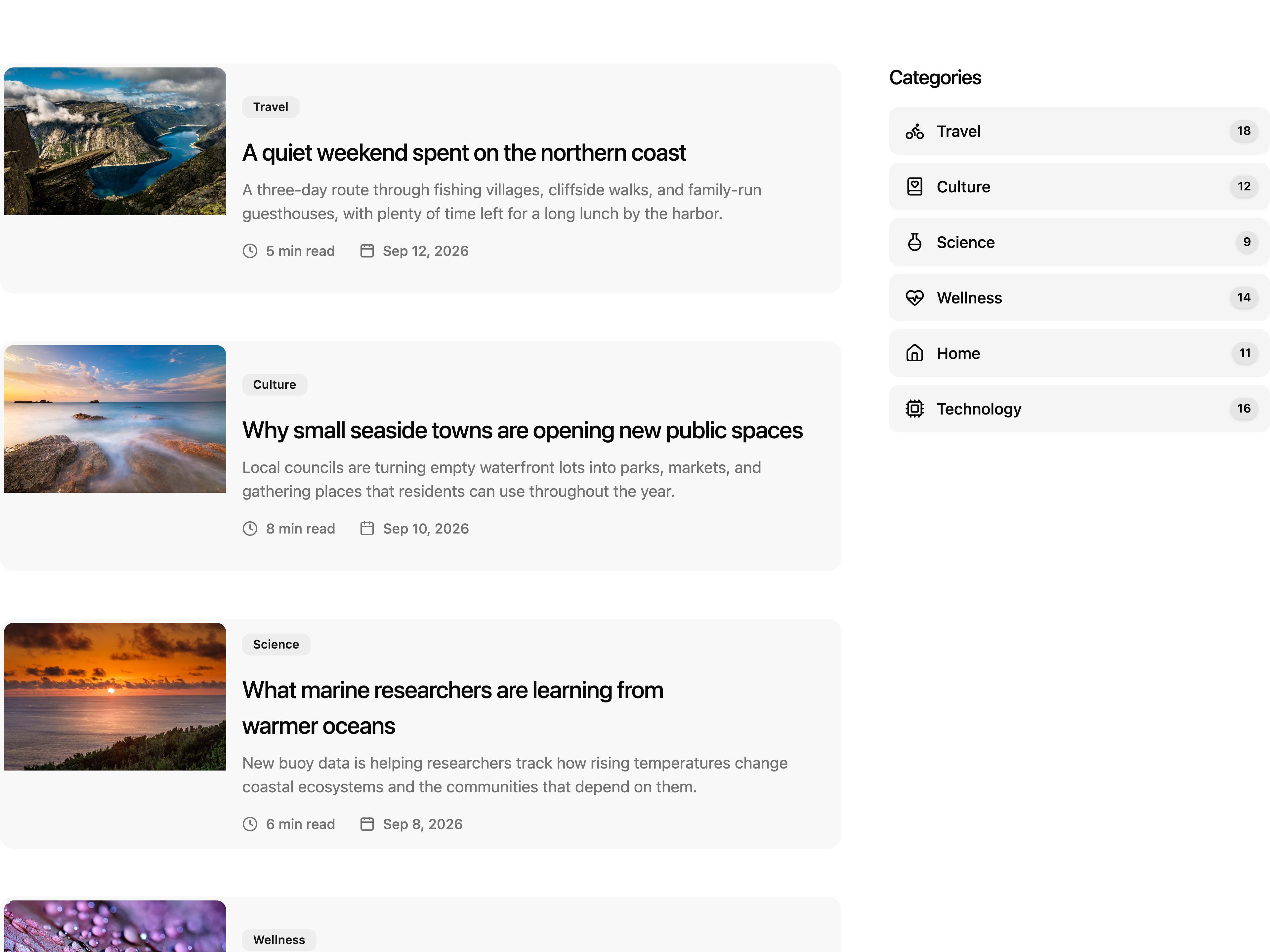
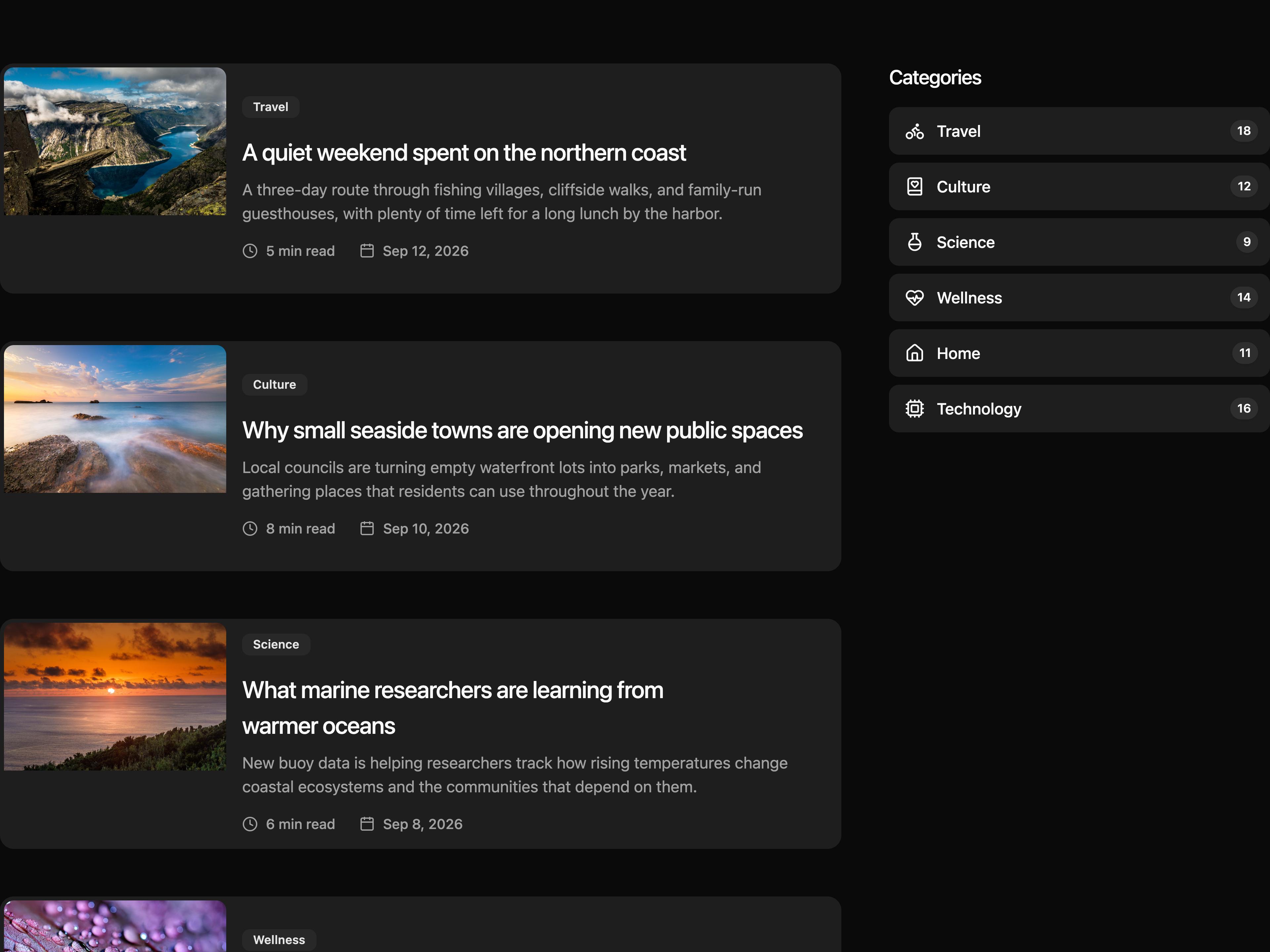
A simple blog post list
A simple blog block
A simple blog block
A simple blog block
A default breadcrumb component
A breadcrumb with slash separator component
A breadcrumb with chevrons separator component
A breadcrumb with dot separator component
A breadcrumb with icon component
An alternate breadcrumb with icon component
A breadcrumb with icon and label component
An alternate breadcrumb with icon and label component
A breadcrumb with background component
A tabs outline breadcrumb component
A collapsed breadcrumb component
A steps breadcrumb component
A primary button component
A secondary button component
A destructive button component
An outline button component
An icon button component
A loading button component
A split button component
A ghost button component
A gradient button component
A link button component
A social button component
A social login button component
A neon button component
A rounded button component
A toggle button component
A theme toggle button component
A full width button component
A button group component
Another button group component
A copy button component
A button with badge component
A button with tooltip component
A button with tap animation component
A default card component
A card with background component
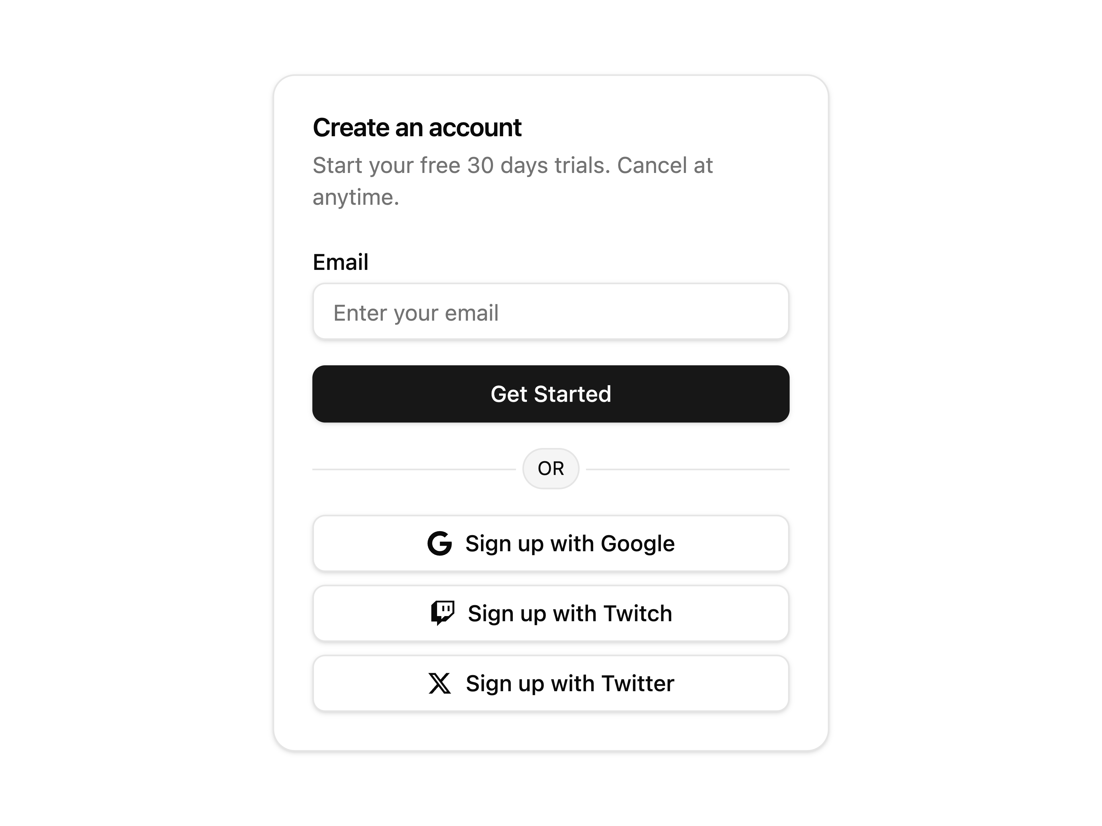
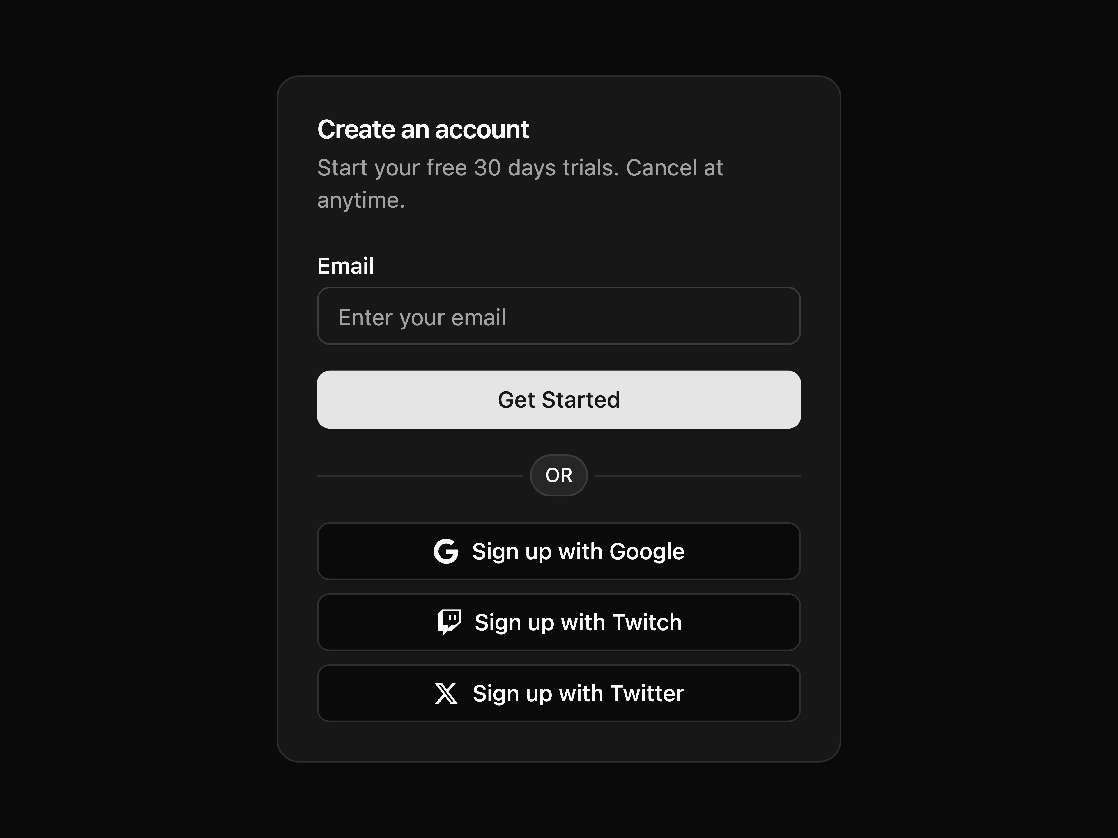
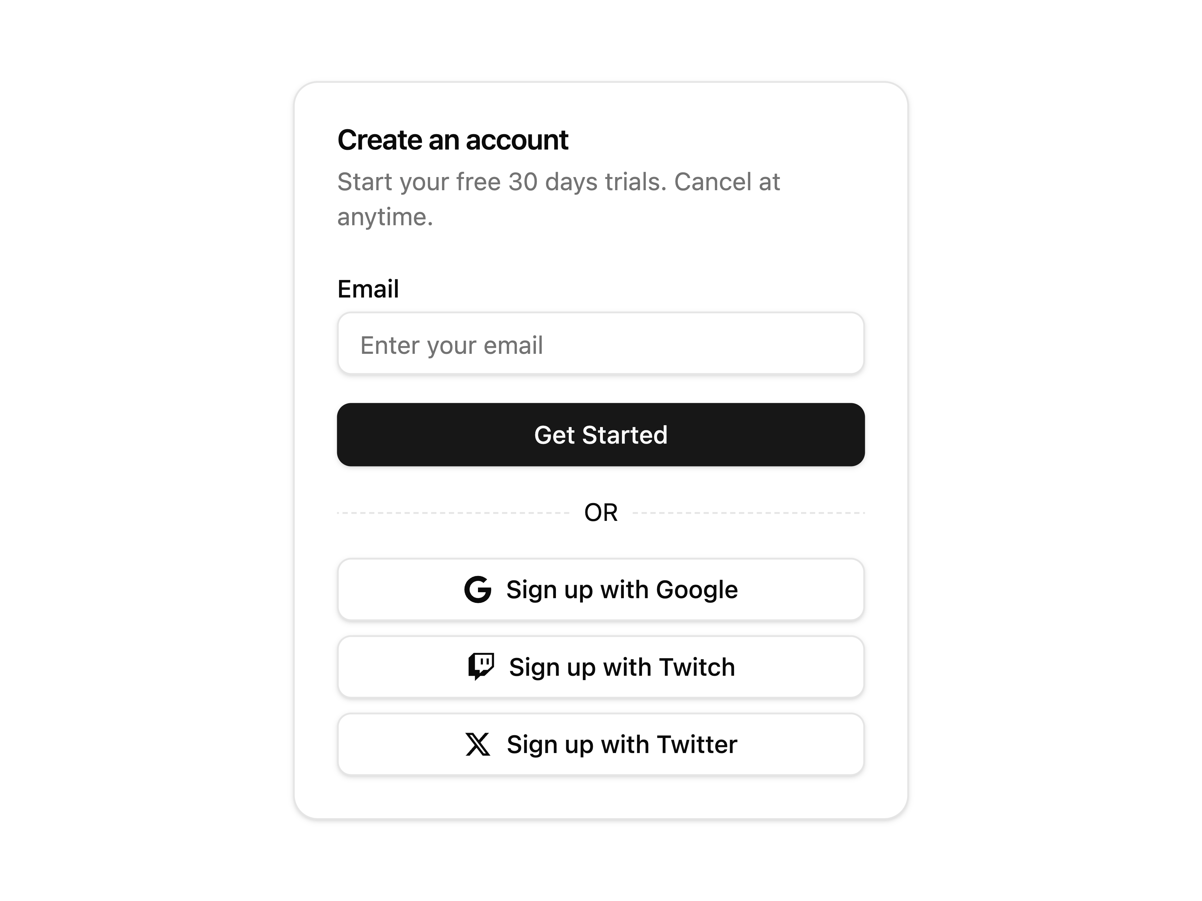
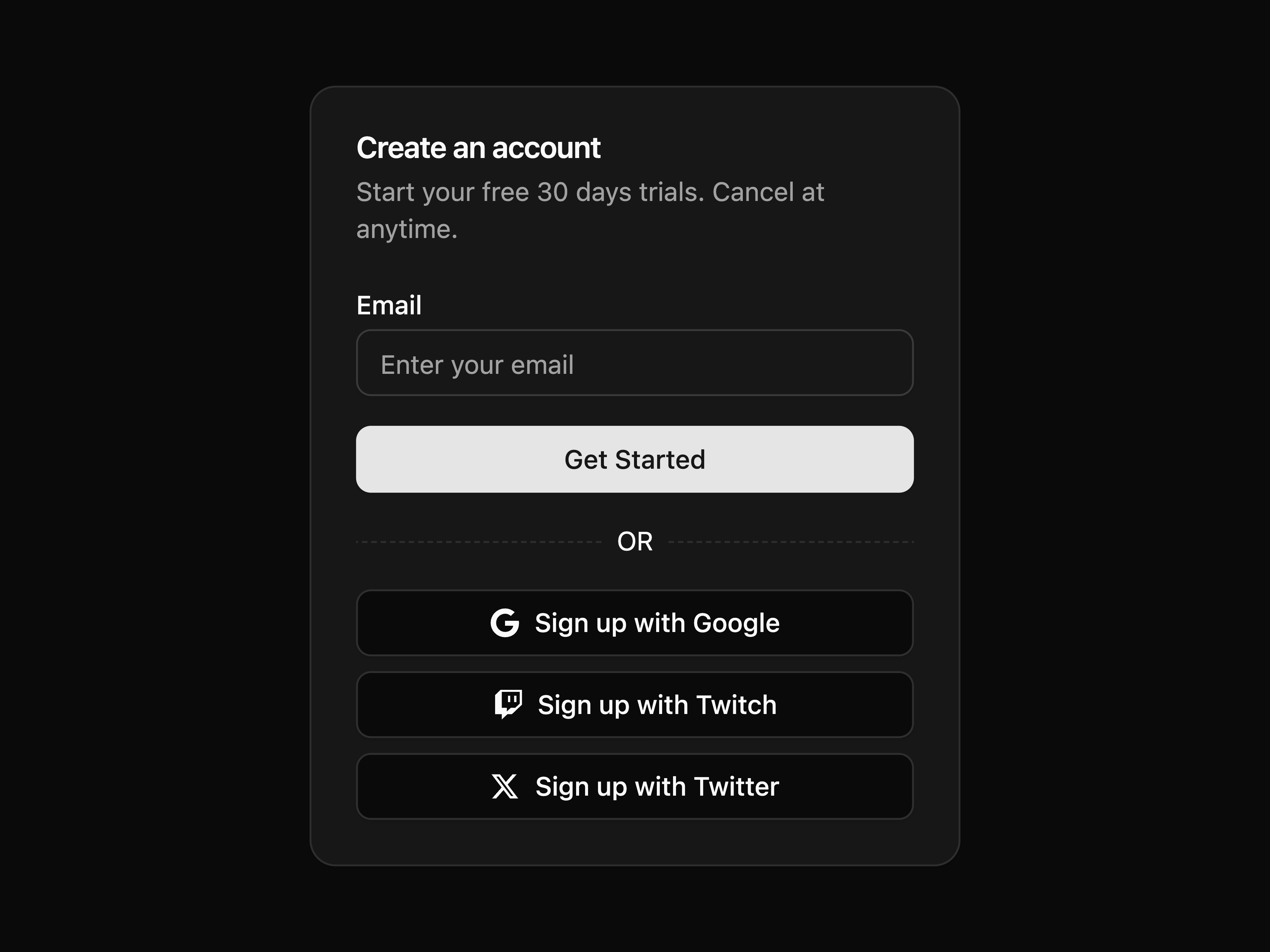
A create account card component
A banner card component
A pricing card component
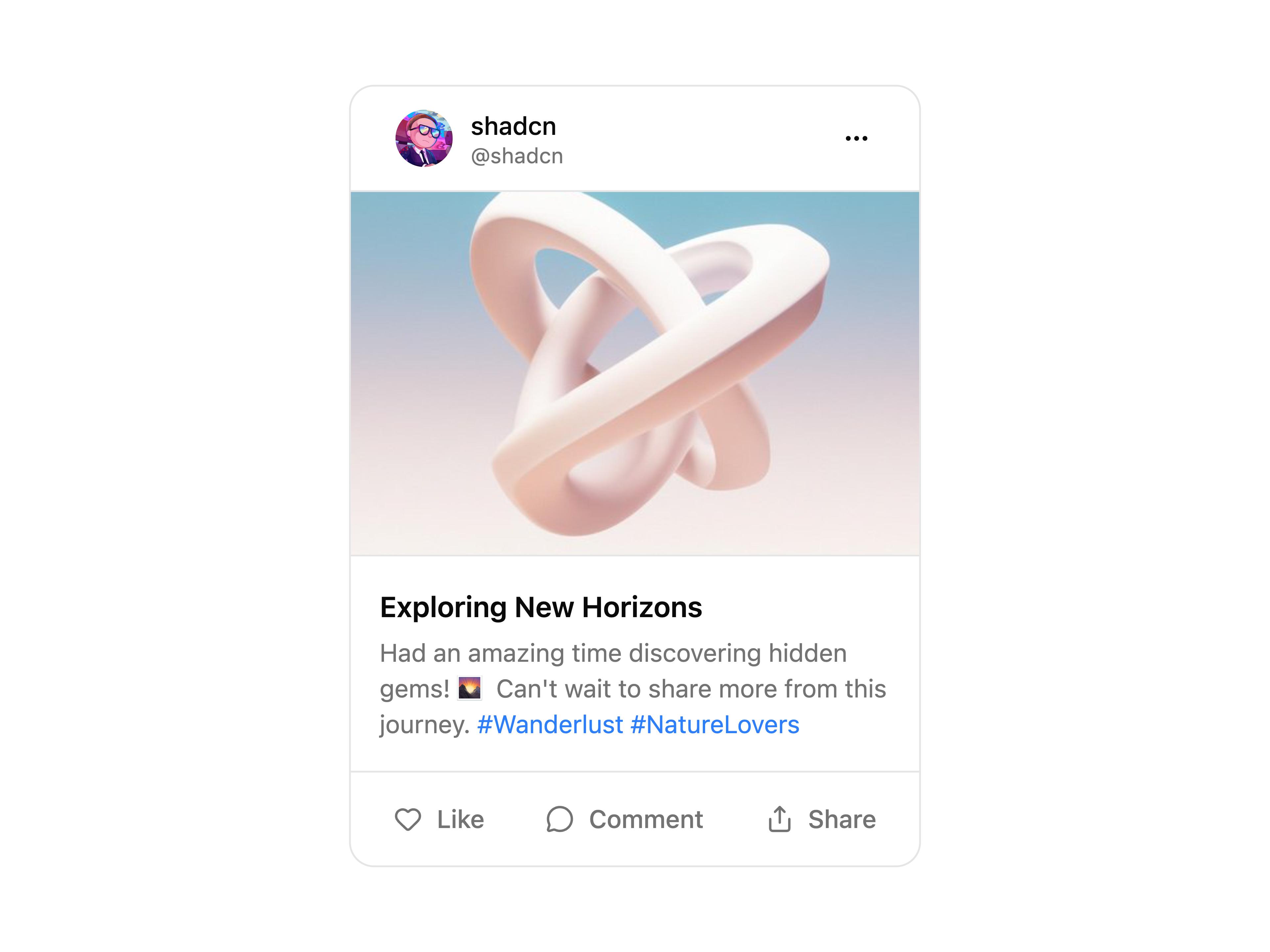
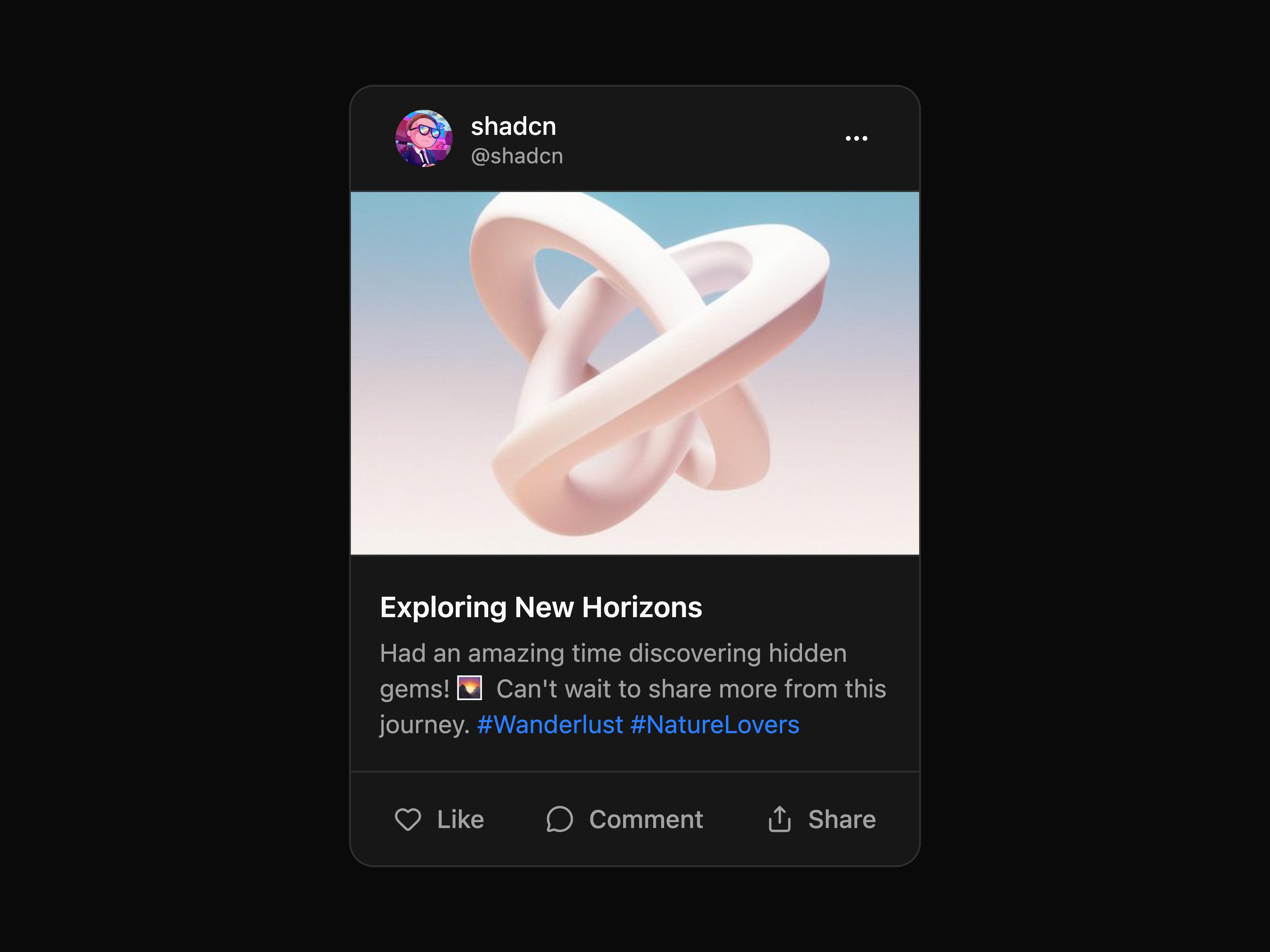
A post card component
A product card component
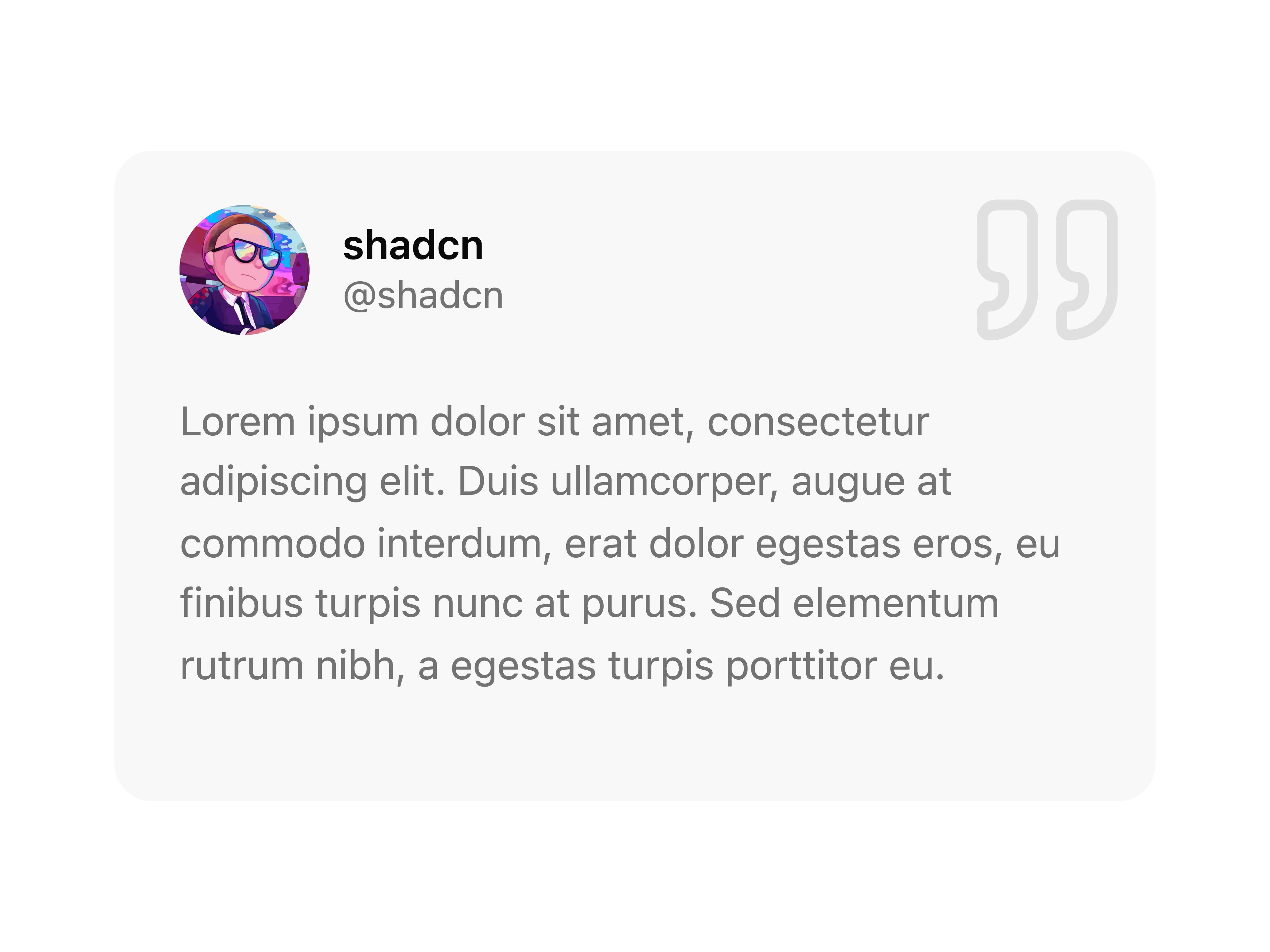
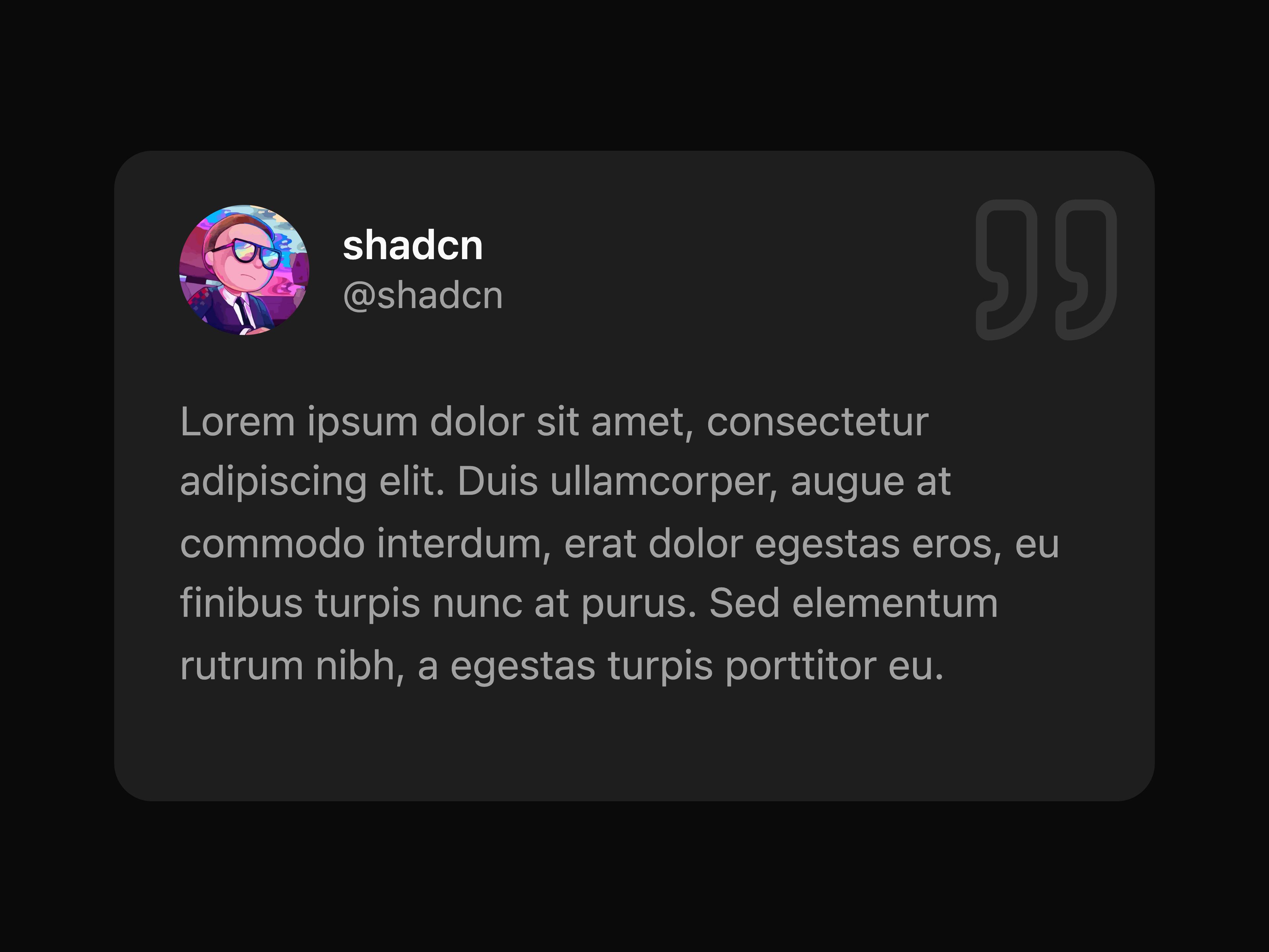
A testimonial card component
A default carousel component
A carousel displaying multiple slides at once
A vertical orientation carousel
A carousel with slide status indicator
An alternate carousel with slide status indicator
A carousel with pagination controls
A carousel with a footer section
A carousel with a progress bar indicator
A carousel with thumbnail navigation
A carousel with opacity transition effects
A carousel with scale transition effects
A simple carousel block
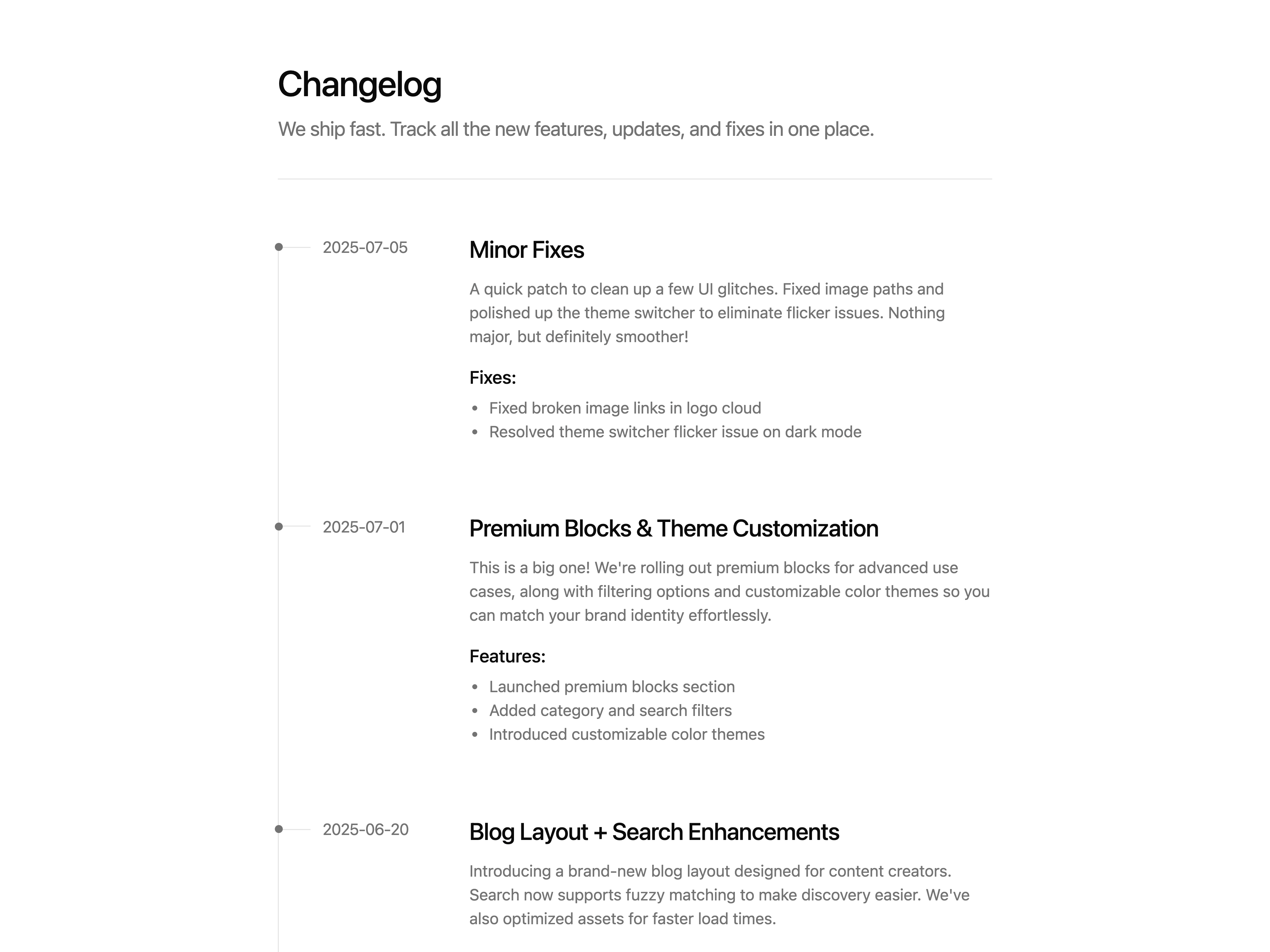
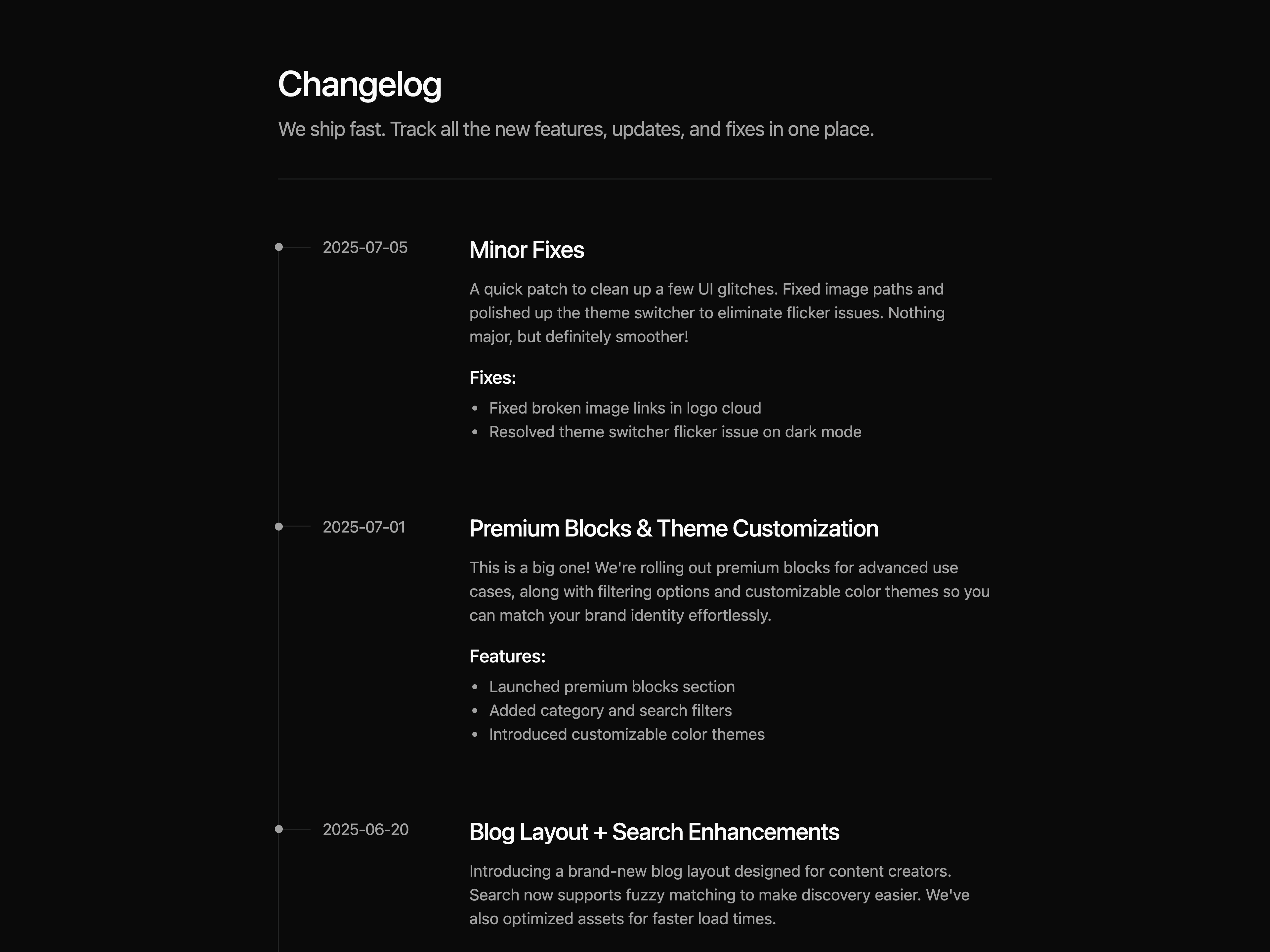
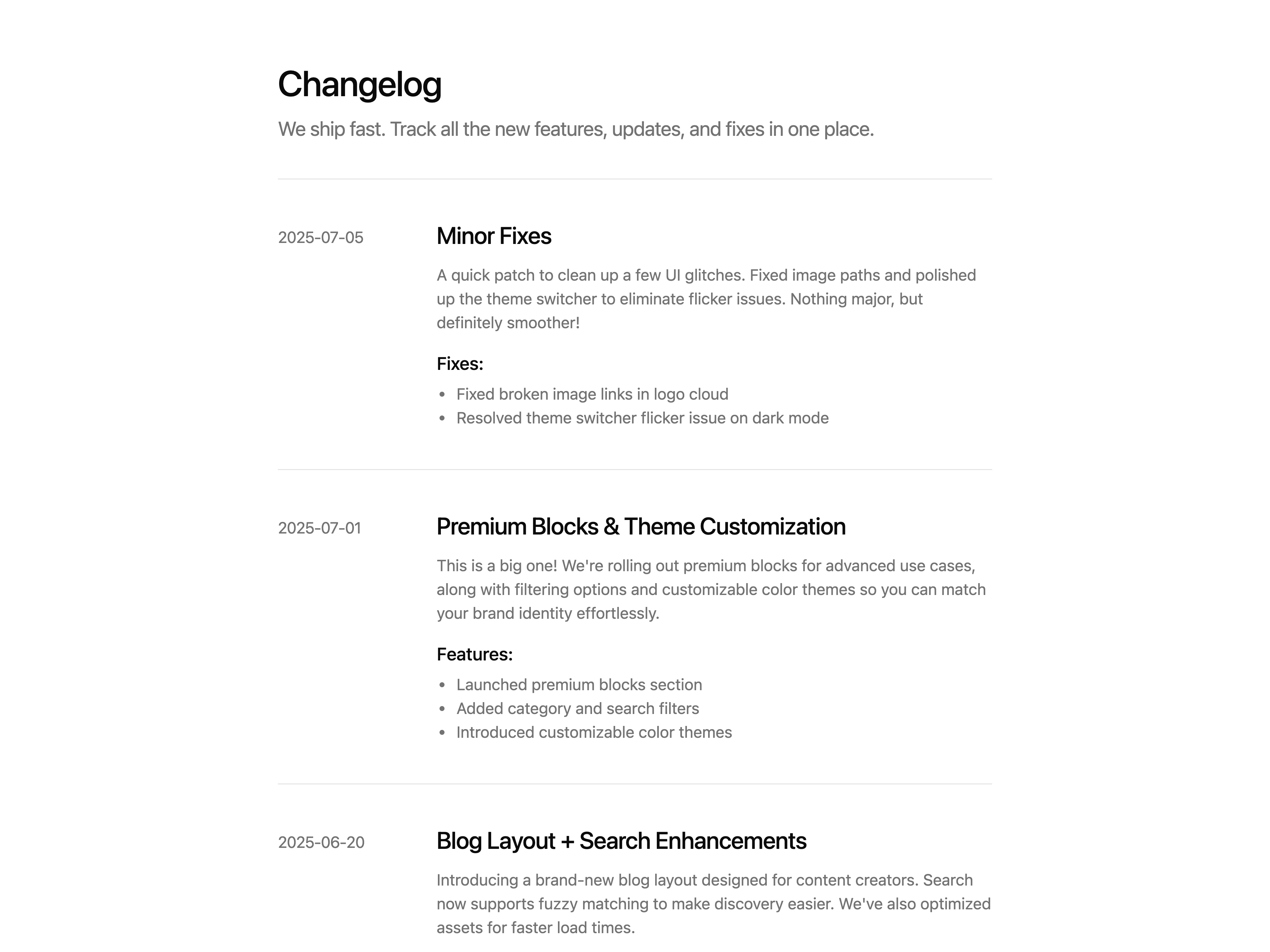
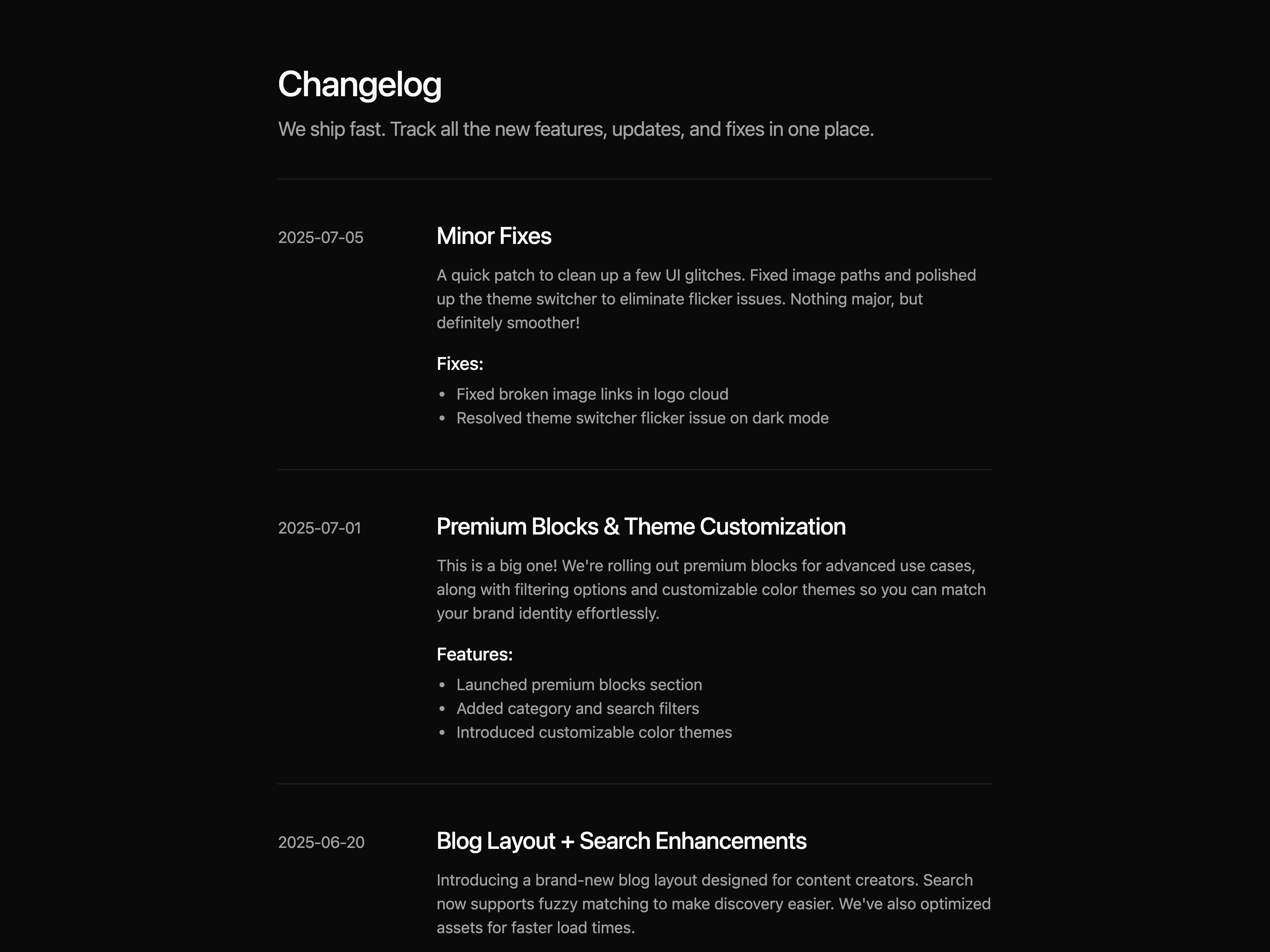
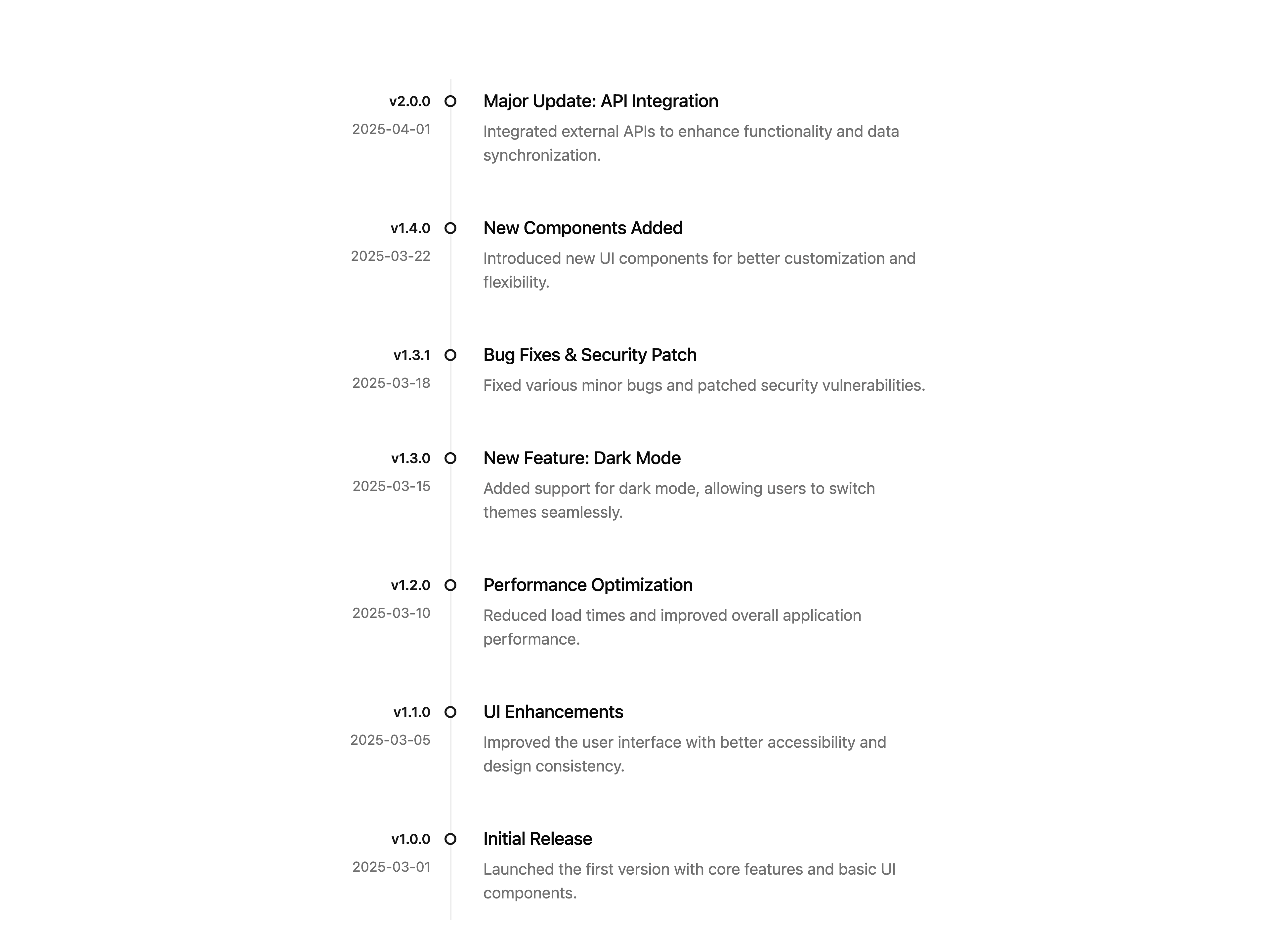
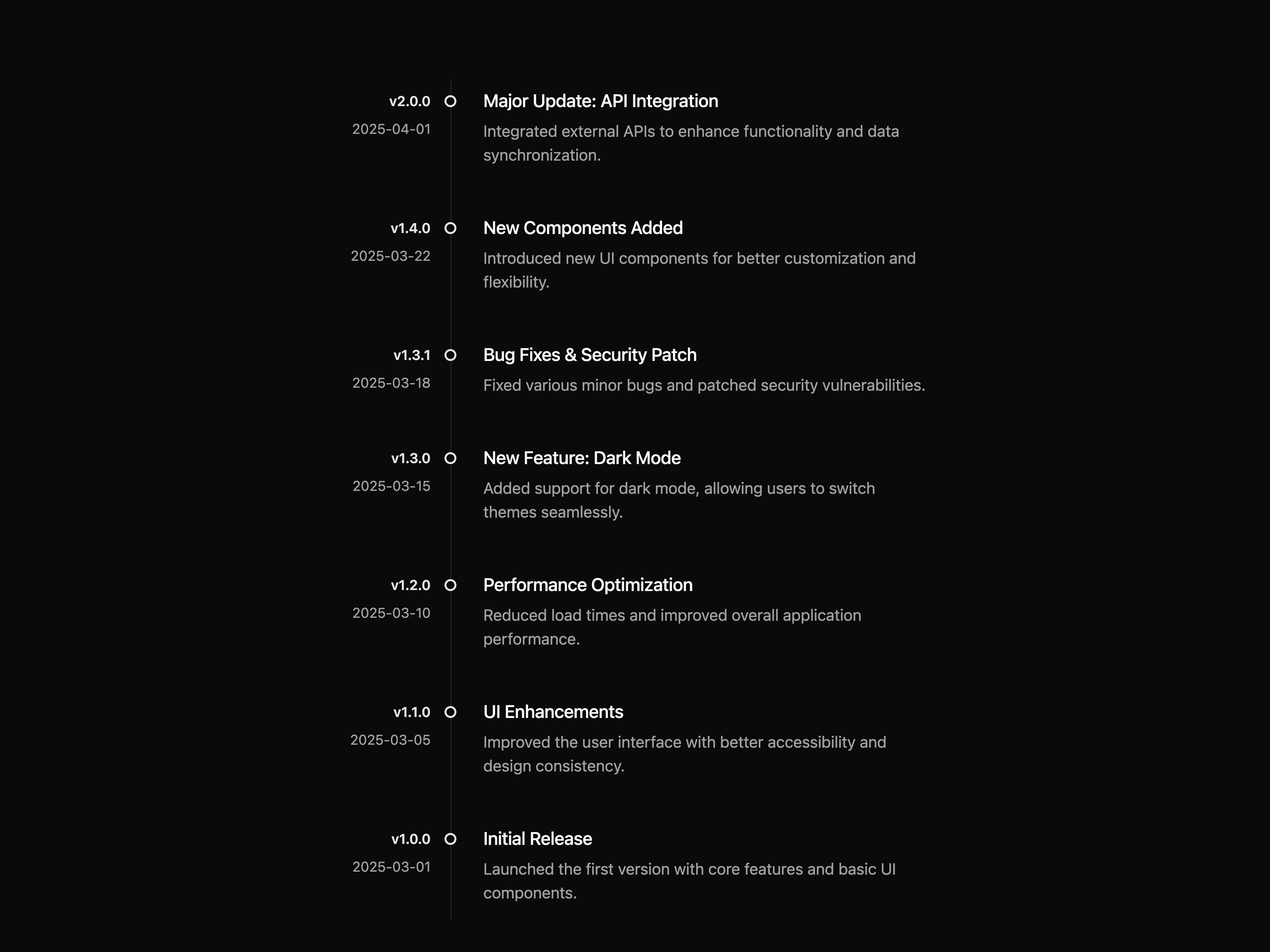
A simple changelog block
A checkbox with text component
A disabled checkbox component
An indeterminate checkbox component
A horizontal checkbox group component
A vertical checkbox group component
A controlled checkbox component
Different colors of checkbox component
Different sizes of checkbox component
A checkbox with custom icon component
A multi color picker checkbox component
A card checkbox component
A checkbox with form component
A roles component
A countries component
A working days component
A notification settings component
A simple code block
A simple code block
A simple code block
A default collapsible component
A collapsible component with show more functionality
A collapsible component for displaying file trees
A collapsible component for filter options
A simple contact form
A simple CTA block
A simple CTA block
A simple CTA block
A simple CTA block
A simple CTA block
A simple CTA block
A simple dot pattern
A default dropdown menu component
A dropdown menu with icon component
A dropdown menu with checkboxes component
A dropdown menu with radio group component
A dropdown menu with sub menu component
A workspace switcher dropdown menu component
A simple empty state block
A simple FAQ component
A simple FAQ block
A simple FAQ block
A simple FAQ block
A simple FAQ block
A simple FAQ block
A simple FAQ block
A simple FAQ block
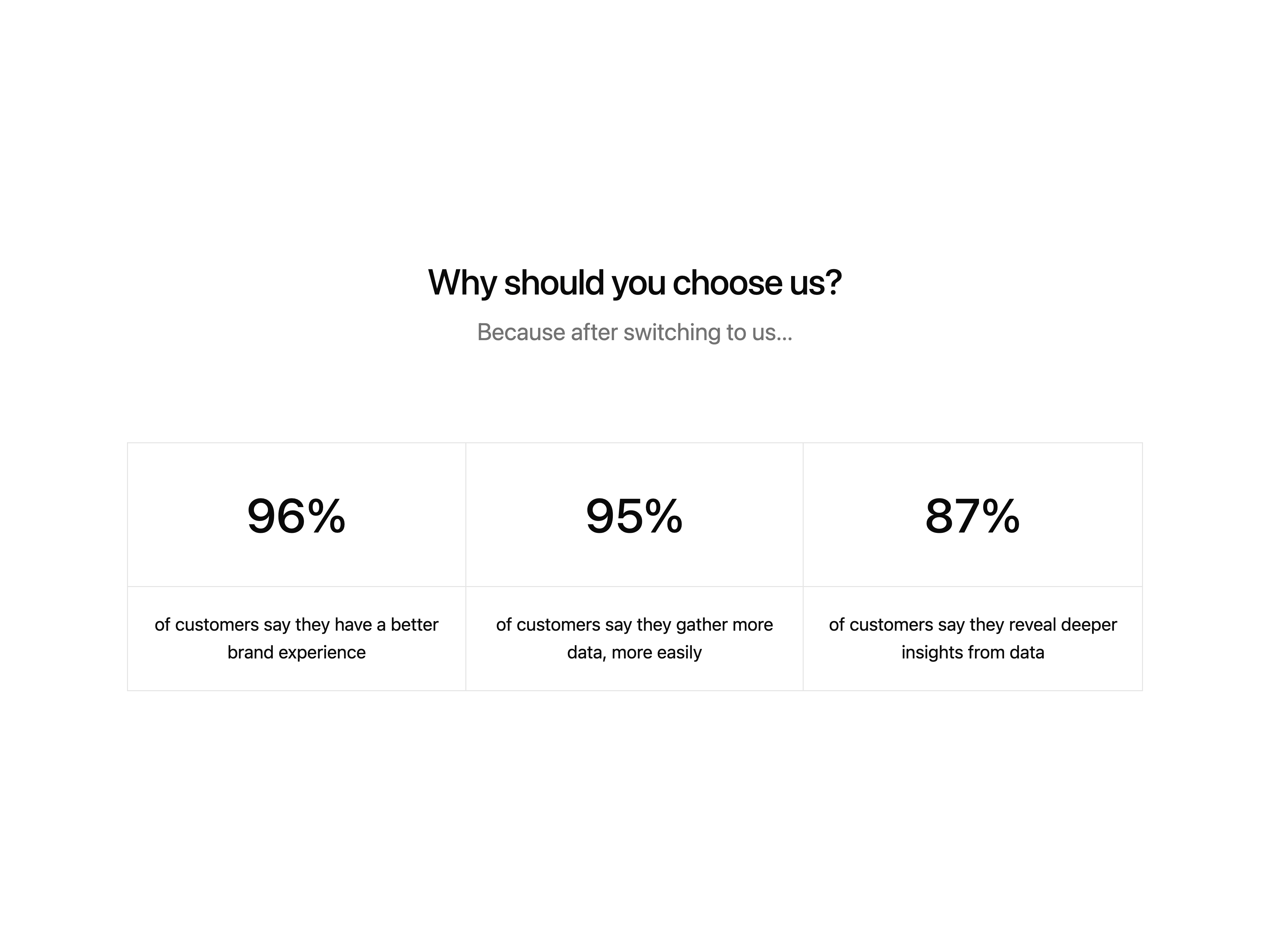
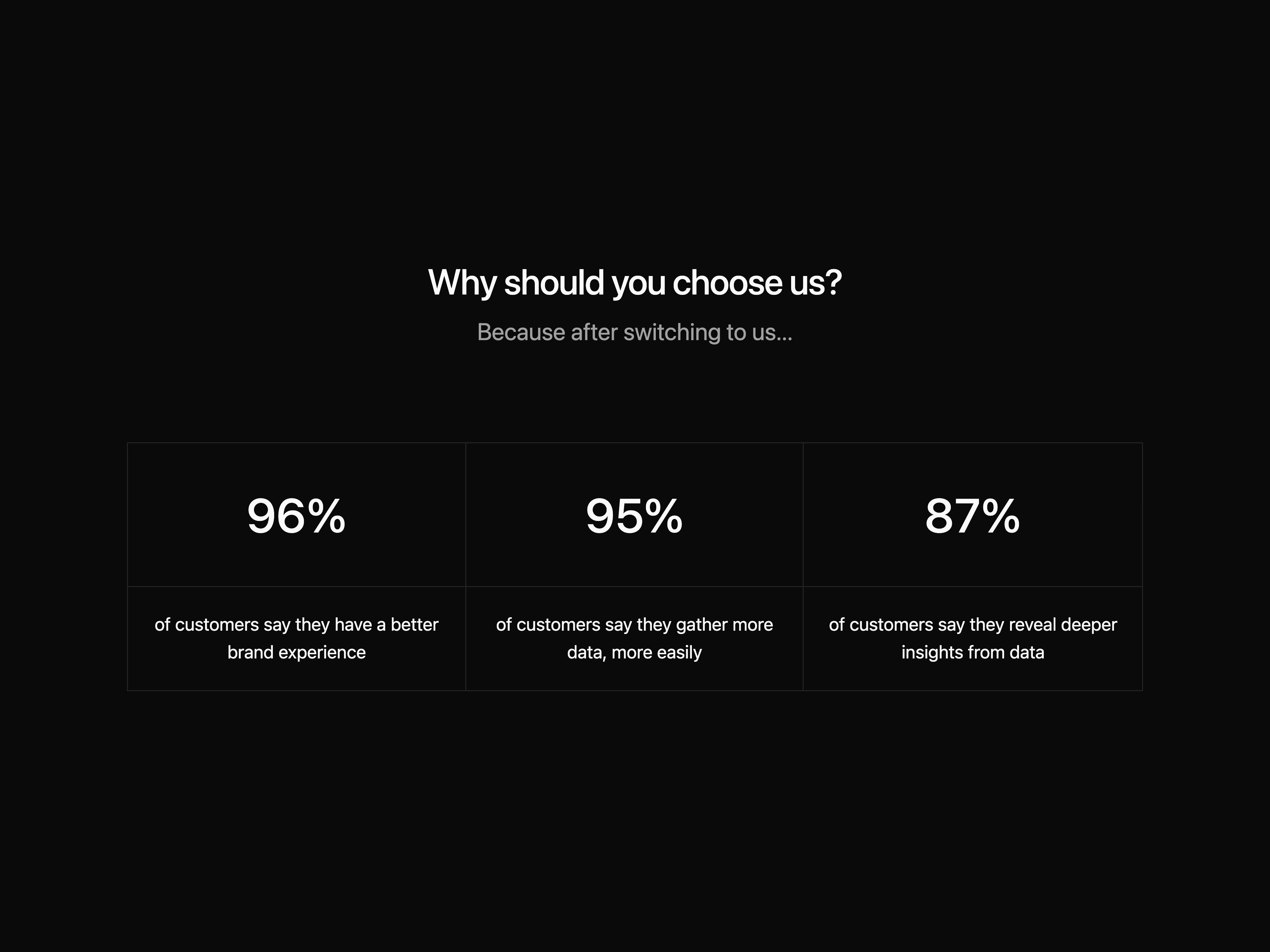
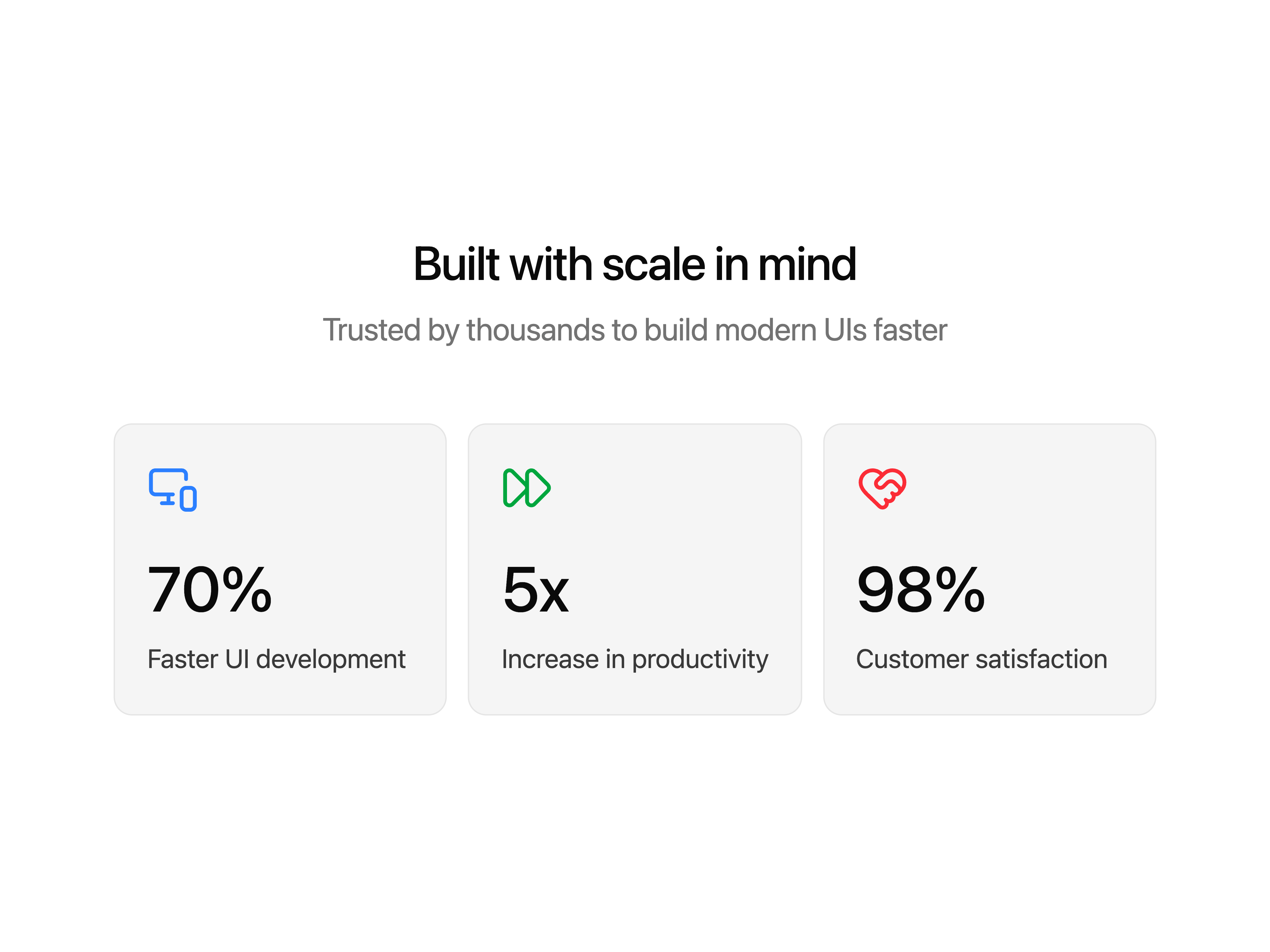
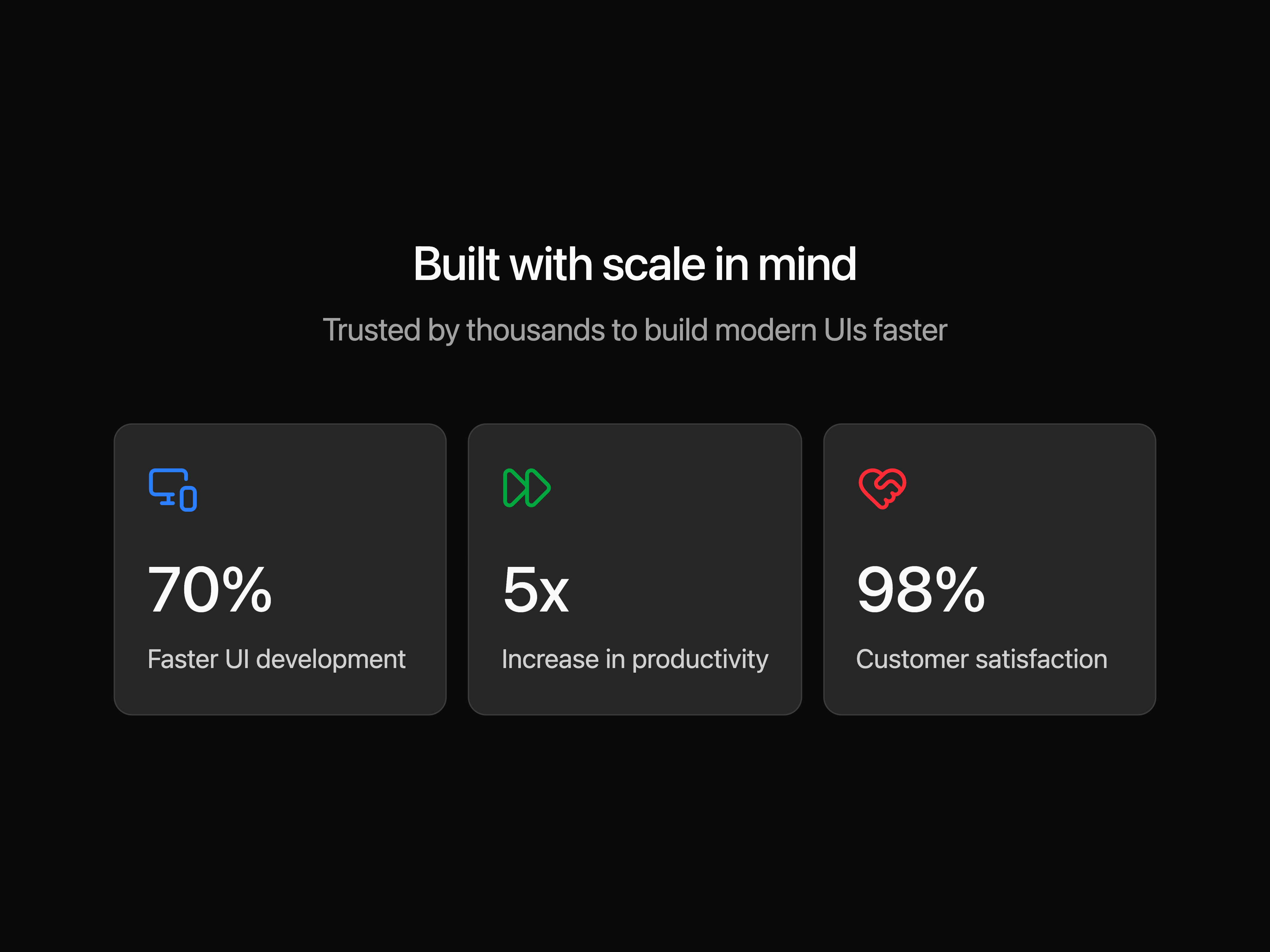
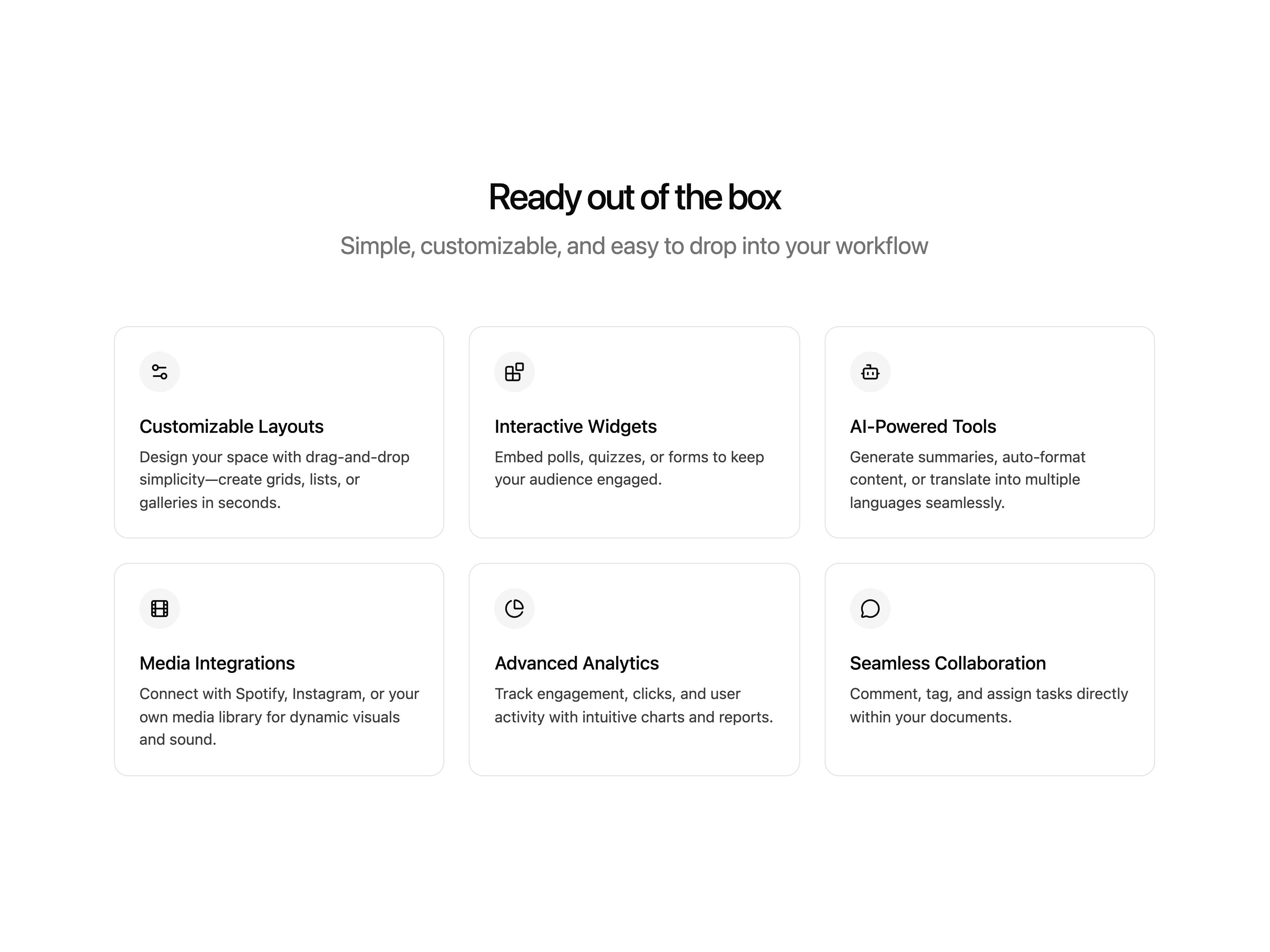
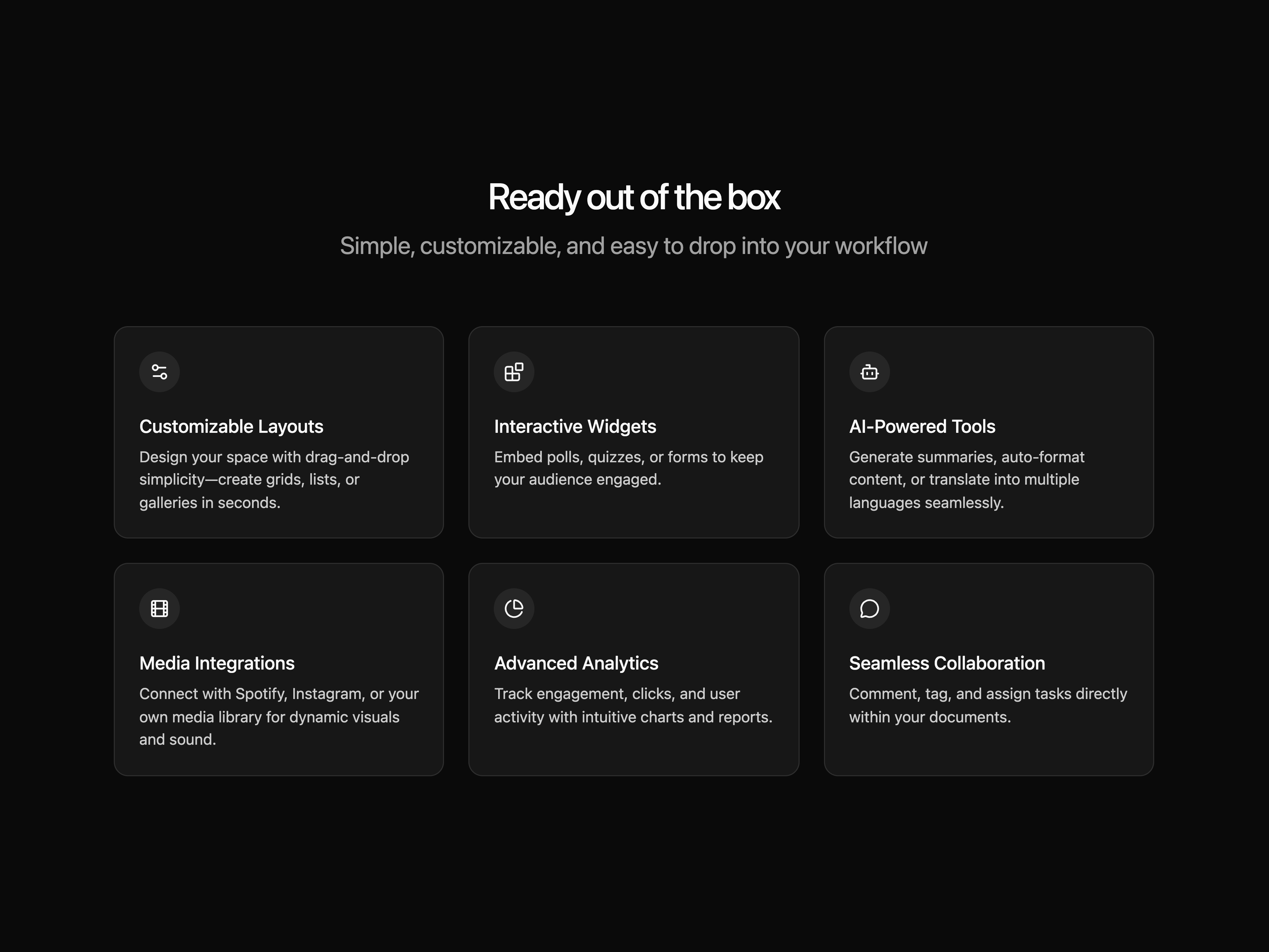
A simple features block
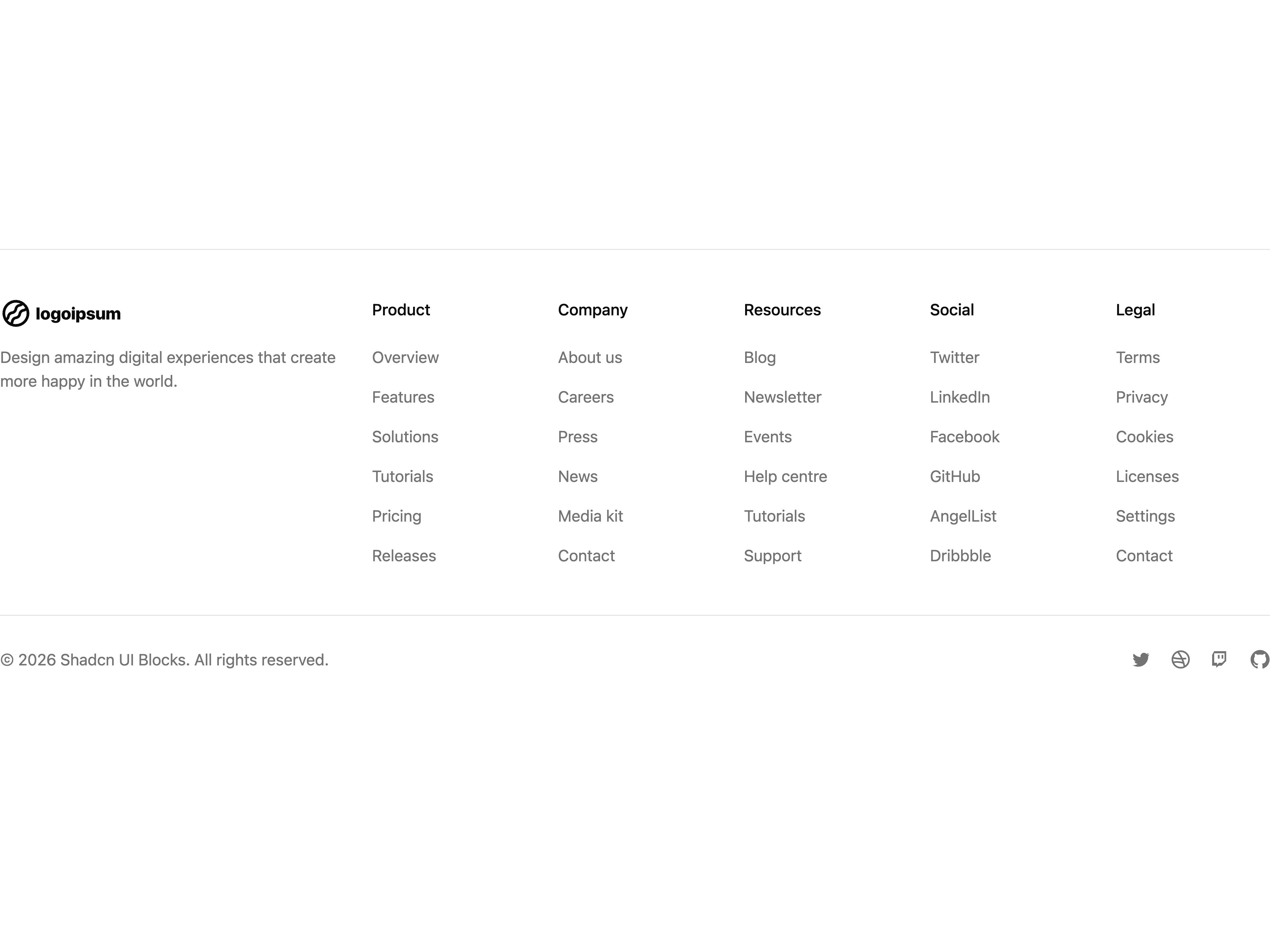
A simple footer block
A simple hero block
A simple hero block
A simple hero block
A simple hero block
A simple hero block
A simple hero block
A simple hero block
A simple hero block
A default input component
A ring input component
A filled input component
A disabled input component
An input with label component
An input with button component
An input with adornment component
An input with helper text component
An input with error message component
An input with form component
A file input component
A dropzone input component
A default one-time password input component
An OTP input without separators between fields
An OTP input with separated input fields
An alternate style of separated OTP input fields
An OTP input with secondary styling
An OTP input with custom separator between fields
An OTP input with inner shadow styling
A simple integrations block
A simple invite member block
A simple keyboard shortcuts block
A simple login block
A simple logos block
A simple logo cloud block
A simple members block
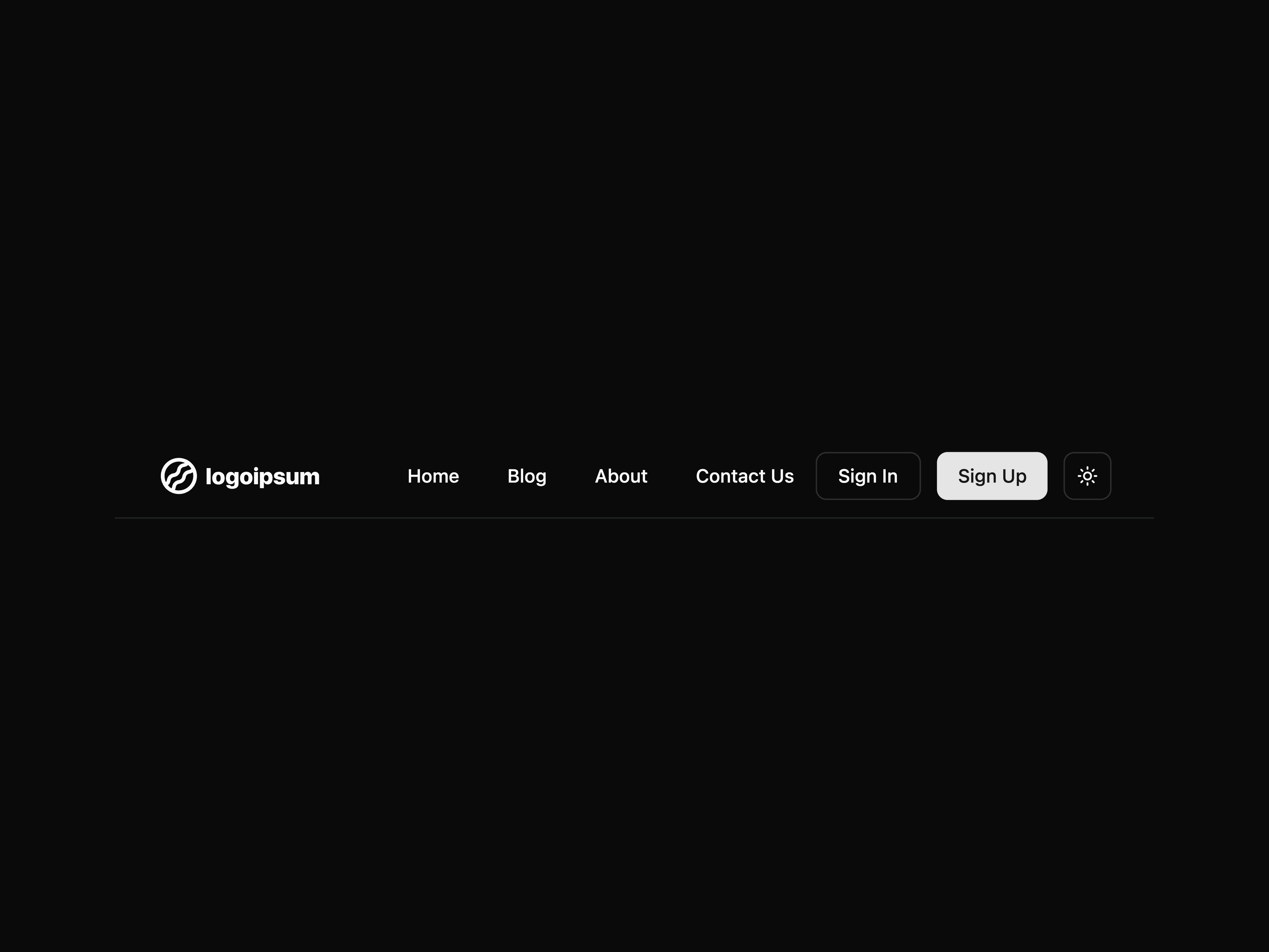
A simple navbar block
A navigation menu with dropdown functionality
A navigation menu with icon elements
A mobile-friendly navigation menu
A simple 404 not found block
A 404 not found block with a split layout
A minimal 404 not found block
A humorous 404 not found block with a glitch effect
A 404 not found block with a full-page background text
A simple order confirmation block
A default pagination component
A pagination component with primary button styling
A pagination component with secondary button styling
A pagination component with rounded button styling
A pagination component with icons
A pagination component with first and last page navigation
A pagination component with bordered styling
A pagination component with tabs styling
A pagination component with secondary tabs styling
A pagination component with icons and labels
A pagination component with text
A simple particles
A simple pricing block
A simple profile block
A default linear progress component
A linear progress component with label
A linear progress component with custom color
A progress component with rounded styling
A progress component with gradient styling
A progress component with animation effects
A circular progress component
A circular progress component with label
A circular progress component with custom label
A circular progress component with custom shape
A default radio group component
A radio group component with horizontal layout
A radio group component with disabled options
A radio group component with custom color options
A radio group component with custom size options
A radio group component with variant styling options
A radio group component with card-style options (style 1)
A radio group component with card-style options (style 2)
A radio group component with card-style options (style 3)
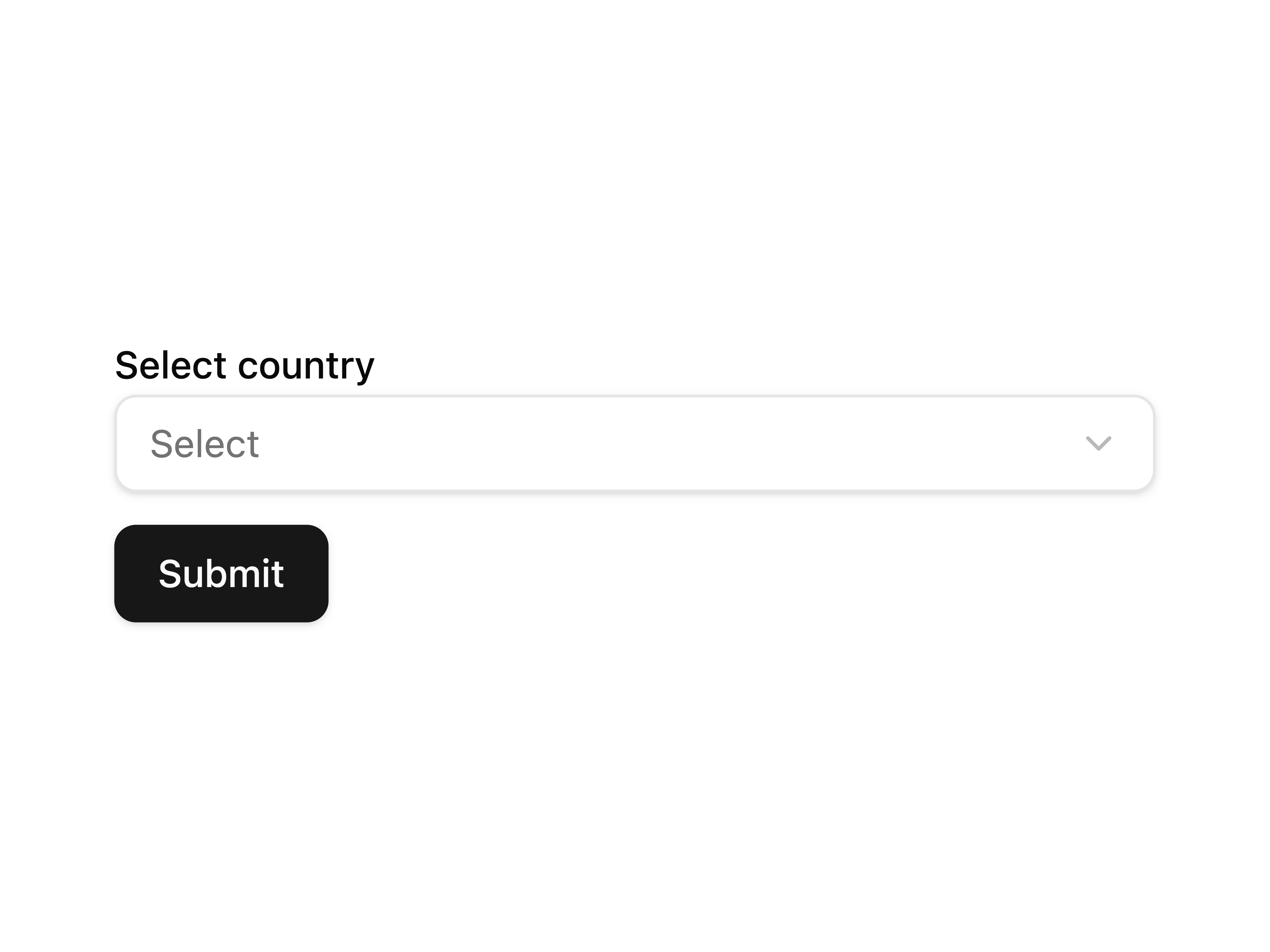
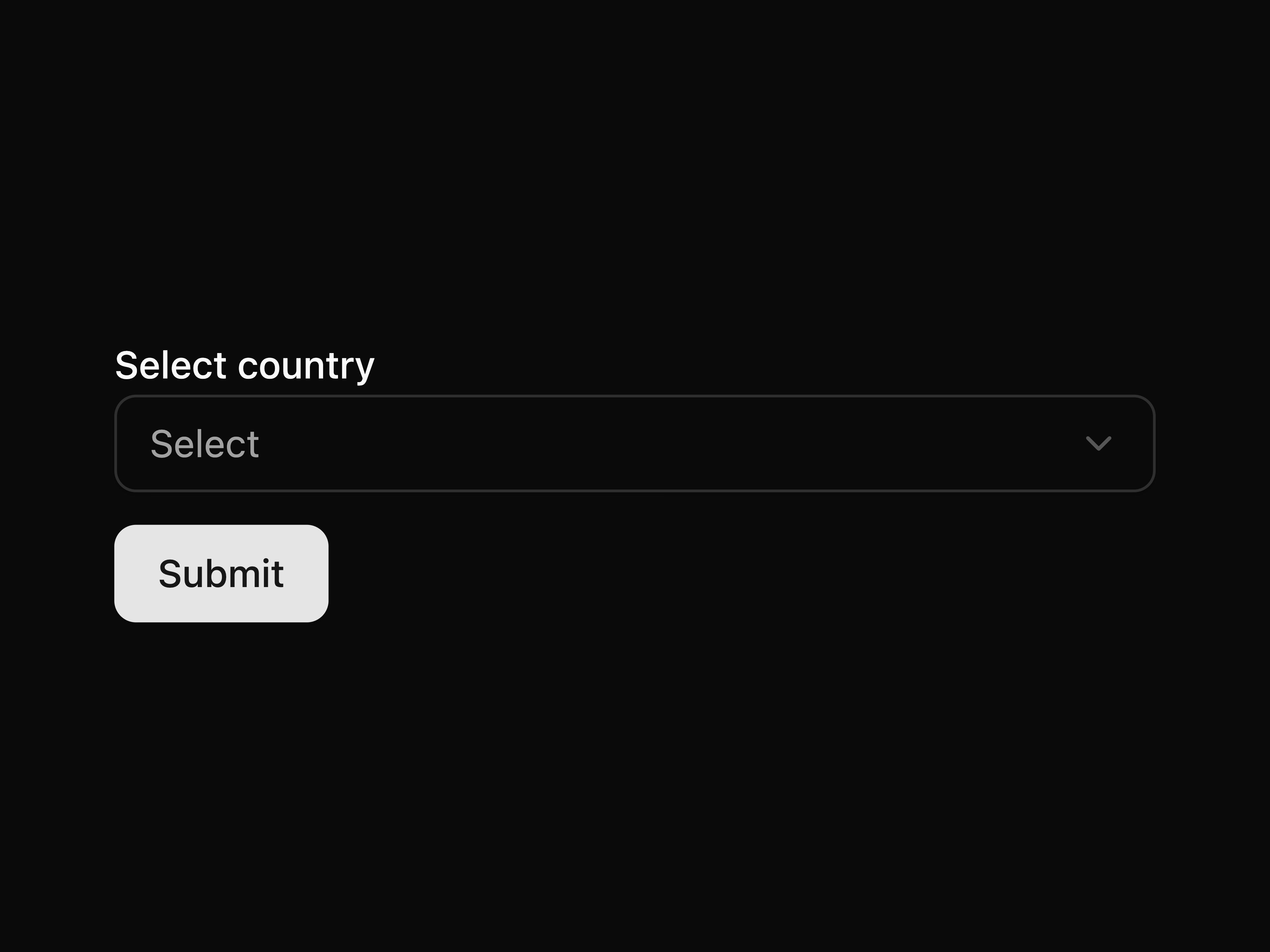
A default select component
A select component with custom background color
A select component with ghost styling
A select component with custom dropdown icon
A select component with custom shape styling
A select component with icon integration
A select component integrated with form handling
A select component for theme selection
A select component with custom menu position
A select component with scrollable options
A controlled select component
A default separator component
A horizontal separator with label component
A horizontal separator with chip component
A dashed separator component
A vertical separator component
A vertical separator with chip component
A vertical separator with label component
A simple setup guide block
A simple signup block
A default slider component
A disabled slider component
A slider component with different sizes
A slider component with different colors
A slider component with different shapes
A slider component with a label
A slider component with a custom thumb icon
A slider component designed for audio controls
A slider component with marks for specific values
A slider component with a sticky label
A slider component with a sticky label that appears on hover
Website - shadcnui-blocks.com
Shadcn UI Blocks is a curated collection of blocks and examples for Shadcn UI components. This platform is designed to help developers preview and copy ready-made code snippets for various components, saving time and enhancing productivity in their projects.
Landing Page: Showcases the most popular Shadcn UI components with examples and links to detailed pages. Component-Specific Pages: Dedicated pages for individual components, featuring multiple variations and previews.
Contributions are welcome! If you have ideas for new blocks or improvements, feel free to reach out or fork the repository.
Inspired by the simplicity and flexibility of Shadcn UI components, this platform aims to make building user interfaces faster and more accessible.
The packages and primitives its components pull in, counted across the registry.
Shadcn UI Blocks is a component library on 21st.dev by shadcnui-blocks with 25 public React components. Every component ships with a live interactive preview and full TSX source β copy the code, install it through the shadcn CLI, or pull it into Cursor or Claude Code over MCP.