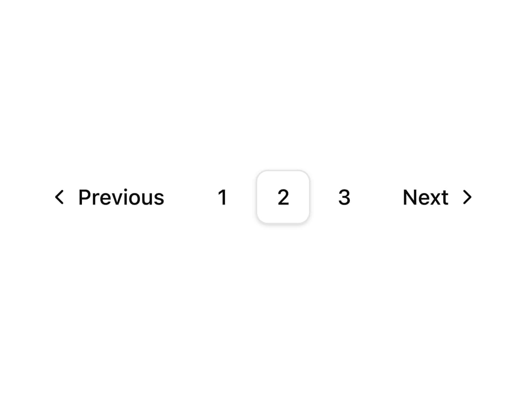
About
A simple numbered pagination control with previous/next arrows and an active page indicator, used to navigate between pages of a list or table.
Built with React and Tailwind. Copy the prompt and paste it into Claude Code, Cursor or Lovable: your agent adds Default Pagination to your project and fits it to your theme.
Code
How Default Pagination is used: the demo's code. The component's own source comes with a free account.
Usage.tsx
import PaginationDemo from "@/components/ui/pagination-01";

export default function Demo() {
  return <PaginationDemo />;
}
More by shadcnui-blocks
View all
Logo Cloud 15
258
Numbers Stats Grid
243
Testimonials 13
197
Underlined Navigation Menu
98
Rich Navigation Menu
90
Integrations 02
84
Empty State with Marquee
82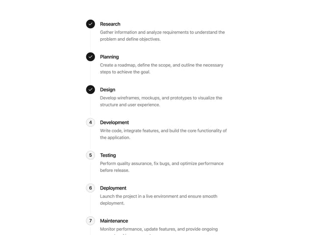
Process Timeline
79
More in Navigation
View all

Sidebar
341

Pagination
99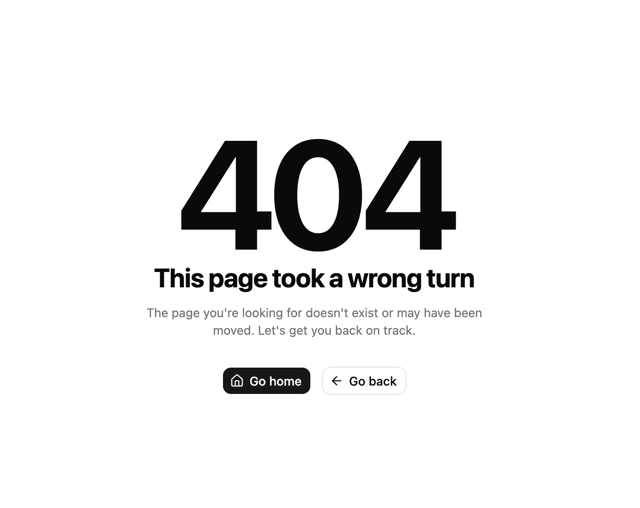
Oversized 404 Numeral
68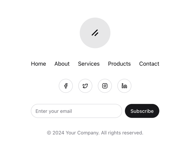
Stacked Circular Footer
443
Navbar
6

Navbar
74
Tabs like bookmark
73

Tabs
33


