About
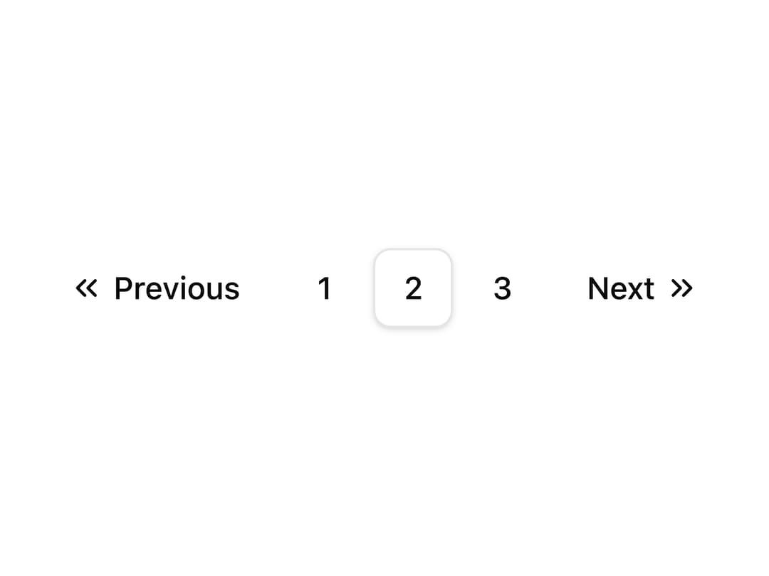
A pagination component with labeled Previous and Next controls using chevron icons.
Built with React and Tailwind. Copy the prompt and paste it into Claude Code, Cursor or Lovable: your agent adds Pagination with Icon and Label to your project and fits it to your theme.
Code
How Pagination with Icon and Label is used: the demo's code. The component's own source comes with a free account.
Usage.tsx
import PaginationWithIconAndLabel from "@/components/ui/pagination-icon-label";

export default function Default() {
  return (
    <div className="flex min-h-40 w-full items-center justify-center p-6">
      <PaginationWithIconAndLabel />
    </div>
  );
}
Dependencies
More by shadcnui-blocks
View all
Logo Cloud 15
264
Numbers Stats Grid
262
Testimonials 13
207
Underlined Navigation Menu
102
Rich Navigation Menu
90
Process Timeline
87
Integrations 02
84
Empty State with Marquee
84
More in Navigation
View all

Sidebar
363
Navbar
8

Pagination
38
Footer
456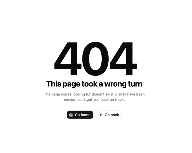

Oversized 404 Numeral
72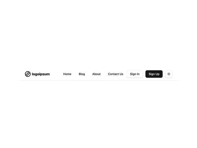
Navbar with Theme Toggle
59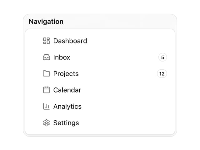

Sortable Sidebar Navigation
75
Tabs like bookmark
76


