
About
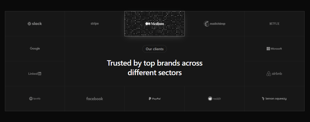
A "trusted by" showcase with character. 14 brand logos arranged in a 5-column grid with a centered headline. Each card runs a canvas-driven pixel shimmer in the brand's actual signature color on hover , Slack purple, Stripe violet, Spotify green. Muted at rest, full color on touch. Tailwind 4 + shadcn tokens, light & dark mode out of the box.
Built with React and Tailwind. Copy the prompt and paste it into Claude Code, Cursor or Lovable: your agent adds Pixel Logo Grid to your project and fits it to your theme.
Code
How Pixel Logo Grid is used: the demo's code. The component's own source comes with a free account.
Usage.tsx
import { Component } from "@/components/ui/pixel-logo-grid";

export default function DemoOne() {
  return <Component />;
}More by SMAmmar
View all
Scroll Reel Testimonials
1.1K
Anti Metal Button
412
Music Player Widget
378
Perspective Highlight
194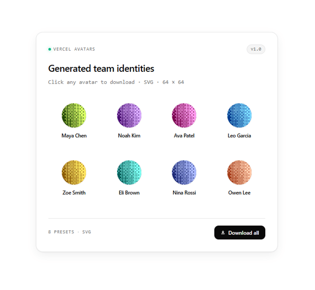
Vercel Avatars
7