
About
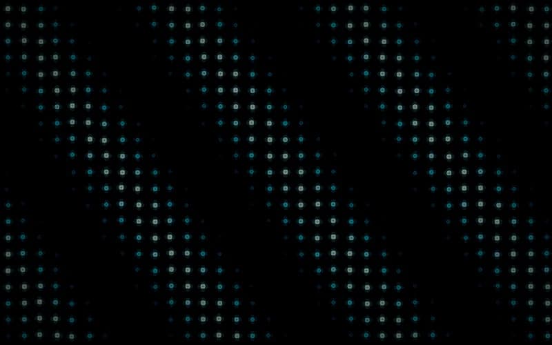
Animated WebGL shader background in the Dot Grid style. Default variant. Generated by the 21st.dev Shader Builder. Adapted from Paper Shaders under Apache-2.0. 4-color palette (#071013, #155E75, #22D3EE, #ECFEFF). Features: cursor-reactive (repel). A drop-in, zero-dependency React component for hero sections and animated gradient/noise backgrounds.
Built with React and Tailwind. Copy the prompt and paste it into Claude Code, Cursor or Lovable: your agent adds Dot Grid lines to your project and fits it to your theme.
Code
How Dot Grid lines is used: the demo's code. The component's own source comes with a free account.
Usage.tsx
import { ShaderBackground } from "@/components/ui/dot-grid-lines"

export default function ShaderBackgroundDemo() {
  return (
    <div className="relative h-screen w-full overflow-hidden">
      <ShaderBackground className="h-full w-full" />
    </div>
  )
}
More by Savva Sicevs
View all

Price Target Fan
201
Candle Chart
182
Market Snapshot
130
Returns Calendar
99
Range Navigator
98
SMA Chart
93
Market Watchlist
92
Sectors Donut
68
More in Heroes
View all

SaaS Template
2.5K

Responsive Hero Banner
2K

Hero
1.3K
Centered Hero with Image Fan
973
Editorial Collage Hero
460

Aero Hero-3
579
Glass Fold
295

HeroSectionWithGradient
351
