
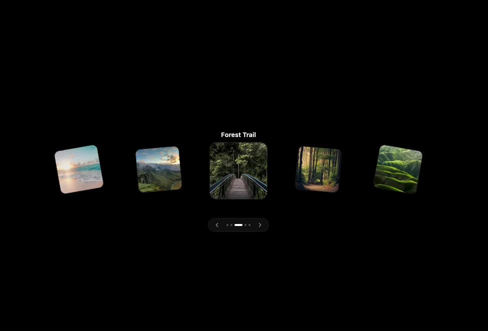
About
An arc-based 3D image carousel with animated dot indicators and prev/next controls that fan cards out on hover.
Built with React and Tailwind. Copy the prompt and paste it into Claude Code, Cursor or Lovable: your agent adds Interactive 3D Card Carousel to your project and fits it to your theme.
Code
How Interactive 3D Card Carousel is used: the demo's code. The component's own source comes with a free account.
Usage.tsx
import { CardCarousel } from "@/components/ui/card-carousel";

export default function CardCarouselDemo() {
  return (
    <div className="w-full h-screen flex items-center justify-center bg-black">
      <CardCarousel />
    </div>
  );
}
Dependencies
More by Subhan Uddin
View all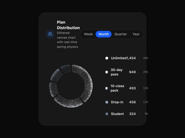

Dither Donut Chart
97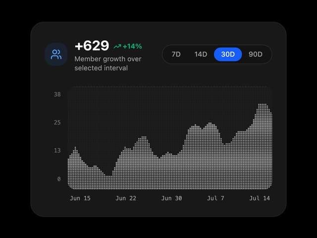
Dither Growth Chart
28
Dots Ring
27
Waveform Loader
18
Page Transition
15
Bouncing Square
13
Dynamic Island Loader
12
Intersecting Rings
11
More in Cards
View all

Course Design Cards
1.2K

Card Studio
11

Interactive Tech Stack Bento Grid with Hover Effects
314
Stats cards with links
40

Statistics Card 2
281
Card
57
Statistics Card 10
276
The Item one
3
