
About
Shadcn badge component
Built with React and Tailwind. Copy the prompt and paste it into Claude Code, Cursor or Lovable: your agent adds badge to your project and fits it to your theme.
Code
How badge is used: the demo's code. The component's own source comes with a free account.
Usage.tsx
"use client"
import { useState } from "react";
import { motion, AnimatePresence } from "framer-motion";
import { cn } from "@/lib/utils";
import { Badge } from "@/components/ui/badge-1"
import { MinusIcon, PlusIcon } from "lucide-react";
interface FaqItem {
id: string;
question: string;
answer: string;
category: "general" | "pricing" | "technical" | "support";
}
const faqItems: FaqItem[] = [
{
id: "1",
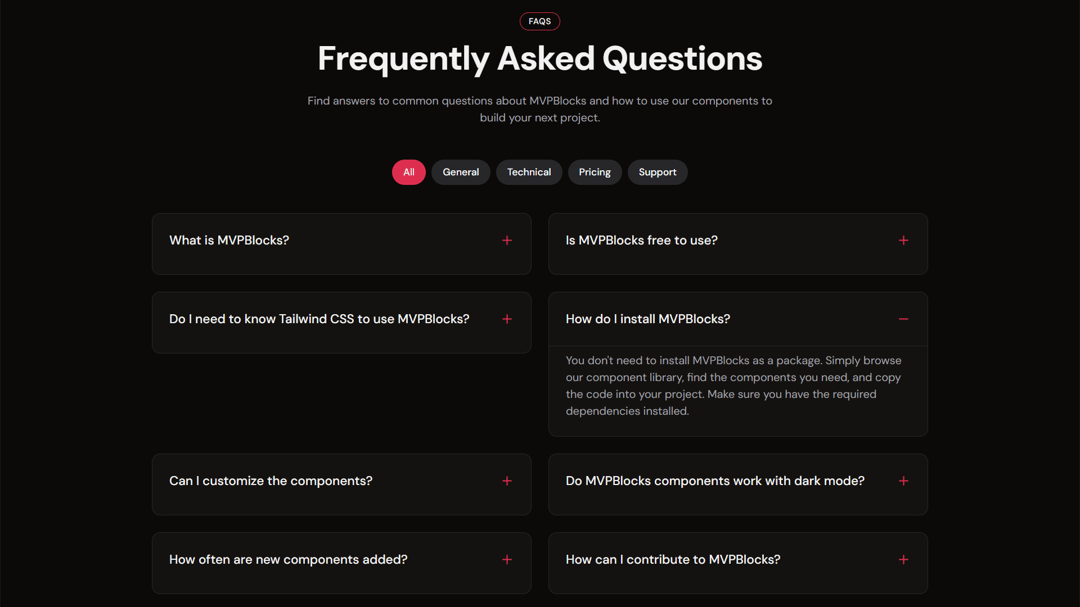
question: "What is MVPBlocks?",
answer: "MVPBlocks is a collection of ready-to-use UI components built with Next.js and Tailwind CSS. It helps developers quickly build beautiful, responsive websites without starting from scratch.",
category: "general",
},
{
id: "2",
question: "Is MVPBlocks free to use?",
answer: "Yes, MVPBlocks is completely free and open-source. You can use it for personal and commercial projects without any restrictions or attribution requirements.",
category: "general",
},
{
id: "3",
question: "Do I need to know Tailwind CSS to use MVPBlocks?",
answer: "While having Tailwind CSS knowledge is helpful, it's not required. You can simply copy and paste our components into your project and make basic modifications without deep Tailwind expertise.",
category: "technical",
},
{
id: "4",
question: "How do I install MVPBlocks?",
answer: "You don't need to install MVPBlocks as a package. Simply browse our component library, find the components you need, and copy the code into your project. Make sure you have the required dependencies installed.",
category: "technical",
},
{
id: "5",
question: "Can I customize the components?",
answer: "Absolutely! All components are built with customization in mind. You can modify colors, spacing, typography, and more using Tailwind classes or by editing the component code directly.",
category: "technical",
},
{
id: "6",
question: "Do MVPBlocks components work with dark mode?",
answer: "Yes, all MVPBlocks components are designed to work seamlessly with both light and dark modes. They automatically adapt to your site's theme settings.",
category: "technical",
},
{
id: "7",
question: "How often are new components added?",
answer: "We regularly add new components to the library. Our goal is to provide a comprehensive set of components for all common UI patterns and website sections.",
category: "general",
},
{
id: "8",
question: "How can I contribute to MVPBlocks?",
answer: "We welcome contributions! You can contribute by creating new components, improving existing ones, fixing bugs, or enhancing documentation. Check our GitHub repository for contribution guidelines.",
category: "support",
},
];
const categories = [
{ id: "all", label: "All" },
{ id: "general", label: "General" },
{ id: "technical", label: "Technical" },
{ id: "pricing", label: "Pricing" },
{ id: "support", label: "Support" },
];
export function Demo() {
const [activeCategory, setActiveCategory] = useState<string>("all");
const [expandedId, setExpandedId] = useState<string | null>(null);
const filteredFaqs = activeCategory === "all"
? faqItems
: faqItems.filter(item => item.category === activeCategory);
const toggleExpand = (id: string) => {
setExpandedId(expandedId === id ? null : id);
};
return (
<section className="py-16 bg-background">
<div className="container mx-auto max-w-6xl px-4 md:px-6">
<div className="flex flex-col items-center mb-12">
<Badge
variant="outline"
className="mb-4 px-3 py-1 text-xs font-medium uppercase tracking-wider border-primary"
>
FAQs
</Badge>
<h2 className="text-4xl md:text-5xl font-bold text-center mb-6 tracking-tight text-foreground">
Frequently Asked Questions
</h2>
<p className="text-muted-foreground text-center max-w-2xl">
Find answers to common questions about MVPBlocks and how to use our components to build your next project.
</p>
</div>
{/* Category Tabs */}
<div className="flex flex-wrap justify-center gap-2 mb-10">
{categories.map((category) => (
<button
key={category.id}
onClick={() => setActiveCategory(category.id)}
className={cn(
"px-4 py-2 rounded-full text-sm font-medium transition-all",
activeCategory === category.id
? "bg-primary text-primary-foreground"
: "bg-secondary text-secondary-foreground hover:bg-secondary/80"
)}
>
{category.label}
</button>
))}
</div>
{/* FAQ Grid */}
<div className="grid grid-cols-1 md:grid-cols-2 gap-6">
<AnimatePresence>
{filteredFaqs.map((faq, index) => (
<motion.div
key={faq.id}
initial={{ opacity: 0, y: 20 }}
animate={{ opacity: 1, y: 0 }}
exit={{ opacity: 0, y: -20 }}
transition={{ duration: 0.3, delay: index * 0.05 }}
className={cn(
"border border-border rounded-xl overflow-hidden h-fit",
expandedId === faq.id ? "bg-card/50 shadow-3xl" : "bg-card/50"
)}
style={{ minHeight: '88px' }}
>
<button
onClick={() => toggleExpand(faq.id)}
className="w-full flex items-center justify-between p-6 text-left"
>
<h3 className="text-lg font-medium text-foreground">{faq.question}</h3>
<div className="ml-4 flex-shrink-0">
{expandedId === faq.id ? (
<MinusIcon className="h-5 w-5 text-primary" />
) : (
<PlusIcon className="h-5 w-5 text-primary" />
)}
</div>
</button>
<AnimatePresence>
{expandedId === faq.id && (
<motion.div
initial={{ height: 0, opacity: 0 }}
animate={{ height: "auto", opacity: 1 }}
exit={{ height: 0, opacity: 0 }}
transition={{ duration: 0.3 }}
className="overflow-hidden"
>
<div className="px-6 pb-6 pt-2 border-t border-border">
<p className="text-muted-foreground">{faq.answer}</p>
</div>
</motion.div>
)}
</AnimatePresence>
</motion.div>
))}
</AnimatePresence>
</div>
{/* Contact CTA */}
<motion.div
initial={{ opacity: 0, y: 20 }}
animate={{ opacity: 1, y: 0 }}
transition={{ delay: 0.5, duration: 0.5 }}
className="mt-16 text-center"
>
<p className="text-muted-foreground mb-4">
Can't find what you're looking for?
</p>
<a
href="#"
className="inline-flex items-center justify-center px-6 py-3 border-2 border-primary rounded-lg font-medium text-foreground hover:bg-primary hover:text-primary-foreground transition-colors"
>
Contact Support
</a>
</motion.div>
</div>
</section>
);
}Dependencies
More by Subhadeep Roy
View all
CTA
Notebook hero
CTA