
About
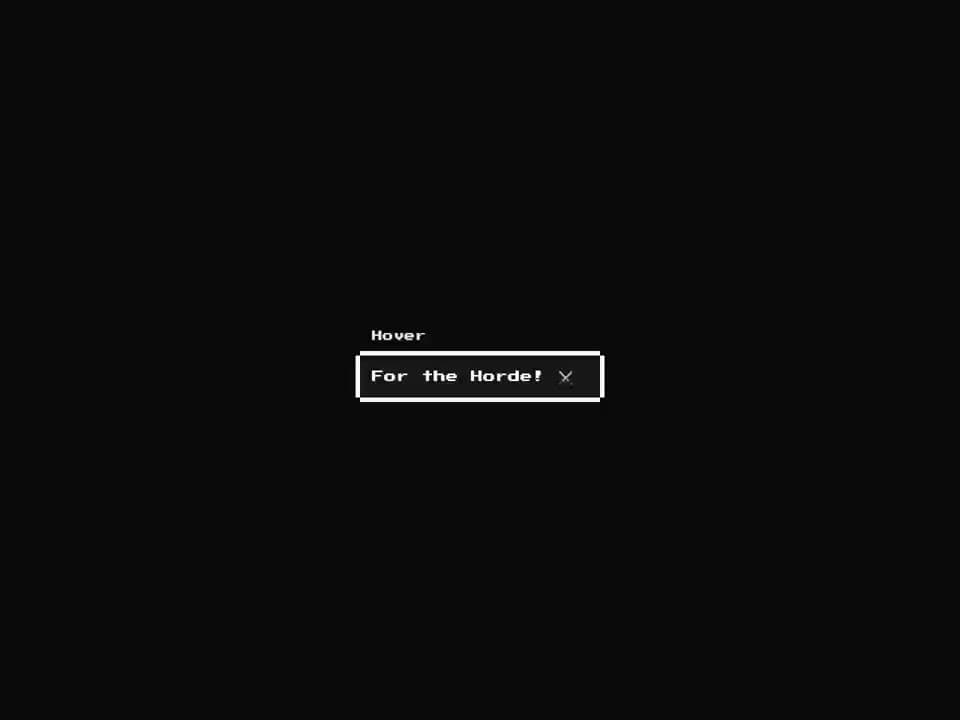
An 8-bit styled hover card component with pixel-border overlay. Renders a retro popover panel on hover using CSS group-hover, no Radix dependency.
Built with React and Tailwind. Copy the prompt and paste it into Claude Code, Cursor or Lovable: your agent adds 8bit Hover Card to your project and fits it to your theme.
Code
How 8bit Hover Card is used: the demo's code. The component's own source comes with a free account.
Usage.tsx
import { Button } from "@/components/ui/8bit-button";
import {
  HoverCard,
  HoverCardContent,
  HoverCardTrigger,
} from "@/components/ui/8bit-hover-card";

export default function Demo() {
  return (
    <div className="flex min-h-[200px] items-center justify-center p-8 retro">
      <HoverCard>
        <HoverCardTrigger>
          <Button variant="link">Hover</Button>
        </HoverCardTrigger>
        <HoverCardContent className="w-80">
          For the Horde! ⚔️
        </HoverCardContent>
      </HoverCard>
    </div>
  );
}
Dependencies
More by OrcDev
View all
8bit CTA 1 — Comparison
295
8bit 404 Page
172
8bit Loading Screen
104
8bit Changelog
75
8-bit Login Form
59
8bit FAQ 2 — Card Grid
57
8-bit Stats Dashboard
54
8bit FAQ 3 Searchable
53
More in Cards
View all

Statistics Card 2
257

Course Design Cards
1.1K
Stats cards with links
83
The Item one
3

Card Studio
36
Card
70
Statistics Card 10
259
File Card Collections
997

