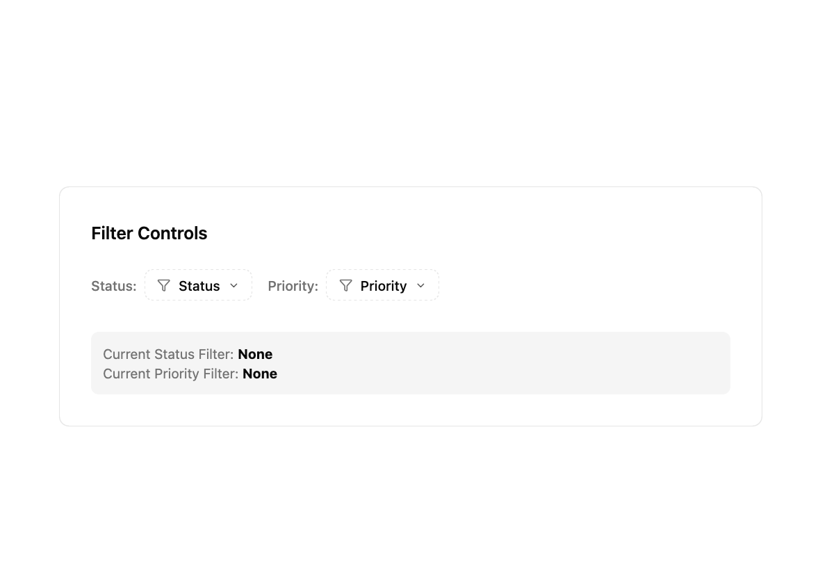
This React component creates a customizable filter for data tables. It addresses the need for a clean, user-friendly way to filter table data based on various criteria. The component leverages the power of the shadcn/ui library for its UI elements and Tailwind CSS for styling, ensuring a consistent and visually appealing experience.
Functionality Breakdown:
- Props-Driven Configuration: The component is highly configurable through its props. You define the filter label, available options (each with a value, label, and optional icon), selected values, and a callback function to handle changes. The
isMultiSelect prop controls whether users can select multiple filter options.
- Interactive Popover: The filter displays as a button that, when clicked, reveals a popover containing a list of filter options. This uses the
@/components/ui/popover component.
- Command Component for Options: Filter options are rendered using the
@/components/ui/command component, providing a familiar and accessible interface for selecting options. Each option is displayed with its label and optional icon. A checkmark indicates selected options.
- State Management: The component manages the currently selected filter values internally using React's
useState hook. Multi-select and single-select logic are carefully handled to ensure correct behavior.
- Dynamic Button Text: The filter button dynamically updates its text to reflect the current selection (e.g., showing the selected option, or "(x selected)" for multiple selections).
- Clear and Select All: For multi-select filters, "Select All" and "Clear Filter" buttons are provided for convenient bulk actions.
- Accessibility: The component incorporates appropriate ARIA attributes (
aria-expanded, aria-haspopup, aria-selected, aria-label) to enhance accessibility for screen readers and assistive technologies.
Libraries and Concepts:
- React: For building the component's UI and managing its state.
- shadcn/ui: Provides the UI components (Button, Popover, Command). This library is built with Tailwind CSS.
- Lucide-React: Library for providing the icons.
- Tailwind CSS: Used for styling.
- TypeScript: Used for type safety and better code maintainability.
Use Cases:
- Filtering data in tables based on status, priority, category, date, etc.
- Creating advanced filtering capabilities in applications with large datasets.
- Enhancing user experience by providing a streamlined way to filter information.
Example Scenarios:
- Filtering tasks by their status (active, pending, completed).
- Filtering products based on category or price range.
- Filtering users by their role or location.