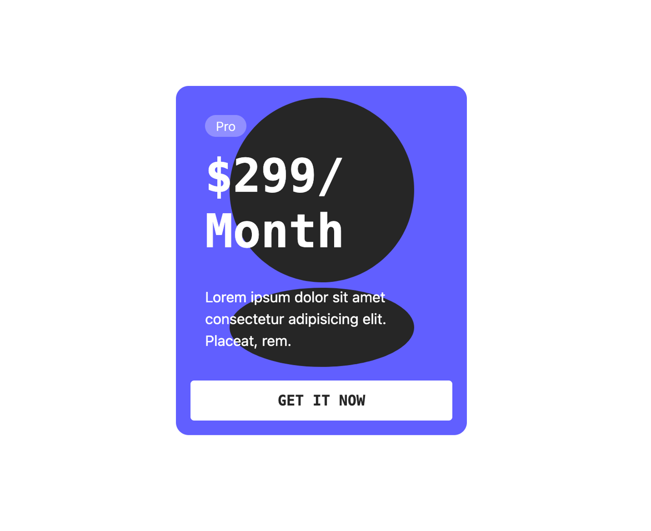
This code implements a visually appealing and interactive card component using the Framer Motion library. The component features a card with a price and description, overlaid on an animated background. On hover, the card scales slightly, and the background elements (a circle and an ellipse) morph dynamically, creating a 'squishy' effect. This solves the problem of creating engaging and memorable UI elements, enhancing user experience.
Here's a step-by-step breakdown:
SquishyCard Component: This is the main container, providing basic styling and layout. It houses the Card component.Card Component: This component uses motion.div from Framer Motion to enable animations. The whileHover prop applies animations on hover. The variants prop defines the animation states ('hover' in this case), specifying a scale increase. transition sets the animation's duration and easing function.Background Component: This component generates the animated background using motion.svg. It contains a motion.circle and motion.ellipse which are individually animated on hover, creating the 'squishy' effect. Each shape's animation is also controlled using variants and transition, with a small delay added to the shapes' animations for better visual flow.- Framer Motion: This library is fundamental to this code, providing the animation capabilities. It allows for smooth and declarative animations through the use of variants and transitions. The
whileHover, variants and transition properties are key to the animations.
This component can be used in various scenarios such as pricing cards, product showcases, or any situation where a visually engaging and interactive element is needed. The customizable nature of the colors, text, and shapes allows for flexibility in adapting the component to different design styles and contexts.