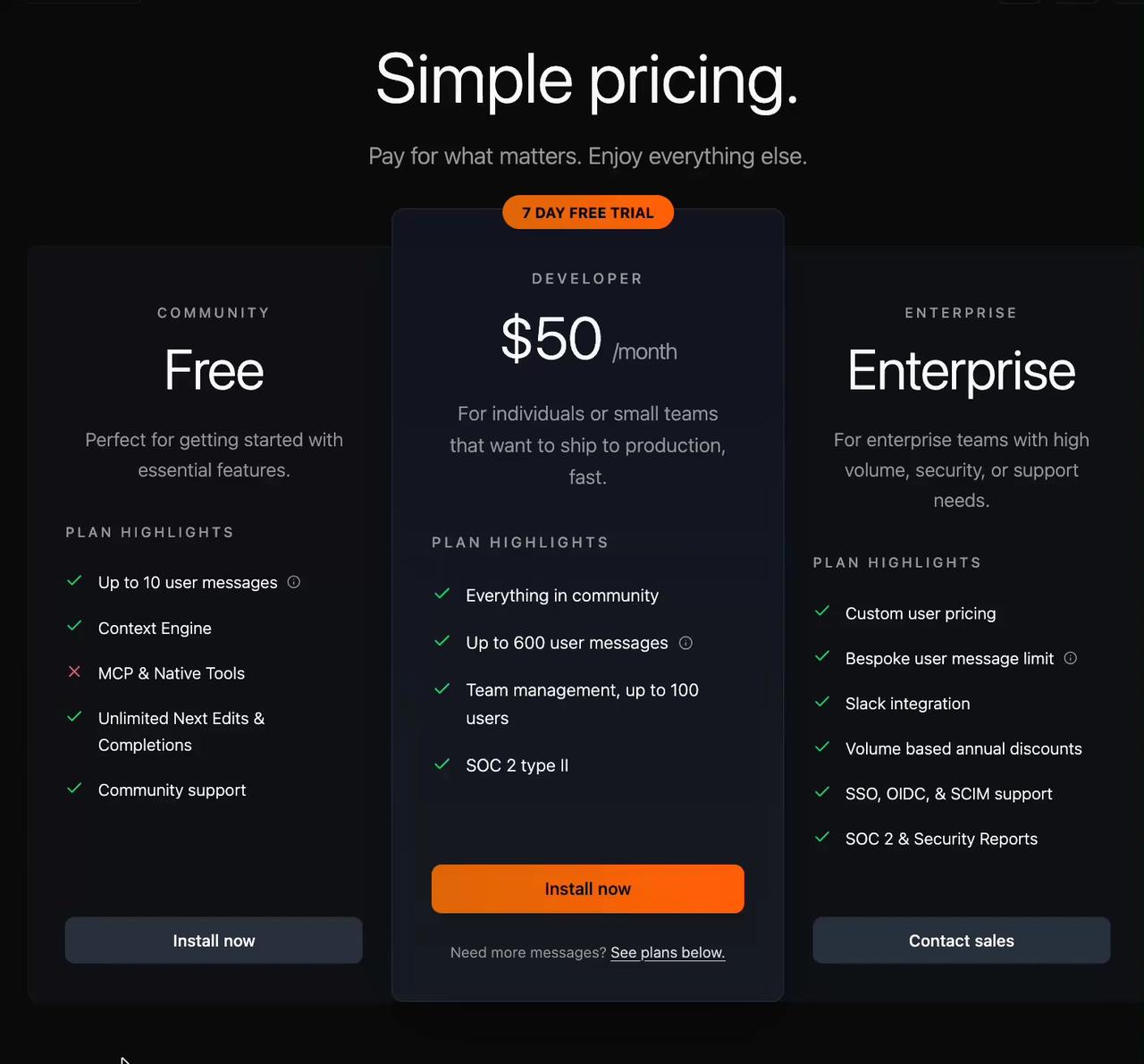
import React from 'react'
import PricingComponent from '@/components/ui/adaptive-pricing-section'

const Demo = () => {
  const pricingTiers = [
    {
      name: "Free",
      subtitle: "COMMUNITY",
      description: "Perfect for getting started with essential features.",
      features: [
        { text: "Up to 10 user messages", included: true, hasInfo: true },
        { text: "Context Engine", included: true },
        { text: "MCP & Native Tools", included: false },
        { text: "Unlimited Next Edits & Completions", included: true },
        { text: "Community support", included: true }
      ],
      buttonText: "Install now"
    },
    {
      name: "$50",
      subtitle: "DEVELOPER",
      price: "$50",
      period: "/month",
      description: "For individuals or small teams that want to ship to production, fast.",
      badge: {
        text: "7 DAY FREE TRIAL"
      },
      features: [
        { text: "Everything in community", included: true },
        { text: "Up to 600 user messages", included: true, hasInfo: true },
        { text: "Team management, up to 100 users", included: true },
        { text: "SOC 2 type II", included: true }
      ],
      buttonText: "Install now",
      highlighted: true,
      footerText: "Need more messages?",
      footerLink: "See plans below."
    },
    {
      name: "Enterprise",
      subtitle: "ENTERPRISE",
      description: "For enterprise teams with high volume, security, or support needs.",
      features: [
        { text: "Custom user pricing", included: true },
        { text: "Bespoke user message limit", included: true, hasInfo: true },
        { text: "Slack integration", included: true },
        { text: "Volume based annual discounts", included: true },
        { text: "SSO, OIDC, & SCIM support", included: true },
        { text: "SOC 2 & Security Reports", included: true }
      ],
      buttonText: "Contact sales"
    }
  ]

  return (
    <div className="w-full">
      <PricingComponent
        tiers={pricingTiers}
      />
    </div>
  )
}

export default Demo