
About
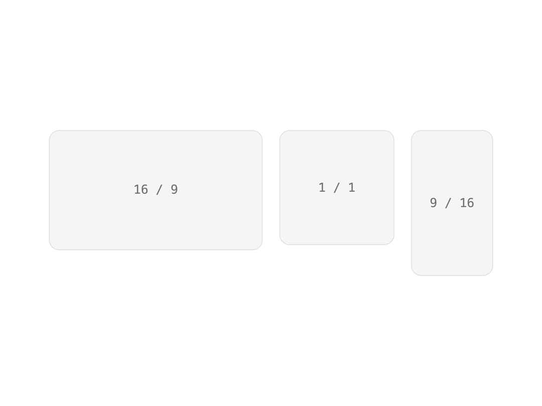
A container that locks its content to a fixed width/height ratio so layouts (images, embeds, cards) don't jump while media loads.
Built with React and Tailwind. Copy the prompt and paste it into Claude Code, Cursor or Lovable: your agent adds Aspect Ratio to your project and fits it to your theme.
Code
How Aspect Ratio is used: the demo's code. The component's own source comes with a free account.
Usage.tsx
import { AspectRatio } from "@/components/ui/aspect-ratio";

export default function Demo() {
  return (
    <div className="flex items-start gap-4">
      {[
        ["16 / 9", 16 / 9, "w-52"],
        ["1 / 1", 1, "w-28"],
        ["9 / 16", 9 / 16, "w-20"],
      ].map(([label, ratio, width]) => (
        <AspectRatio
          key={label as string}
          ratio={ratio as number}
          className={`${width} flex items-center justify-center rounded-lg border border-border bg-muted font-mono text-xs text-muted-foreground`}
        >
          {label}
        </AspectRatio>
      ))}
    </div>
  );
}
Dependencies
More by viandwi24
View all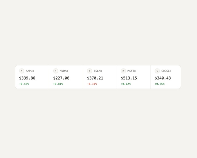
Ticker Strip
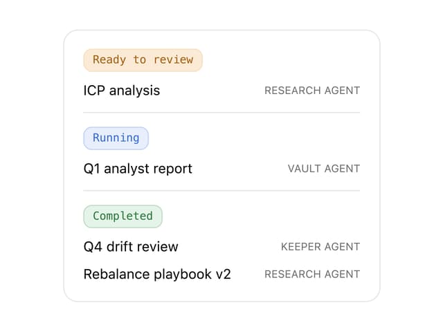
Task List
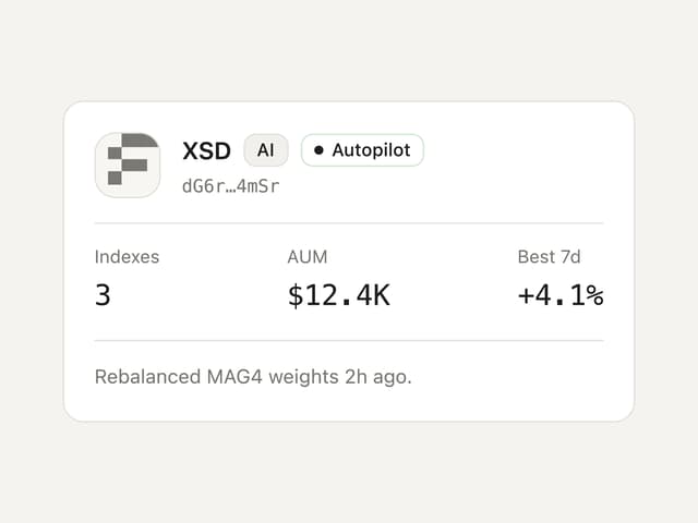
Agent Card
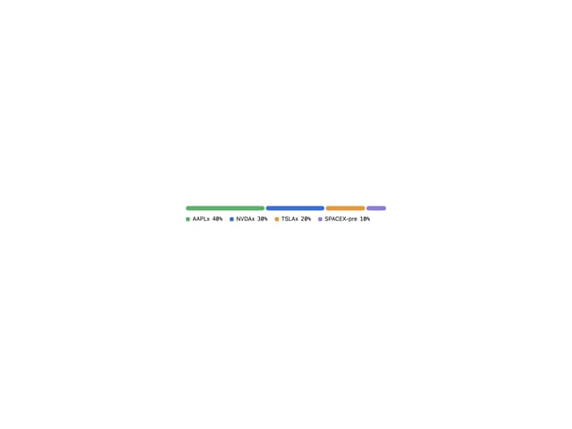
Allocation Bar
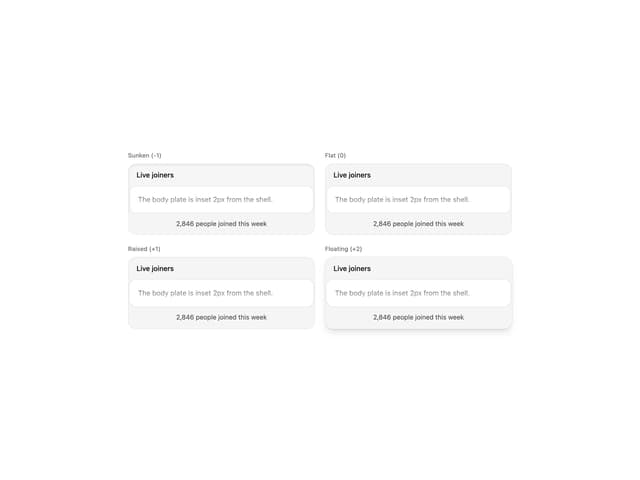
Inset Panel
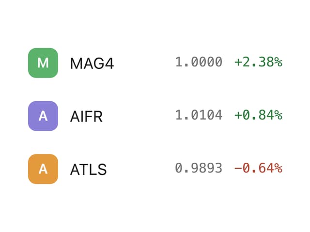
Watchlist Item